

Welcome to another Envato Tuts+ screencast tutorial! In this video I’m going to give you a quick introduction to using CSS vertical breakpoints.
Breakpoints are synonymous with responsive web design; they’re the points at which you choose to alter the layout of a design. For example, 768px is a commonly used viewport width, below which you might want to arrange your layout for mobile devices, and above which you might think more in terms of desktop.
However, breakpoints don’t only apply horizontally, to a viewport’s width; they might come into effect for a number of different reasons. In this tutorial we’re going to look at vertical breakpoints, which are applied in relation to a viewport’s height. We use them with the min-height and max-height properties within CSS media queries. Let’s take a deeper look.
In this video we look at the following scenarios:
- Changing the spacing and font sizes on short viewports.
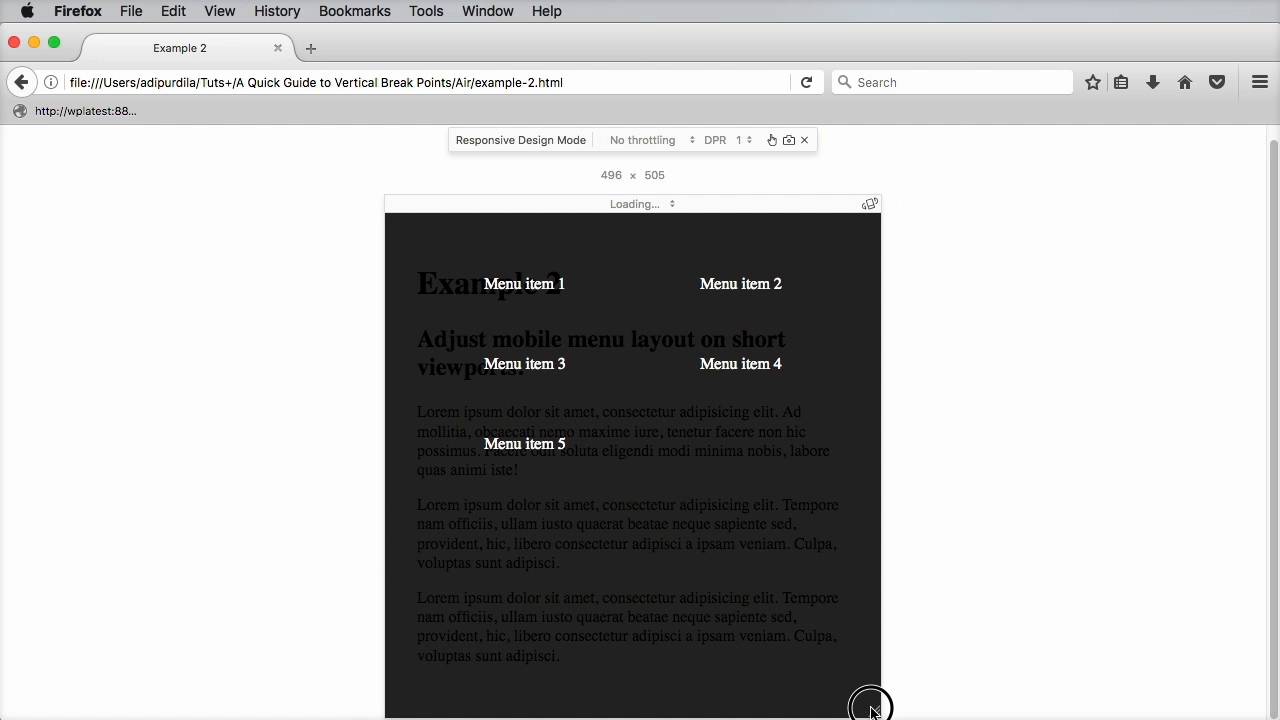
- Adjusting mobile navigation sizes on short viewports.
- Making a header or footer fixed, only when there is enough room.
- Adjusting full-screen sections for short viewports.
Be sure to download the source files to follow along.
Further Reading


 By
By


