
Brutalist websites were thrust into the spotlight recently when Pascal Deville’s brutalistwebsites.com hit Hacker News and went viral. This collection showcases the less warm and fuzzy side of the web–let’s take a look and see if we can pull some inspiration from brutalism.
Brutal Buildings
“Brutalism” (or “New Brutalism”) is a term which has been rattling round architectural schools for over half a century. It refers to a raw form of architecture with characteristics such as rough unfinished surfaces, unusual shapes, solid materials (like concrete), massive forms, and contrasting small features.
The actual term comes from the French béton brut—literally “raw concrete”, left unfinished after being cast, and thereby displaying the imperfections and patterns made by the formwork.
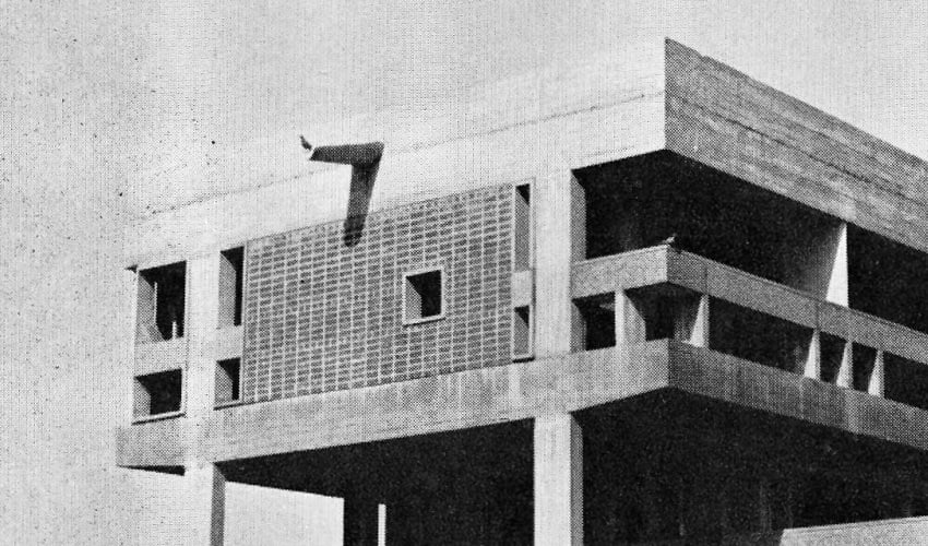


“…what characterises the New Brutalism…is precisely its brutality, its je-m’en-foutisme, its bloody-mindedness.” – Reyner Banham, 1955
Brutal Websites
Brutalist websites, like their architectural cousins, are an antidote to the more popular, softer web. We live in an age of emotional web design; where we as interface and experience designers climb over each other to offer users empathy and understanding. Where products entice customers in the friendliest, easiest ways possible. Colors are inviting, images are polished, type is smooth and crafted.
Looking at brutalist websites, adjectives such as these spring to mind:
- harsh
- rough
- rugged
- uncomfortable
- raw
- confrontational
- cynical
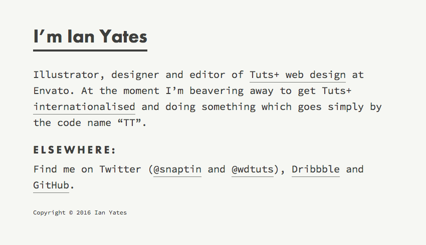
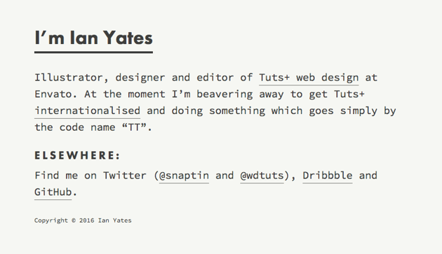
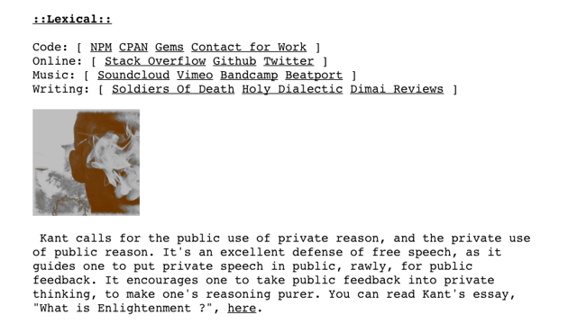
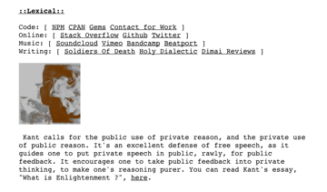
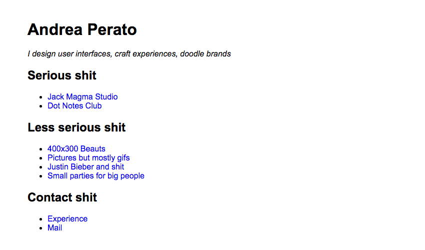
It’s a school of thinking I like; you could argue my own website (at the time of writing at least) has a touch of brutality:
So how do we actually define a brutalist website? Let’s examine some typical features.
Brutal Raw Code
First up, it’s worth mentioning that this isn’t a purely aesthetic thing. Brutalism is something which rises from the very core of a website: its code. Brutalist websites will tend to have crude, simple markup, inline styles, a lack of optimization, but also nothing complex to weigh things down. Check out the sum total of the document head for brutalistwebsites.com!
1 |
<html>
|
2 |
<head>
|
3 |
<title>Brutalist Websites</title> |
4 |
|
5 |
<style>
|
6 |
body { |
7 |
font-family: monospace; |
8 |
background-color: #eee; |
9 |
margin: 40px; |
10 |
}
|
11 |
.box { |
12 |
width:400px; |
13 |
height: 250px; |
14 |
float: left; |
15 |
padding: 0px 40px 80px 0px; |
16 |
}
|
17 |
.screenshot { |
18 |
width:400px; |
19 |
height: 250px; |
20 |
overflow: hidden; |
21 |
}
|
22 |
</style>
|
23 |
|
24 |
</head>
|
25 |
<body>
|
Raw code, like most aspects of brutalism, drags things back to a cruder form.


“I wasn't attempting to design a "brutalist" website” – Seth Thompson
Brutal System Fonts
Speaking of dragging things back to a cruder form, there was once a time when vast catalogues of cosy web fonts weren’t available. Times New Roman and Arial worked just fine thank you.


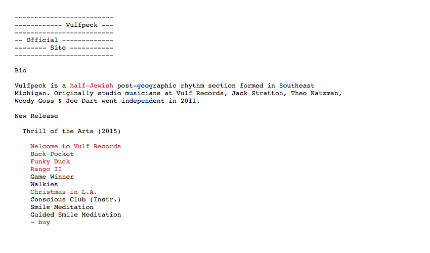
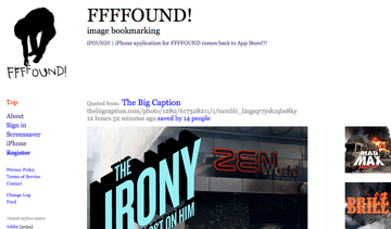
Ffffound! used to be brilliant, and always let users’ input do the talking–letting the UI take a supporting role with simple colors and fonts.


Have to love a bit of font-family: Courier,monospace;
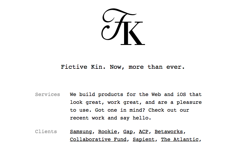

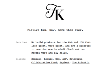
“I wanted to create a site that couldn't be created using Squarespace.” – Andrew Herzog
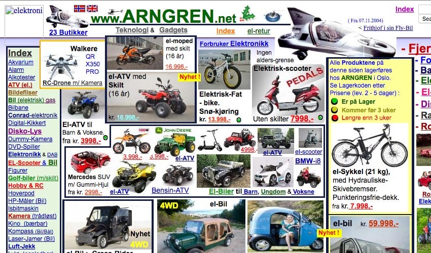
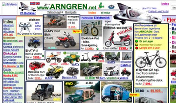
Brutal Colors
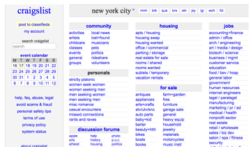
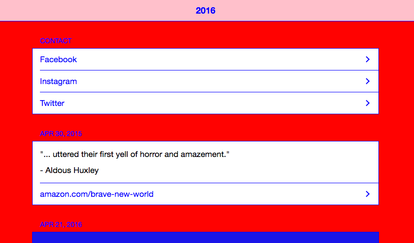
System fonts go hand in hand with a system palette. The web was a simpler place when designers limited themselves to 216 glorious browser safe colors. A gray, a blue, a red. And maybe a beige, with some burgundy. And if they needed depth, bevels were there to save the day.
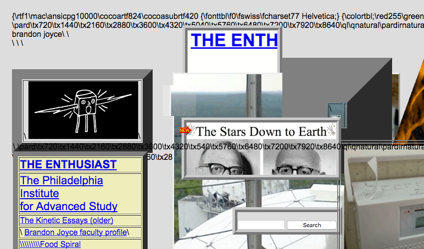

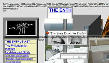
“My brutalism is a form of adversarial or uncooperative design: the internet suffers from an excess of orderliness” – Brandon Joyce

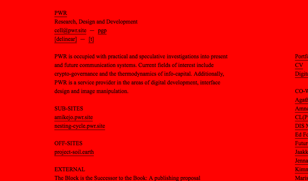
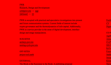
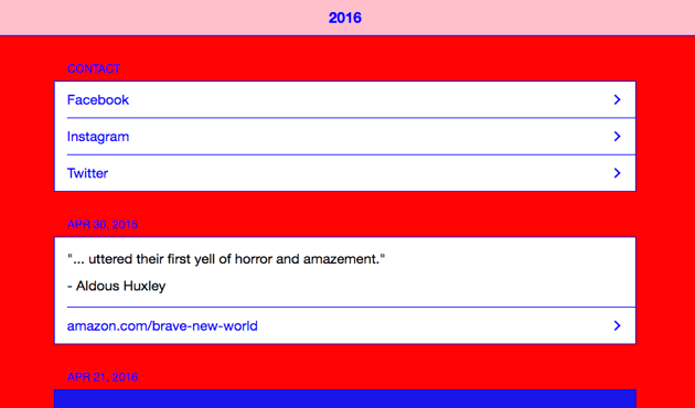
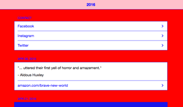
More red:
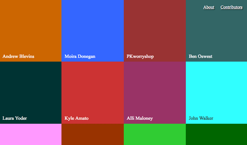
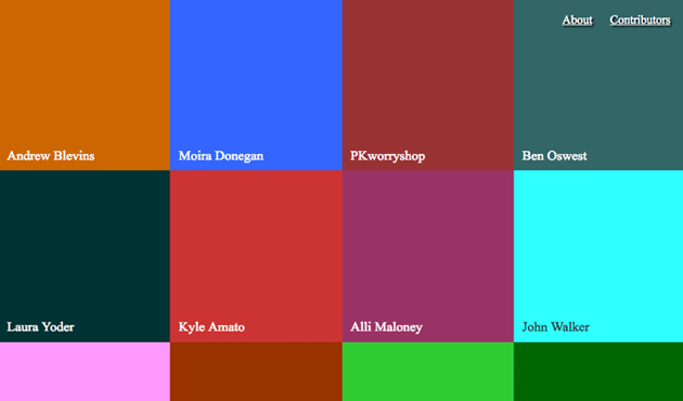
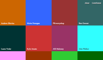
Mmm, purest green.

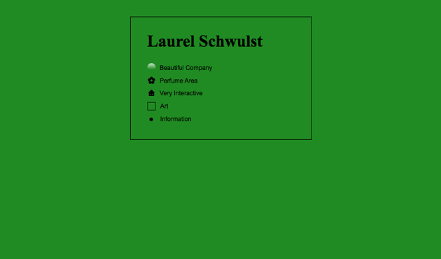

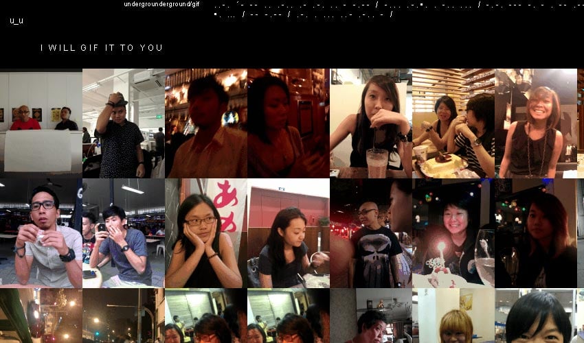
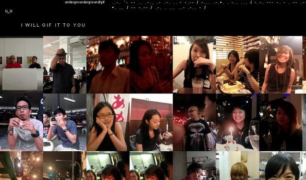
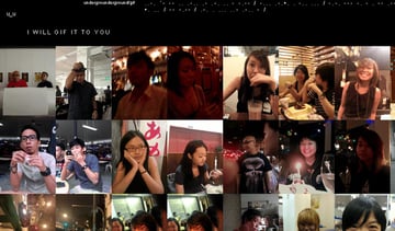
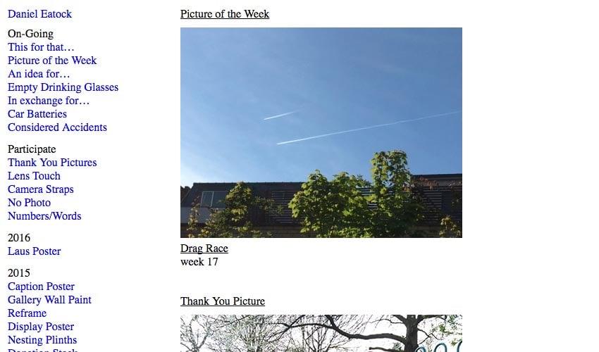
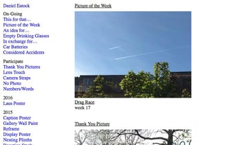
Brutal Images
Don’t panic, these aren’t actually brutal images, more like images which hark back to an era before Instagram and SnapChat filters.


“I wouldn't call it Brutalist, I would just call it normal” – Laurel Schwulst
Brutal Language
I suppose crude content counts too, right?


Brutal Ending
Right, we’re done here.


