

Math is everywhere, even where you wouldn’t expect it. You can find mathematical ratios and constants in architecture, but also in the instruments we use to make music. You can find math in certain games we play, and therefore it should not surprise you that mathematics plays an important role in web design too. But what is this role? And how can we use these ratios, constants, and theories to make our web designs more beautiful?
Math is Everywhere
Walt Disney once made a film about Donald Duck in Mathmagicland. In this video – available on YouTube – they introduce children to mathematics and what it’s used for. It shows that a mathematical ratio is used to define the notes on our instruments, and that a mathematical rectangle can be found in both ancient and modern architecture. Also, we can find this exact same rectangle in some Renaissance art by, for example, the famous Leonardo Da Vinci.

The general lesson is simple: you can use some basic mathematical principles to design order and beauty in your own creations.
A Little History
In ancient Greece there was an elite group of mathematicians who called themselves the Pythagoreans. The Pythagoreans had the pentagram as their emblem. They chose this shape because of its mathematical perfection: The linear shape of the pentagram already contains the golden ratio three times already! Also, there are tons of golden rectangles hidden inside the shape as well, these are the same golden rectangles that are present in the Mona Lisa.
Rabbit Breeding
A while after that, in the 12th and 13th century, lived a talented Italian mathematician. His name was Leonardo Pisano Bigollo, although you might know him better as Fibonacci. For his book Liber Aci, he observed the natural breeding of rabbits. In this ideal world of him, where no rabbit would ever die and every individual rabbit would start reproducing as soon as possible, he found out this cycle contained a special sequence of numbers. This sequence later became known as the Fibonacci Numbers.

The thing that’s so special about this sequence is that if you divide a chosen number with the number prior in the sequence, you will (approximately) get the same number, every time. This number is approximately 1.618, better known as Phi. The further you go in the sequence, the closer the result of the division comes to Phi. Fibonacci also found out that this sequence is not only found in the breeding of rabbits, but also in other things in nature, such as the arrangement of seeds in a sunflower.
The Golden Ratio
As you might already know, Phi is also a very prominent constant in design; This is because a ratio of 1 to 1.618 is better known as the Golden Ratio – often referred to as the Golden Section, Golden Mean or the Divine Ratio. If you create a rectangle according to this ratio, you get a shape known as the Golden Rectangle.

The Golden Rectangle, shown here, shows how you can divide it upon itself infinitely (and perfectly).
The Golden Ratio and the Golden Rectangle is used in many forms of art and design. In the Renaissance period, many artists proportioned their artworks according to this ratio and rectangle. In ancient Greece, architects used this rectangle in the design of the buildings; the Parthenon is a good example of this. Even in modern architecture, the golden rectangle has a strong presence.
But what is it that makes this ratio so special? Because this number, Phi, finds its origins in nature, we humans automatically find ourselves comfortable with this ratio. Because we are so acquainted to this ratio, it naturally triggers a feeling of balance and harmony. For that reason, using this ratio can guarantee you a balanced composition of your elements.
Examples of The Golden Ratio in Web Design
Before we even start thinking about applying the ratio to our designs, we must first look at a few examples that use the ratio already.
One good example is this website, as its design houses multiple cases of the ratio. In the image below, you can see a screenshot of this website. As you can see, I’ve used two colours to mark the different columns. The width of the main column with the blog posts in it is more or less 1.618 times as big as the sidebar with the ads. A quick calculation on the bottom proves this.

But not only does this website use the golden ratio on its total width, it’s also applied to some of the smaller parts of the website.
Let’s take a quick look the main column, and then the content inside. As you can see below, the containing element is about 1.618 times as big as the content that’s to be read inside this element.

Another good example is the famous Smashing Magazine blog. Its main column has a total width of just over 700 pixels. When you divide this number by 1.618, about 435 is the result: The exact width of the sidebar.

How to Apply this Ratio to Your Next Design
The canvas of a painting and the width of a building all have a fixed width, the monitors that display our work vary in size. Therefore – and especially in fluid designs – there’s an extra variable that should be taken in consideration when calculating the golden ratio.
However, there is an easy way to overcome this problem. When you want to calculate the width of an element according to the ratio, you just need to take the width of its parent-element, so the containing element. In our first and last example, this was the complete width of a website. In the second example, this was just the width of a smaller part: their main column.
Anyhow, when you’ve determined the width of the containing element, you should now divide this value by Phi. The result will give you the width of the main element. Now, all that’s left to do is to subtract the result from the main element from your original width, this will give you the width of the secondary column.
If you have any trouble remembering Phi, or when you’re just lazy to fill in some numbers on a calculator, I suggest using Phiculator. This little application requires you to fill in a value (the width of the containing element that is) and it automatically calculates the corresponding width. You can even ask it to calculate with integers, so you don’t have to worry about decimal numbers either.
The Rule of Thirds
Another famous mathematical division is the rule of thirds. This rule can help you create a balanced composition by dividing your canvas in nine equal parts. The rule is a little similar to the Golden Ratio, as the division by 0.62 is closely similar to 0.67 – which equals to two-thirds.
Photography
A form of art where the rule of thirds is used very often is in Photography as it’s an easy and quick guide to get you a good composition. This is why you’re likely to find a function on your digital camera that divides its LCD screen in nine parts, using the rule of thirds. Even some dSLR’s have this function, as they plant a few light dots in the viewfinder when focusing.
How Does it Work?
Using the rule of thirds, you will divide your canvas horizontally and vertically in by three. This division gives you nine equal rectangles, four lines and four intersection-points. You can create an interesting and balanced composition by using these lines and points of intersection.
The key in a good composition, obviously, lies in positioning your elements correctly. When using the rule of thirds, there are two things you can position with.
The first are the lines used to divide the canvas. In photography, things with a long and straight shape are often aligned to these lines. In design, things with this same shape – such as a sidebar – can be aligned to these lines as well.
The second things to align to are the points where your dividing lines intersect. You will need to put one or two objects on these points, because too much will still kill your composition.
A good example of this I found on Photography-website Flickr. As you can see below, the photographer aligned the row of buildings with the top line, and on the upper-right intersection point, you will find a house that stands out the most because of its colour. Because it’s a focal point by itself already, aligning it with the intersection point adds to a good composition and a balanced feel.
 flickr photograph found here
We’ve seen the rule of thirds applied to photography, but how about applying it to website design, can we find examples of that?
The Rule of Thirds in Web Design
A good example of the rule being applied to web design is, again, this website. I’ve prepared an image that you can see below. It shows that, on the right, the sidebar is aligned very closely to the vertical line on the right. On the left, you can see that the articles are positioned on the intersecting points.
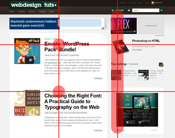
The two alignments you see above create a feeling of harmony in the layout of this website.
Applying the Rule of Thirds to Your Next Design
So how exactly can the rule of thirds be applied to your site’s design? Again, the varying width of our ‘canvas’ can bring some trouble. When we use the same technique as we did with the golden ratio, though, we’ll be fine.
To apply the division, you must take the full width of your containing element and divide it by three. You then have to draw a line – or a guide, whatever suits you best – two times on the value you get as a result (multiply them by two to get the position of the second line).
The second part of the division can give you some problems, though. The height of our ‘canvas’ is also variable, therefore dividing this variable by three will give us some trouble. The way I use to work around this, is to calculate the ‘height’ of the division with a 16:9 (widescreen) ratio or just use the height of the containing element. Divide the width of the containing element by 16 and multiply that number with 9 and you’ve got yourself a height. You can now divide this number by 3 again, and draw the lines/guides.
When you’ve got the guides set up, you can now position your elements according to these guides. Align your elements with the lines, and you must put some elements of interest and contrast on the points of intersection.
Grid Systems
You might not think of grids as being mathematical, but they are. You are dividing your canvas in different columns and gutters, this division by two, three – and I’ve seen up to sixteen – is really mathematical.
A lot of people argue that grid systems limit your creativity, because you’re limiting your freedom with a grid system. I don’t think this is true, as book called Vormator taught me that limitations actually boost your creativity. This is because you will think of solutions with these limits in mind, whereas these ideas would never have been thought of if you don’t have these restrictions.
The reason grid systems ‘work’ is that they can guide you in sizing, positioning and aligning your website design. They can help you in organizing and removing clutter from content. But most importantly, they’re easy to use.
Another good reason to use grids is that rules are meant to be broken, aren’t they? If you ‘break’ your grid once in a while, it’s not bad. On the contrary! ‘Breaking’ your grid can create special interest for a specific element on the page, because it’s in contrast with the rest. This can help you achieve certain goals, like a call to action that stands out more because of this.
How to Create a Good Grid
There is no real set way to construct a good grid system, as they revolve around content and no content is really the same. But for the sake of it, I’ll demonstrate a simple process in how to construct a 6-column grid in a 960-pixel wide environment.
First, we will divide our total canvas width by 6 so we have the total width of each column. The result of this division is 160 pixels, as you can see below in the image.

Secondly, we’ll create an image of one column, we’ll duplicate this later. This way it’s easier to create our complete grid afterwards, as we don’t have to repeat this step for each column.
We’ll decide on the size of our gutter, I think 20 pixels will suffice. The gutter should be added to both sides of the column, so we must divide it by two. If we don’t do this, our gutter will be 40 pixels wide. As you can see in the image below, we’ve added a 10-pixel gutter on each side.

Now we can duplicate this image until we reach the total of 960 pixels again, and we’ve created ourselves a (basic) grid.
I'm Lazy!
Don’t worry; even if you’re lazy you won’t have to live without grids. There are lots of nice – and free – grid systems up for grabs on the internet. My favourite, and I’m sure you’ve heard about it before, is the famous 960.gs grid system, which has a CSS-framework and a PSD-file with all the guides installed.

Conclusion
I hope I’ve shown you that mathematics can be beautiful when applied to design, and that I’ve given you enough techniques to use in your next design. Be warned though, lots of other things are required to make a design a success, and therefore using these tricks is no guarantee for a good design, but they can sure help you and guide you in the process of making one.
Thanks for reading!
 By
By


