
Windows 8’s touch screen interface and hidden navigational structure allow for some interesting paradigm shifts in User Experience practice.
I have recently been working on re-purposing an enterprise level medical software for Windows 8.1. It’s been a jump in the deep end, but I’ve walked away with some pretty interesting insights.

This post will broadly look at search, navigation and layout patterns common to native Windows 8 apps. I will select some of my favorite aspects of each, some innovations made and my approach. There’ll also be some takeaways for your own projects, applicable to any User Interface.
Search
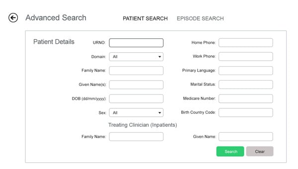
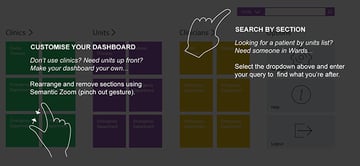
Prior to Windows 8.1, apps used the Search charm to provide in-app search—the charm bar is accessed by swiping your screen on the left (inwards)–it is now recommended that the search charm is used for global searches. In app search being on the page, as seen below:

My Approach
A good rule of thumb, from a UX point of view, is to think about the importance of the feature. We did some user sessions after some initial prototypes and found that clinicians relied heavily on doing searches.
Innovations Made
In the example, the drop down icon is used to distinguish the label from a button. The user can select a different section that is of interest to them to help narrow down the result.
UI Takeaway
Who are you building the digital product for? Is the search critical, or an afterthought? Consider putting key features only in the UI (including in-app search if this is key to the UX).
Navigation
I’m not going to give you the whole run-down of Windows 8 navigation. One specific example comes to mind though: Semantic Zoom. Probably the least known, but very powerful, it gives you the opportunity to represent data in another context.

My Approach
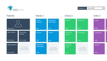
On the ‘landing page’ there are many tiles, sliced and diced, to access different things, including tiles which remember previous user selections. Our Users came from many different clinical backgrounds, so we needed to cater to those groups through customization.
Innovations Made
Semantic zoom here not only gives a high level view of all options, but gives the user the ability to turn off sections they never use, and reorganize elements based on importance. In our project, there were different fragments in our user base that made customization critical.
UI Takeaway
If there are are more than a couple of primary users consider making your user interface custom. Ask your developer about the technical constraints and possibilities. A collaborative team is much more effective than one person ‘designing’ an application.
Layout
Layout has plenty of out of the box options available. The content and structure of the app will determine which you will use.
My Approach
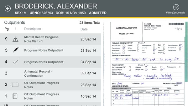
In the example above, you can see the template I selected was a good fit for the document selection functionality. The app is effectively a document reader, so it made sense.


Innovations Made
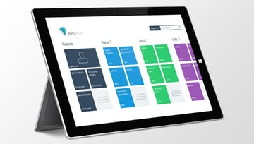
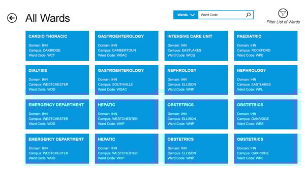
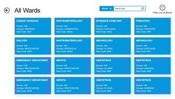
This patient list page used a different layout, one more suitable for panning and selecting tile elements. The fact that layouts for critical parts of the user flow are significantly different, yet consistent, is a great way finding technique, especially because there are no breadcrumb navigational elements available.
UI Takeaway
Content is at the heart of the experience, a large content-driven application will generally have a hierarchical structure, so a lot of the information at the beginning will be high level, and as the user progresses it gets more detailed.
Windows 8 content flows edge to edge and includes panning. In my experience, this can make stakeholders used to old paradigms uncomfortable, but it’s simply a way to reduce the amount of noise on the page and let the user explore using touch gestures.
Conclusion
Windows 8 is a unique User Interface platform that has unique capabilities and benefits for users that require touch and mobility.
It has a well structured navigation that promotes discovery and assists even beginner designers with clues about information architecture and what should be included on and off page.
The grids, templates and layouts available have been put together by UX experts.
However, there will always be some customisation, and the evolving framework continues to improve, such as including basic search on page.
In my opinion, many of the ideas in this post should be useful not just in Windows 8.1 app design, but more broadly. This article just touched the surface of windows 8.1 app design patterns. Have you had a chance to look at any others not mentioned in this post? What are your thoughts?
 By
By


