

Let’s look at three common mistakes and pitfalls when designing icons, and ways to avoid them!
Pitfall 1: Icon is Too Complex
An icon may be designed to represent a complex topic but it should avoid being overly complex itself. Complexity affects scalability and can lead to it being unrecognizable. An effective icon is meant to be recognizable and unique at a glance, at whatever scale.
Take a look at this simplified “Lightly” icon; it scales more effectively and still conveys the same concept.
Solution: Use simple, unique shapes that best convey the concept without any superfluous details. Get to know the scalability requirements for your icon and design for your constraints. Simple and distinctive icons can be highly effective.
Pitfall 2: Icon is Designed in a Silo
If your icons look like they wouldn't fit together visually side by side, you may have been designing the icons in a silo. Icons for a digital product should fit in with the overall visual strategy to look and feel like a family. This is a common pitfall that can happen if newer icons are designed over time and by different designers.
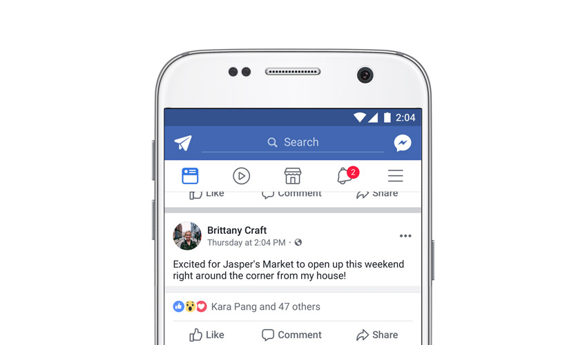
Facebook’s latest mobile icon set has a cohesive look due to the use of rounded shapes and simple line styles.
Solution: Design icons as part of a set. Use common perspective, line weights, color choices and styling to ensure a cohesive feel. Approach the icon design by focusing on the context where it will live.
Pitfall 3: Icon is Designed From Scratch
Icon libraries exist for a reason. Use references to get a sense of what visual metaphors exist for your concept, and don’t make assumptions about what works for an icon before gauging the existing landscape. An icon designed from scratch may be confusing to users from differing cultures and backgrounds.
“Settings” icons are typically depicted by a gear, but that’s not always the case.


Solution: Utilize existing icon libraries to start brainstorming your icon concept. Be aware of any potential differences or alternative meanings of symbols across cultures as well as consistency with shapes used for common icons.
Learn More About Icon Design


 By
By


