
It's time to pick up our Skeleton layout once more, this time to approach layouts larger than the standard 960px width. Skeleton throws a few curve balls our way when it comes to extending the framework - let's take a look at those difficulties and see what we can do to get around them.
Widescreen
Alternatively, Download the video, or subscribe to Webdesigntuts+ screencasts via iTunes or YouTube!
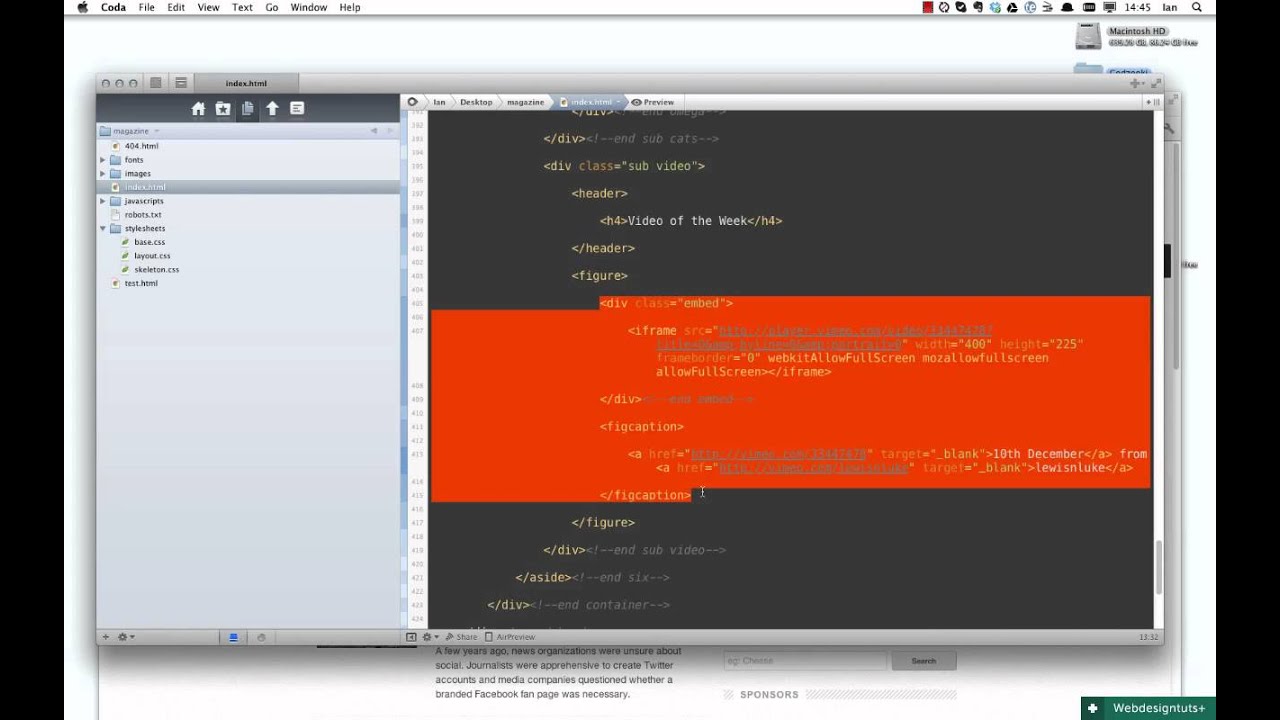
Extending Skeleton
During my experiments I came up with a couple of things. If you're interested, here are the recalculated columns for a 1280px container:
1 |
/* #Additional - Large Screens beyond 1280px
|
2 |
================================================== */
|
3 |
|
4 |
/* Note: Design for a width of 1280px */
|
5 |
|
6 |
@media only screen and (min-width: 1280px) { |
7 |
.container { width: 1280px; } |
8 |
.container .column, |
9 |
.container .columns { margin-left: 10px; margin-right: 10px; } |
10 |
.column.alpha, .columns.alpha { margin-left: 0; margin-right: 10px; } |
11 |
.column.omega, .columns.omega { margin-right: 0; margin-left: 10px; } |
12 |
.alpha.omega { margin-left: 0; margin-right: 0; } |
13 |
|
14 |
.container .one.column, |
15 |
.container .one.columns { width: 60px; } |
16 |
.container .two.columns { width: 140px; } |
17 |
.container .three.columns { width: 220px; } |
18 |
.container .four.columns { width: 300px; } |
19 |
.container .five.columns { width: 380px; } |
20 |
.container .six.columns { width: 460px; } |
21 |
.container .seven.columns { width: 540px; } |
22 |
.container .eight.columns { width: 620px; } |
23 |
.container .nine.columns { width: 700px; } |
24 |
.container .ten.columns { width: 780px; } |
25 |
.container .eleven.columns { width: 860px; } |
26 |
.container .twelve.columns { width: 940px; } |
27 |
.container .thirteen.columns { width: 1020px; } |
28 |
.container .fourteen.columns { width: 1100px; } |
29 |
.container .fifteen.columns { width: 1180px; } |
30 |
.container .sixteen.columns { width: 1260px; } |
31 |
|
32 |
.container .one-third.column { width: 406px; } |
33 |
.container .two-thirds.column { width: 822px; } |
34 |
|
35 |
/* Offsets */
|
36 |
.container .offset-by-one { padding-left: 80px; } |
37 |
.container .offset-by-two { padding-left: 160px; } |
38 |
.container .offset-by-three { padding-left: 240px; } |
39 |
.container .offset-by-four { padding-left: 320px; } |
40 |
.container .offset-by-five { padding-left: 400px; } |
41 |
.container .offset-by-six { padding-left: 480px; } |
42 |
.container .offset-by-seven { padding-left: 560px; } |
43 |
.container .offset-by-eight { padding-left: 640px; } |
44 |
.container .offset-by-nine { padding-left: 720px; } |
45 |
.container .offset-by-ten { padding-left: 800px; } |
46 |
.container .offset-by-eleven { padding-left: 880px; } |
47 |
.container .offset-by-twelve { padding-left: 960px; } |
48 |
.container .offset-by-thirteen { padding-left: 1040px; } |
49 |
.container .offset-by-fourteen { padding-left: 1120px; } |
50 |
.container .offset-by-fifteen { padding-left: 1200px; } |
51 |
}
|
Also, here are the column widths recalculated as percentages. That's right, a fluid Skeleton! Be aware that nesting columns will not work in this case..
1 |
/* #Additional - Flexible Column Widths
|
2 |
================================================== */
|
3 |
|
4 |
.container { width: 90%; } /*whatever you want - can even be fixed if you prefer*/ |
5 |
.container .column, |
6 |
.container .columns { margin-left: 0.78125%; margin-right: 0.78125%; } |
7 |
|
8 |
.container .one.column, |
9 |
.container .one.columns { width: 4.6875%; } |
10 |
.container .two.columns { width: 10.9375%; } |
11 |
.container .three.columns { width: 17.1875%; } |
12 |
.container .four.columns { width: 23.4375%; } |
13 |
.container .five.columns { width: 29.6875%; } |
14 |
.container .six.columns { width: 35.9375%; } |
15 |
.container .seven.columns { width: 42.1875%; } |
16 |
.container .eight.columns { width: 48.4375%; } |
17 |
.container .nine.columns { width: 54.6875%; } |
18 |
.container .ten.columns { width: 60.9375%; } |
19 |
.container .eleven.columns { width: 67.1875%; } |
20 |
.container .twelve.columns { width: 73.4375%; } |
21 |
.container .thirteen.columns { width: 79.6875%; } |
22 |
.container .fourteen.columns { width: 85.9375%; } |
23 |
.container .fifteen.columns { width: 92.1875%; } |
24 |
.container .sixteen.columns { width: 98.4375%; } |
25 |
|
26 |
.container .one-third.column { width: 31.7708%; } |
27 |
.container .two-thirds.column { width: 65.1041%; } |
28 |
|
29 |
/* Offsets */
|
30 |
.container .offset-by-one { padding-left: 6.25%; } |
31 |
.container .offset-by-two { padding-left: 12.5%; } |
32 |
.container .offset-by-three { padding-left: 18.75%; } |
33 |
.container .offset-by-four { padding-left: 25%; } |
34 |
.container .offset-by-five { padding-left: 31.25%; } |
35 |
.container .offset-by-six { padding-left: 37.5%; } |
36 |
.container .offset-by-seven { padding-left: 43.75%; } |
37 |
.container .offset-by-eight { padding-left: 50%; } |
38 |
.container .offset-by-nine { padding-left: 56.25%; } |
39 |
.container .offset-by-ten { padding-left: 62.5%; } |
40 |
.container .offset-by-eleven { padding-left: 68.75%; } |
41 |
.container .offset-by-twelve { padding-left: 75%; } |
42 |
.container .offset-by-thirteen { padding-left: 81.25%; } |
43 |
.container .offset-by-fourteen { padding-left: 87.5%; } |
44 |
.container .offset-by-fifteen { padding-left: 93.75%; } |
Additional Resources
Some useful links to further build on what's been covered in this video.
- Skeleton Boilerplate and Documentation
- Life Beyond 960px: Designing for Large Screens
- Putting media queries in their place by Paul Boag
- The brilliant Apache by oneedo
- Off Canvas Multi-Device Layouts by Luke Wroblewski
 By
By


