

- Overview
- Transcript
2.6 Style the Layouts Properly
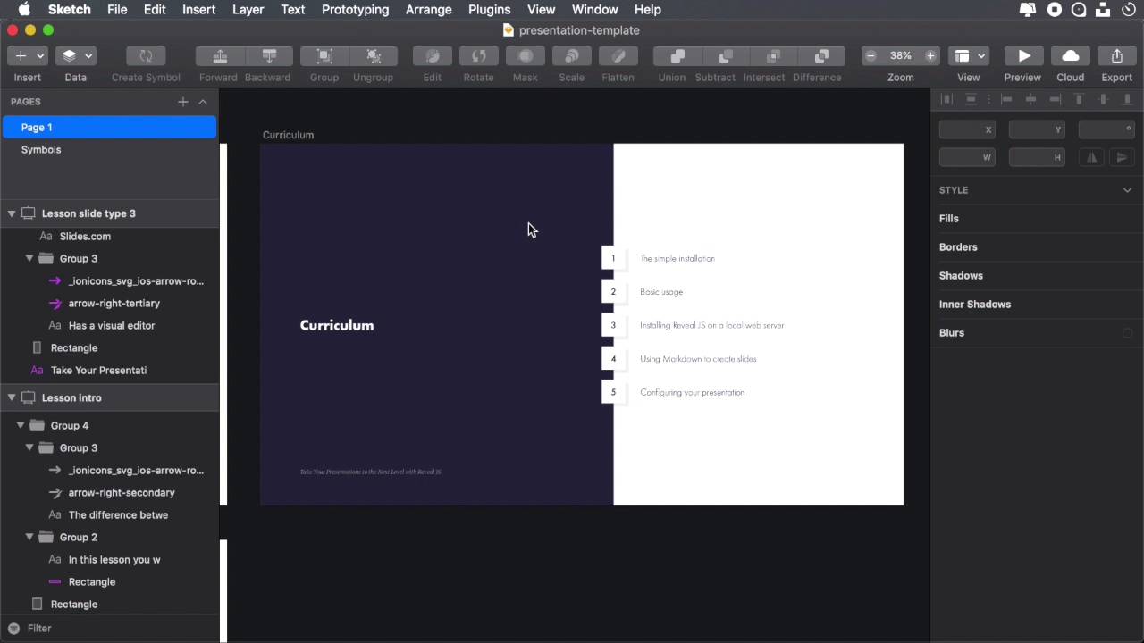
Now that we’ve set some proper scaling and applied flex positioning to the right elements, let’s go through each slide and make sure everything is positioned properly.
1.Introduction
1.1Welcome to the Course00:52
2.Creating Custom Themes for Reveal.js
2.1Installing Reveal.js and Creating a Custom Theme File05:18
2.2A Quick Look at the Theme We’ll Build04:00
2.3Set the Typography06:01
2.4Set the Colours04:18
2.5Set a Custom Scaling and Position the Footer08:16
2.6Style the Layouts Properly07:04
2.7Finishing Touches26:13
2.6 Style the Layouts Properly
All right, now that we've set the proper scaling and applied flux positioning to the right element, let's go ahead, let's go through each slide and make sure that all the elements are properly positioned. Now, we're not talking about the final adjustments, those will come in the next lesson. For now, we're just worried about positioning. So if we have two columns side by side, we gotta make sure, are these positioned properly? If not, let's go ahead and do that. So we'll start here, first slide. Positioning-wise, these are good to go. They're all in the center, exactly what we need. Move on. Next we have this, curriculum. Now here, the title, and let's actually compare this with the sketch file. The title is here to the left, and we have this dark background and the curriculum, the list, is on the right side so we have a two column layout here. Now, back in html, I am achieving that with a class of columns on the section and then a class of column applied to the left side and also the right side. So let's go ahead and style these. First, we'll go into the section and we'll make sure that, the sections with a class of columns have padding zero. I only wanna apply the padding to the standalone layouts. The one that just have a simple content right from the middle okay? So then inside the section element, we'll do this. Add columns, we'll set flex direction, to row. And by doing that, I make sure that when I have columns, all right, the elements are positioned correctly. So here's the left column, here's the right column. The same goes for all the other slides as well. You can see they're now positioned correctly. All right? Left column, right column. Okay, cool. What else? Let's see, I'm actually going to create a separate section here for columns or for actually the column element. So column. Okay, by default, yeah, we're gonna set the display to flex because the column itself sits on a flex container but I want it also to be a flex container to properly position the elements inside it. So display flex, by default I'm going to have the flex direction set to column because I want content going vertically. And then I'm gonna center align that content, so justify content center. And also because we switched the flex trajection around, let's do align items flex start, so they're positioned to the left, they're aligned to the left. By default, let's add a width of 45% to the column and also a lateral padding of five rands. Now if we take a look in our sketch file, you'll see that this first column Is larger than the second column, so the column on the left is larger than the column on the right. So to achieve that, I'm basically going to target the first child, the first column, and set a width of 55% instead, okay? So a normal column is 45% and the very first one is 55%. So with that, let's have another look. Now the content is properly positioned inside the columns, so you can see it's aligned to the left, and also positioned vertically in the middle. Same goes for this, yeah, same goes for this, and all the other slides as well, cool. Now let's see what else we have to do here to position the items properly. Okay, this looks all right. There are some slides where I would like the content to be aligned at the top, not in the middle okay? And actually have some written down here, for example the first slide, the intro slide, has a class of the align tops. So I want to align this content to the top, just to leave more room, and we're also using this align top class on lesson slide type 2, the one with the markdown support, which is this one, so let's go ahead and style that as well. So we'll go back our section, and I'm gonna add a new class here, align top. Now from here, I'm just going to say justify-content, flex-start, instead of center, which will align it to the top. Let's also do a padding-top of 3rems. And that should do the trick. I can see now, in those particular slides, my content is now aligned to the top. Let's see another example, here is in the middle, middle, middle, and here's at the top. So this is a good example because I want to have as much space as possible here for the source code. Maybe I have a longer source code that I wanna showcase. So, I'm gonna align this to the top. This is also in the middle. Middle, middle, and this is also at the top, cool. So let's go through these one more time, make sure we didn't miss anything in terms of positioning. And everything seems to be in order. All right, so now come the fun part. We laid out the foundation for our theme by taking care of the aspects that were repeating themselves like typographic colors, layout positioning. Once all of that is done, all that's left to do is work on the details to complete our theme. And we'll do that in the next lesson. It's gonna be a slightly longer lesson because we're all gonna do this in one but I'm confident that we can do it. So coming up in the next lesson, we're gonna do the finishing touches. See you there.


