

- Overview
- Transcript
2.1 The Problem With Media Queries
In this lesson, we’re discussing a problem you might encounter when using media queries to make certain components responsive. Let’s begin.
Related Links
1.Introduction
1.1Welcome to the Course03:04
2.CSS Container Queries
2.1The Problem With Media Queries04:23
2.2Container Queries to the Rescue10:20
2.3Exploring a More Complex Example17:34
2.1 The Problem With Media Queries
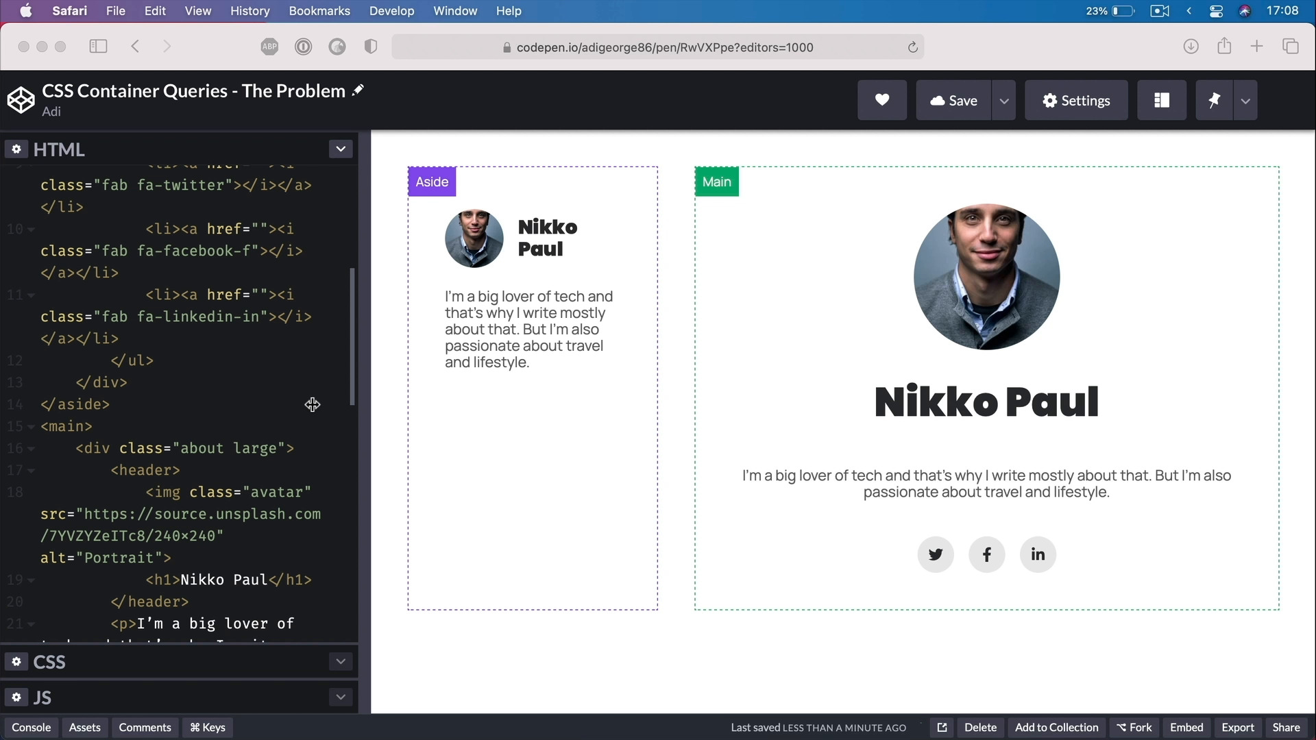
Welcome back to the course. In this lesson we're discussing a problem you might encounter when trying to make certain components responsive by using media queries. Let's begin. Alright, so I'm in code pen and I made a quick demo to show you what I mean. Let's assume that I have a typical blog layout with a sidebar and a main area and I want to display this. Let's call it widget or element, with the autobiography in both places. I want the components in the side bar, to look like this. And I want the one in the main window, or in the main area, to look like this, alright. I just made a quick sketch in Figma. So big difference right? Where I have more space, like the main area here I wanna use this version of the component. When I have less space, I wanna use this version, right? Because it works better on or in areas with smaller widths. So how do I do that? Well, the easiest thing to do would be to create two versions of this in CSS by using a class. And I did just that, I created a class of large. That I'm gonna apply to the second element. So it's all good so far, right? But, how do I show this larger version only when there's enough room for it? Because right now, if I'm gonna resize this viewport I'm still getting the big version? Well, the answer to that would be media queries, right? But how do I do this with media queries? Because with media queries, I can just remove a class from an element unless there's some JavaScript involved. But that's over complicating things. I could like get rid of this second class approach and just write a media query where I target the actual elements and I change them, but that's gonna change both elements. And then you might say okay, but you can target just the elements in the aside or in the main, correct. Let's say I do target the element in the main, but that won't solve my problem. Because, I might have a certain screen sizes, where the viewport or the media query is gonna kick in and it's gonna show me either the small or the large version. But maybe in some situations, I want to show the large version even on smaller screens when there is room. How do I do that? That's really the problem because when you're using media queries you just tie it to the viewport width. What if I want my component to change its style based on the size or in this case the width of its parent element. Wouldn't that be much better and much easier to manage? In our case exactly, I have the exact same element in both places. But how can I make the same element to be displayed differently on the side, which is much smaller in size or on the main which is much bigger in size? Currently, we can't really do that with media queries, or maybe we can, but it's gonna take a lot of effort. Well, the answer to this problem is with CSS Container Queries. Alright, so that's the problem, basically. And media queries don't really help us right here. But container queries can help us. And in fact, they solve the problem entirely. Let me show you how you can solve the problem using container queries in the next lesson. I'll see you there.


