Google Material Design: Updates, Improvements, and New Tools
Let’s talk about what’s new, what’s changed, and what’s been improved in Google’s newest Material Design.
Watch the Screencast

What is Google Material Design?
Material Design is a visual design language, first developed by Google back in 2014. It grew from a need to have more consistency between Google products, cross-platform. In time, it evolved, was released as open source, and its ideas continue to grow thanks to a huge number of collaborators.


Earlier this year, at Google’s 2018 I/O developer conference, they announced an updated version of Material Design. According to the team behind it, Material is now:
“an adaptable design system–backed by open-source code–that helps teams build high-quality, digital experiences”
Material Design is no longer just a design language. It’s evolving into a set of tools intended to improve the design and development workflow. Let’s begin by looking at “Material Theming”.
Introducing Material Theming
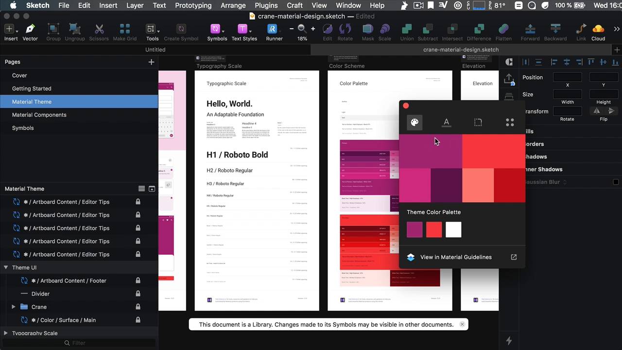
“Material Theme Editor” is a plugin for Sketch and gives you (assuming you’re a Sketch, and therefore Mac OS user) complete control over colors, typography, components, and more. To download it, head over to the Material site and hit the prominent button. Double-click the package to install, then in Sketch you can access it via Plugins > Material > Open Theme Editor..
Click Create New Theme in the dialog which pops up, after which you can choose from a selection of predefined themes, and hit Save.


Saving takes a moment, because Sketch essentially creates a new document for you, populating it with the Material Design assets and components, all neatly arranged into pages, symbols, styles, and swatches.


Collaborate and Share With “Gallery”
Gallery is another new Material feature, allowing you to share and collaborate on your designs. This is an online platform which you can access by visiting https://gallery.io. Sign in using your Google account:


To add projects to your Gallery, go back to Sketch and navigate to Plugins > Material > Upload to Gallery.. You’re prompted to select a project or add a new one, the same goes for the collection you want to add it to. That’s it! Your project is now available to share with others. Collaborators can leave comments, and even inspect elements within your designs, giving them access to dimensions and details without needing Sketch themselves.
Users will also be given a reference to the docs for the component they’re inspecting–now that’s useful!


Easy Designing With Material’s Color Tool
The Color Tool is Material Design’s offering to help you experiment with color combinations and palettes in an intuitive environment. Visit https://material.io/tools/color/ to access it.


Click your way around the UI to define a primary color, a secondary color, and additional details such as text on your primary color, and text on your secondary. The previews give you real-time updates to show you what it looks like.
There’s also an Accessibility tab which will warn you of any color combinations which don’t meet the recommended legibility guidelines.
When you’re happy with your color combination you can export to Android, iOS, or the web (in the form of a CodePen):


Brand New Components
A full list of all the new components which Material has on offer is available on the website, but here are a couple which I consider particularly interesting:
Bottom App Bars
These are used for displaying navigation and key actions, at the bottom of mobile screens.


Backdrops
Backdrops are for components which appear behind other surfaces–useful for displaying contextual content.


Banners
Then we have banners. These are new components which display messages and related actions.


Image Lists
Image lists are also a new addition, though they were formerly known as the slightly less versatile “grid lists”.


Text Fields
Finally, we have text fields. Not new exactly, but a replacement for the previous generation, and now available in both filled and outlined flavors.


Conclusion
Well there we have it; a quick overview of what’s new in the latest iteration of Google’s Material Design. It hardly needs saying, but there’s much more to learn and take onboard, so go and take a look, dive deep, and let us know what strikes you most about what’s new.
Useful Links
-
material.io
- Getting to Know Material Design course on Tuts+


