
.jpg)
A responsive website must consider a range of screens and devices, including computers, tablets and smartphones. Today we’ll look at some tips and tricks to create a responsive design in Figma.


It might sound like a lot to consider, but the truth is the software makes it pretty easy for designers to make a Figma responsive prototype.
This is a great tool to present clients how their design will be adapted to different screens. It helps us designers understand our general structure and all the elements we need to consider for our design to work in multiple devices.
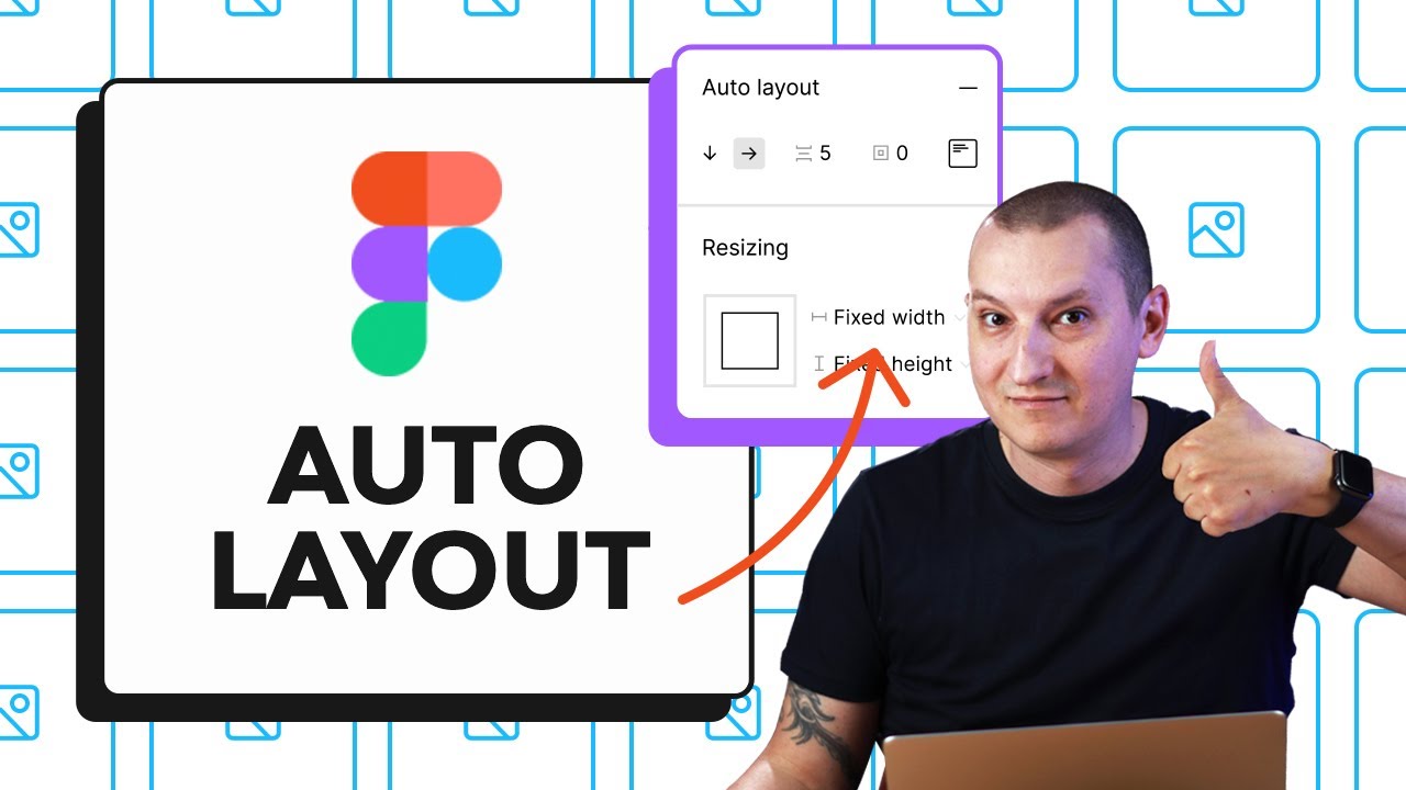
Learn Figma Auto Layout in 30 Minutes
Figma’s Auto Layout feature let’s you group elements to align them, as well as add spacing between and padding around those elements. An absolute time saver and task optimization ally for UI and UX design!
To become an Auto Layout expert, follow Adi Purdila in this video tutorial from our Envato Tuts+ YouTube channel:
Before we get started, you might also want to go through the basics with our amazing FREE course on Web Design for Beginners.
How to Use Figma for Responsive Web Design
In this tutorial we’ll learn how to make a Figma responsive web design using Constraints and Auto Layout.
To walk you through the process, I’ll be working Upec Portfolio Figma Template from Envato Elements.


1. The Basics of Responsive Web Design
Before we even start thinking about design and layouts, it’s important we cover the basics of responsive web design. Here are some things to consider to create a Figma responsive design:
- Think about user experience and interaction to make it as easy as possible for users to navigate from any device.
- Consider content hierarchy for each kind of device, so users find what they look for in less time.
- Having flexible images is key to make sure users are looking at exactly what we want to show them. Think about how the image will scale when the screen is adjusted.
- Always adjust navigation to the screen space available. For example, mobile versions don’t need to display the entire menu on screen. Instead, use a hamburger menu.
2. How to Make Design Elements Responsive
We’ll start with the desktop version of our landing page design. This format allows us to display all the elements we need to consider for our main navigation. In this case, I adjusted the template to my own design needs.


Try to adjust the width of your Frame and notice how everything moves around. In responsive design elements should distribute in a coherent way. That’s what we want to fix with this tutorial.


Step 1: Add Constraints to Your Navigation Bar
Let’s start out by setting Constraints to our navigation bar. We want all of our elements to stay in position even when the screen shrinks or expands.
Start by ungrouping all elements of your navigation bar. Select your logo and on the right side menu go to Constraints. Make sure your constraints are set to Top and Left.
Now let’s do the same with the menu in the middle. We want to set the constraints to Center and Top.


Lastly, we’ll do the same to our Sign up button. Select it and set the constraints to Top and Right.


Now test it out! Adjust your Frame width and you’ll notice everything stays in place.
Step 2: Add Constraints to Your Background
If you have background colors or images you want to set up constraints for those too.
In this case, we have a background bar behind our menu. We want it to expand as contract with all our menu elements. Select it and set the constraints to Left and Right. It should look something like this:


Step 3: Add Constraints and Auto Layout to Your Hero Section
Now, we want out hero section to adjust and that elements fit together, respecting distances and scales. We’ll use the hero section as an example on how to do that.
First, let’s ungroup our hero content so we can manipulate elements individually. Now, select the subtext, heading and buttons. Then press Shift + A to activate Auto Layout feature and keep the spacing between them as the screen adjusts.


I renamed the layer to “hero content” and set the resizing property to Fixed width.


This way we can set up our constraints to Scale and Top.


We’re almost there. To make this section fully we need to set up the title to adjust. So let’s double click the heading to select it. Now, set up the horizontal resizing property to Fill container.


Now test it out by adjusting your Frame to verify that it works.
Step 4: Add Constraints to Image
This is the last step so we have fully responsive design in Figma. Let’s set up the images to adjust with our screen format.
First, make sure the images are ungrouped. Then, select them all and set up Constraints to Scale and Top.


Make sure your images are set up to “Fill” so that they don’t stretch when you adjust the screen size.


Test it to verify it works. Move the corners of your Frame to see how your Figma responsive prototype works!
3. Adjust For Tablet and Mobile
Now we have a functional a Figma responsive prototype for our desktop version. Let’s move on to tablet and mobile.
Start by duplicating our Frame pressing Command + D. Rename the Frame to “Tablet” and adjust the width to 820 px so we can adjust our design for an iPad Air.


You’ll notice some elements are overlapping in the navigation bar. So let’s fix that.
This is the point that we as designers can optimize our UX by leaving only the necessary elements on screen, specially when navigating form a smaller device like a tablet. In this case, we’ll remove our menu and CTA and replace it for a hamburger menu icon.
Go to Resources on the top bar and search for an icon library in Plugins. I’ll be using Iconoir Icon Library.
Then, search for “menu” icons and drag the one you like to your Frame.
Adjust the icon to your design, align with your logo and set up Constraints to Right and Top.
Test your design and adjust the width of your hero content and images if necessary so they’re scaled into the screen size.
Now, let’s duplicate our tablet Frame to work on our mobile version. Press Command + D and rename the Frame to “Smartphone”. Set up the width to 390 px to simulate an iPhone 12 screen.


Most things will adapt, but you might need to adjust some elements to space between them correspond to this new format.
And that’s it! You’re all set and ready to present your Figma responsive design to your client.
Figma Website Templates on Envato Elements
The good news for designers nowadays is that we don’t have to build everything from scratch. You can get a step ahead by working with website templates to create our responsive design in Figma.
Take a look at our library with over 18K options for you to choose from!


Premium Figma templates are created with the best UX/UI design practices in mind. Save up some time and focus on your content. Try out one of the many Figma webite templates available on Envato Elements!
More Figma Resources and Tutorials
Now you know how to create a Figma responsive design to present to your clients. Check out some of our Figma tutorials and resources to get your skills to the next level:

 We Tested the Latest Figma Updates (Little Big Updates April 2023)


 15+ Best Figma Mobile App Templates


 10 Figma Templates with Geometric Designs

 21+ Best Figma eCommerce Templates
.jpg)
.jpg)
You’re All Set!
Ready to work on your next responsive design in Figma? Hope you found useful tips and tricks to apply on every Figma responsive prototype you work with. Find all the inspiration and creative resources you need on Envato Elements.
.jpg) By
By


