
In this tutorial we’ll continue building our podcast site. We’ll begin styling our index of posts, create a nice little footer and throw a bit of color into the mix. All that using Sass and the Bourbon suite.
Our Posts Index
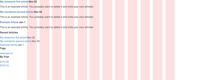
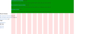
Right, where were we? At the moment our site doesn’t look too great:
Currently our posts aren’t aligned to anything other than the left side, so we’re in need of a grid to fix this mess. Our beloved Bourbon Neat to the rescue! First we’ll add a class posts as a wrapper for our posts and make it an outer-container that centers the content on the page.
In “source/index.html.erb”:
1 |
|
2 |
|
3 |
|
4 |
|
5 |
|
6 |
|
7 |
|
8 |
|
9 |
Then we need to create a new Sass partial for our index styles and apply some magic, so in “source/stylesheets/all.sass”:
1 |
|
2 |
@import 'index_posts' |
And in “source/stylesheets/_index_posts.sass”:
1 |
|
2 |
.posts
|
3 |
+outer-container |
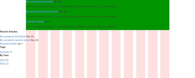
I also feel it’s a good idea to add a background color to make our outer container easily visible—for now.

Then commit to Git:
1 |
|
2 |
git add -all
|
3 |
git commit -m 'Adds Sass partial for index posts |
4 |
Centers content'
|
Recent articles, tags, and calendar stuff is in “layout.erb” and doesn’t concern us at the moment. Let’s focus instead on making this index list of posts pop. Let’s give the h2 title a class post-title and let title and paragraphs of body copy span for eight (out of twelve) columns across the page. The posts need to shift two columns over as well because we want to avoid having our copy running across the whole page and thereby exceeding a healthy line width (measure) for reading of 45-75 characters.
So in “source/index.html.erb”:
1 |
|
2 |
|
3 |
|
4 |
|
5 |
|
6 |
|
7 |
|
8 |
|
9 |
And in “source/stylesheets/_index_posts.sass”:
1 |
|
2 |
.post-title, .posts p |
3 |
+shift(2) |
4 |
+span-columns(8) |

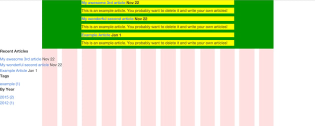

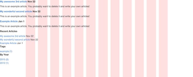
Now we’re talking. Our content is aligned and nicely centered on the page. What we’re missing is any form of visual hierarchy; our h2 titles are not much bigger than the content of our posts. To provide a better reading experience, we should make sure titles and their corresponding text have better visual contrast than that.
First, we need better text to work with, so let’s make use of a Middleman helper for dummy text. Let’s add an erb extension to our blogposts and add the following to our test posts.
Note: we need the “.erb” extension only because we want to run some ruby code between this construct ``.
In “source/posts/2012-01-01-example-article.html.markdown.erb”:
1 |
|
2 |
This is an example article. You probably want to delete it and write your own articles! |
3 |
We’ll go over the details in a moment, but first a few more styles in “source/stylesheets/_index_posts.sass”:
1 |
|
2 |
.post-title
|
3 |
font-size: 1.7em |
4 |
|
5 |
.posts p |
6 |
font-size: 1.05em |
7 |
margin-bottom: 4em |

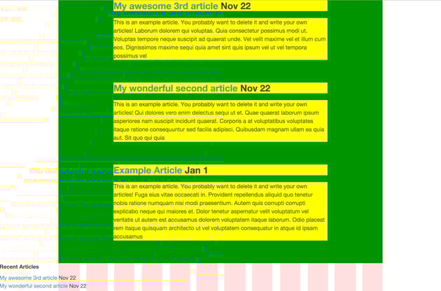
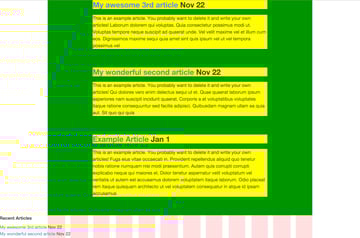
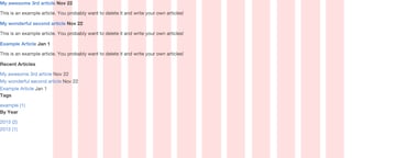
That’s a bit easier on the eyes isn’t it? We have adjusted the headers and paragraphs to a reasonable degree. A little extra margin in between posts makes all the difference. In terms of hierachy, it’s a good start.
Commit to Git:
1 |
|
2 |
git add --all
|
3 |
git commit -m 'Adjusts size for title and body text |
4 |
Adds dummy text
|
5 |
Adds .erb extension to dummy posts'
|
Footer
On with the footer. I think we should take care of the ghastly floating elements on the bottom first. Let’s pack “Recent Articles” and “Tags” in a footer and get rid of “By Year”. The relevant markup is part of the global layout in “source/layouts/layout.erb”. Find the code in the aside tag below yield and adapt it as follows. In “source/layouts/layout.erb”:
1 |
|
2 |
|
3 |
|
4 |
|
5 |
Recent Posts |
6 |
|
7 |
|
8 |
|
9 |
|
10 |
|
11 |
|
12 |
|
13 |
|
14 |
|
15 |
Tags |
16 |
|
17 |
|
18 |
|
19 |
|
20 |
</ol>
|
21 |
</div>
|
22 |
|
23 |
</footer>
|
24 |
</pre>
|
25 |
|
26 |
The above default business of just looping through our posts and tags that comes with Middleman is fine. I want to have it a bit smarter, though, and introduce shuffling to both recent posts and tags. That way, the user doesn’t only see the last ten articles or a huge list of tags, but a randomized version of both that is always ten items long. They also don’t consume a whole lot of space and let me align both items consistently in the footer. I renamed the `h3` for posts as well, in “source/layouts/layout.erb”: |
27 |
|
28 |
|
29 |
|
30 |
|
31 |
|
32 |
Random Posts |
33 |
|
34 |
|
35 |
|
36 |
|
37 |
|
38 |
|
39 |
|
40 |
|
41 |
|
42 |
Tags |
43 |
|
44 |
|
45 |
|
46 |
|
47 |
</ol>
|
48 |
</div>
|
49 |
|
50 |
</footer>
|
51 |
</pre>
|
52 |
### Alignment |
53 |
|
54 |
I think we’ve improved the user experience quite a bit through that little enhancement. Ruby made our job super easy. Now this markup only needs a little push for better alignment. We create a new Sass partial for just the footer. In “source/stylesheets/all.sass”: |
55 |
|
56 |
|
57 |
@import 'footer' |
58 |
|
59 |
|
60 |
And then in the partial “source/stylesheets/_footer.sass”: |
61 |
|
62 |
|
63 |
footer |
64 |
+outer-container |
65 |
border-top: 1px solid $base-border-color |
66 |
padding: |
67 |
top: 4em |
68 |
bottom: 4em |
69 |
|
70 |
.recent-posts |
71 |
+shift(2) |
72 |
+span-columns(6) |
73 |
|
74 |
.footer-tags |
75 |
+span-columns(2) |
76 |
|
77 |
.recent-posts, .footer-tags |
78 |
h3 |
79 |
font-size: 1.7em |
80 |
li |
81 |
font-size: 1.05em |
82 |
|
83 |
|
84 |
In order to have some tangible test data, I added a couple more example posts via the middleman generator and gave it some dummy lorem text. Via the terminal: |
85 |
|
86 |
|
87 |
middleman article 'Your fancy title' |
88 |
|
89 |
I should probably mention that I also needed to add an “.erb” extension to these new posts for the dummy lorem text generator. The frontmatter contains a couple more tags to play with as well. |
90 |
|
91 |
In “source/posts/2015-12-01-your-fancy-title.html.markdown.erb”: |
92 |
|
93 |
|
94 |
--- |
95 |
title: Example Post |
96 |
date: 2015-12-01 |
97 |
tags: example, bourbon, neat, middleman |
98 |
--- |
99 |
|
100 |
This is an example article. You probably want to delete it and write your own articles! |
101 |
|
102 |
|
103 |
|
104 |
The goal was to have at least ten posts and tags to see if everything aligns properly. Let’s see what we have here: |
105 |
|
106 |
 |
107 |
|
108 |
The background colors have fullfilled their duty for now. Let’s kill them and check if we’re happy with the actual result: |
109 |
|
110 |
 |
111 |
|
112 |
I think we can leave it like that for now. Time to commit our changes! |
113 |
|
114 |
|
115 |
git add ../layouts/layout.erb |
116 |
gco -m 'Adapts layout and adds footer' |
117 |
|
118 |
git add ../stylesheets/_footer.sass ../stylesheets/all.sass |
119 |
git commit -m 'Adds styles for footer and imports Sass partial' |
120 |
|
121 |
git add ../posts/*.markdown.erb |
122 |
git commit -m 'Adds a bunch of dummy posts with: |
123 |
dummy lorem text |
124 |
dummy tags' |
125 |
|
126 |
|
127 |
## Deploy |
128 |
|
129 |
Before we move on, we should deploy to GitHub Pages, check our progress and make sure we’re not running into any surprises. |
130 |
|
131 |
|
132 |
middleman deploy |
133 |
|
134 |
|
135 |
Open your browser, go to `yourusername.github.io/your_project_name` and see if you’re happy with your site so far. |
136 |
|
137 |
## Extraction |
138 |
|
139 |
What should we do next? You’re right, the footer screams in big letters EXTRACTION! We’re going to take the ``, create a new folder for partials and put the markup in there. In turn, we need to render that partial from “source/layouts/layout.erb”: |
140 |
|
141 |
|
142 |
|
143 |
|
144 |
|
145 |
|
146 |
|
147 |
|
148 |
|
149 |
|
150 |
|
151 |
|
152 |
|
153 |
|
154 |
Then in the partial “source/partials/_footer.erb”: |
155 |
|
156 |
|
157 |
|
158 |
|
159 |
|
160 |
Random Posts |
161 |
|
162 |
|
163 |
|
164 |
|
165 |
</ol>
|
166 |
</div>
|
167 |
|
168 |
|
169 |
|
170 |
Tags |
171 |
|
172 |
|
173 |
|
174 |
|
175 |
</ol>
|
176 |
</div>
|
177 |
|
178 |
</footer>
|
179 |
</pre>
|
180 |
|
181 |
If you paid close attention you’ll have seen that I removed the date for the list of articles in the footer. I did this for two reasons. First of all, we’re going to save a bit more space so that we don’t easily run into the scenario that the alignment with the tags breaks when the title for the post is a bit longer. Secondly, I thought it is a bit distracting and doesn’t add too much. |
182 |
|
183 |
This list of randomzied articles in the footer is a handy way to introduce new stuff to the audience. The date doesn’t play a big role in that. The same goes for the number of articles for the tag links. They waste space without adding too much value. Also, if you don’t have too many articles for a certain tag, it doesn’t look empty right away. I’d rather have more space for a stable layout. It also feels a bit more clean, but that is completely subjective. |
184 |
|
185 |
 |
186 |
|
187 |
Commit: |
188 |
|
189 |
|
190 |
git add --all |
191 |
git commit -m 'Extracts footer into partial |
192 |
Removes date from post links in footer |
193 |
Removes number of articles for tags in footer |
194 |
Didn’t provide enough value to sacrifice space' |
195 |
|
196 |
|
197 |
### More Dates |
198 |
|
199 |
While we’re at it. Let’s take care of the date in our index titles. I think their size is way too prominent which does not improve our visual hierarchy and I don’t like having it at the end of the title. I’d rather stick it on the other side and use it as a visual anchor that doesn’t jump around with varying title lengths. |
200 |
|
201 |
In “source/index.html.erb”: |
202 |
|
203 |
|
204 |
|
205 |
|
206 |
|
207 |
|
208 |
|
209 |
|
210 |
|
211 |
|
212 |
|
213 |
And in “source/stylesheets/_index_posts.sass”: |
214 |
|
215 |
|
216 |
.post-date |
217 |
font-size: 0.7em |
218 |
margin: |
219 |
left: em(-80px) |
220 |
right: em(20px) |
221 |
|
222 |
|
223 |
The title of the post is reordered and starts with the span that contains the date. I left a little whitespace between the span with the date and the title itself, because if I align the date with the article body text for smaller screens then I have a natural one character space between the date and the title–and don’t need to use Sass unnecessarily. |
224 |
|
225 |
The Sass code is straightforward. The negative margins help me to visually anchor the date to the left of the title and I used a Bourbon function to convert their pixel values into ems. Simple, but I like the hierarchy we’ve achieved. The eyes have something to jump to via the dates and the rest has enough whitespace so that we can stay away from using borders to divide our posts. Me, happy! |
226 |
|
227 |
 |
228 |
|
229 |
Commit to Git: |
230 |
|
231 |
|
232 |
git add ../index.html.erb ../stylesheets/_index_posts.sass |
233 |
git commit -m 'Changes order for date and post title on index page |
234 |
Styles date to create visual anchor' |
235 |
|
236 |
|
237 |
And deploy: |
238 |
|
239 |
|
240 |
middleman deploy |
241 |
|
242 |
|
243 |
## Color |
244 |
|
245 |
Let’s bring this thing to life a bit—but not too much. Less is more! I went to [COLOURlovers](https://www.colourlovers.com/) and played with a couple of color palettes. Watch out for solutions that can enhance your visual hierarchy, but stay away from colors that are screamishly loud. I realize that this is vague, since colors can be very subjective and culturally loaded, but that’s how I approach it at the moment anyway. |
246 |
|
247 |
In our variables “source/stylesheets/base/_variables.scss”: |
248 |
|
249 |
|
250 |
$matcha-green: #78B69D; |
251 |
$text-color: darken($medium-gray, 20%); |
252 |
|
253 |
|
254 |
Back to business; after playing with some ideas, I added two new global colors to my Sass variables file from Bitters. `$matcha-green` is now the color I wish to use for my identity and placed in this file I can reuse this variable wherever I please. Should I change my mind about what green I want, I will need to change it in once place. Also, I wasn’t too happy with the default color for text. Using a Sass function I darkened one of the preset colors from Bitters by 20 percent and stored that as `$text-color`. Post titles on hover, as well as dates and body copy received the new text color. The default was too dark in my opinion. |
255 |
|
256 |
In “source/stylesheets/base_typography.scss”: |
257 |
|
258 |
|
259 |
// transition: color $base-duration $base-timing; |
260 |
|
261 |
And then in “source/stylesheets/_index_posts.sass”: |
262 |
|
263 |
|
264 |
.post-title |
265 |
font-size: 1.7em |
266 |
a |
267 |
+transition(color .4s ease-in-out) |
268 |
color: $matcha-green |
269 |
&:hover
|
270 |
color: $text-color |
271 |
|
272 |
.post-date |
273 |
color: $text-color |
274 |
|
275 |
.posts p |
276 |
color: $text-color |
277 |
|
278 |
|
279 |
I also added a slight transition through a Bourbon mixin for hovering over `.post-title`. This changes from `$matcha-green` to `$text-color` over `.4` seconds. Check my articles about [Bourbon Mixins](https://webdesign.tutsplus.com/articles/6-essential-bourbon-neat-mixins--cms-24894) if you want to know more. |
280 |
|
281 |
In case you’re wondering about the `ease-in-out` part, it’s one of 32 ways to time transitional behaviour. ($ease-in-out, as a `$`variable, like in the documentation, will throw an error) It’s a small enhancement but looks a lot better than browser defaults. To make this work I also had to uncomment the default transition behaviour from Bitters first in “base_typography.scss”. |
282 |
|
283 |
In “source/stylesheets/_footer.sass”: |
284 |
|
285 |
|
286 |
footer |
287 |
border-top: 1px solid rgba($text-color, .3) |
288 |
|
289 |
.recent-posts, .footer-tags |
290 |
color: darken($medium-gray, 20%) |
291 |
a |
292 |
+transition(all .1s ease-in-out) |
293 |
color: $text-color |
294 |
&:hover
|
295 |
color: $matcha-green |
296 |
border-bottom: 2px solid $matcha-green |
297 |
|
298 |
|
299 |
Lastly, I adapted the colors for the footer as well. This gives us a coherent appearance and hopefully a bit of subtle understatement. The transitional behavior needed to be sped up for the links in the footer. Since they are grouped so tightly together I felt it wold be better if they were a bit snappier and underlined as well. |
300 |
|
301 |
In terms of color, I did the oposite as with the titles in the index list. Since the footer list doesn’t need to be as present on the page—especially with so little distance between them—I gave them the default gray text color and only use the `$matcha-green` when hovering. In this example we only use whitespace and the sizing of type to achieve hierarchy. |
302 |
|
303 |
Oh, and the border above the footer needed a bit of opacity via the Sass `rgba` function. I figured that 30 percent opacity is just enough to do its job without sticking out that much. |
304 |
|
305 |
Not too shabby-looking, for such a small amount of code. Exactly how I like it—the less code you write, the fewer bugs there are to bite you! |
306 |
|
307 |
 |
308 |
|
309 |
Commit to Git: |
310 |
|
311 |
|
312 |
git add --all |
313 |
|
314 |
git commit -m 'First attempt at tuning colors |
315 |
Adds new brand color as $matcha-green |
316 |
Adds new $text-color: |
317 |
Body copy |
318 |
Post titles hover |
319 |
Footer headers |
320 |
Takes care of hover transitions |
321 |
Comments out Bitters default transition' |
322 |
|
323 |
## Tweaks |
324 |
|
325 |
One more little thing that irritates me is the line-height of the body copy. Let’s tweak that too. In “source/stylesheets/_index_posts.sass”: |
326 |
|
327 |
|
328 |
.posts p |
329 |
line-height: 1.35em |
330 |
|
331 |
|
332 |
 |
333 |
|
334 |
Commit: |
335 |
|
336 |
|
337 |
git add ../source/stylesheets/_index_posts.sass |
338 |
git commit -m 'Adjusts line-height for body copy on index' |
339 |
|
340 |
|
341 |
And, again, deploy: |
342 |
|
343 |
|
344 |
middleman deploy |
345 |
|
346 |
|
347 |
## Break |
348 |
|
349 |
Good job so far! It’s high time for another break. In the next tutorial we’re going to add a navbar and a “hero unit” on top. See you there! Get yourself a snack and chill for a bit! |
350 |
</footer>
|


