
At the 2014 CSSConf in Australia, Simurai gave a really amazing presentation called "Styling with Strings" where he went over quite a few techniques for developing in-browser. The one tip that really stood out to me was this: pad UI components with EMs, put space between them with REMs. Or, as a rule of thumb: EMs for padding, REMs for margin.
The reason this is so interesting is because this allows us to scale our entire sites up and down simply by changing a few font-size properties.
Want your UI components to all be a bit bigger? Bump your body { font-size: 13px; } up to 15px. Want to put a bit more whitespace between those components? Bump your html { font-size: 15px; } up to 17px.
Adding Whitespace
Watch the whitespace between these buttons increase as I dial the html element’s font-size (and therefore the global padding) upwards. The padding on the buttons remains resolutely set at padding: 1em 3em.

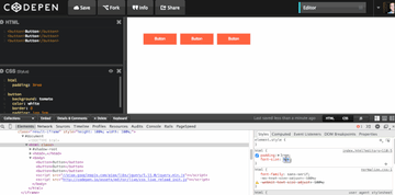
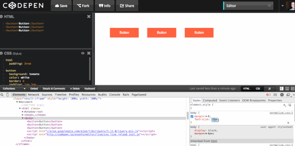
Making Components Larger
In this example I’m dialling up the font-size on the body element. As you can see everything except the margins between the elements grows proportionately.

Conclusion
This is a really quick, but powerful approach to creating flexible layouts. Play with the demo yourself:
Further Reading
- Read more about this technique on Simurai’s and Jeremy Church’s blogs
- Taking the “Erm..” Out of Ems
- Taking Ems Even Further
 By
By


