

For the most part web design isn't really about Photoshop technique, so it's always tricky writing a Photoshop tutorial on the subject. Still today I'm going to take you through a design that I recently put together. We'll be going through some Photoshop steps, and I'll try to fill you in on some of the reasoning behind my actions too.
You can find the Photoshop PSD files in a directory labelled 'PSDs' that came in the ZIP file that you downloaded. You may wish to look through them briefly before we begin.
First, the Final Designs
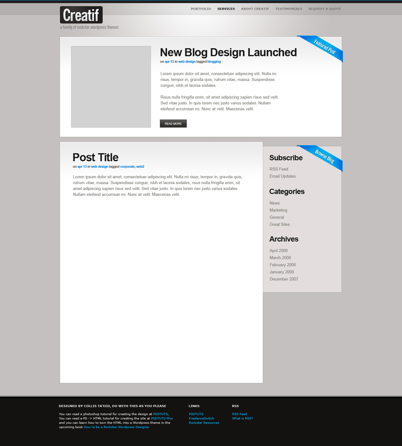
First a look at the designs. I'm writing a book on WordPress theming called How to Be a Rockstar WordPress Designer. The book required a follow along example theme, so I designed this one which I'm calling "Creatif" - because it sounds French and kinda cool. Basically it's a set of designs that we'll build into two WordPress themes - one is a regular blog, and one is a theme that lets you use WordPress to make a portfolio.
What you see below are the four main design screens I've used to build the theme. Generally speaking I create two screens for most websites - a homepage and a content page. If a site is more complicated, then I'd create one screen per critical page. To some extent you can design some pages when you're in the HTML build phase, but it's good to map out any key pages, so you can be sure that everything looks and feels right.
The screens below are:
- The homepage for the Creatif Portfolio theme
- The homepage for the Creatif Blog theme
- A general content page for either
- An alternate colour scheme that we'll build into an interchangeable stylesheet - so you can swap them and get a dark or light version of either theme.


Colour Palette
One of my first decisions when designing a new site is to choose a colour palette. There are some good sites out there to help you choose a nice set but often I just come up with my own by experimenting. A simple formula that I sometimes use is to choose a set of neutral shades and a single highlight colour to lift the palette. In this instance I've chosen a beigy-grey colour palette with a really bright light blue as my highlight colour.

Step 1
We begin the tutorial with a little logo. While logo design is generally a complex process, in this instance I just want a little graphic to anchor my page. So I skipped all the regular process and just made a nice little text / box logo. If you're interested in logo design, a great blog on the subject is Logo Design Love by David Airey, and a good gallery of logos can of course be found at Faveup.
Anyhow so I chose the font News Gothic Condensed Bold. I think this is a default Mac font, but I'm not sure as I install a bazillion fonts everywhere I go. I used a simple Layer Style (for which you can see settings in the next step) that makes the type look kinda web2 and trendy. It uses a faint gradient, subtle shadow and a 1px border to lift the type off the page.


Step 2
Here are the settings for the Layer Style:


Step 3
Next I added a rounded rectangle behind the text. You can create this with the Rounded Rectangle Tool (U). As you can see in the image below I added a faint gradient to the box as well. You can do this by CTRL-clicking the box layer to select its pixels, going to Select > Modify > Contract and contracting by 1px and then in a new layer drawing a Radial Gradient from a lighter version of the dark colour and fading to transparency.
As I mentioned earlier this design has a bit of a web2 sort of feel to it - it's clean and simple, has some gradients and is quite uncluttered. Some designers resolutely stay away from trends, personally I don't mind using them so long as they fit my purpose. In this case I wanted a clean look that didn't get in the way of the content but provided a nice wrapper. Anyhow, it's all a bit subjective really.


Step 4
Now the canvas I'm using here is about 1100px wide x 1400px high. In reality all the content is within 1000px so that it will be viewable on a 1024 x 768 screen. I like to have a wider canvas so I can plan for what happens when the viewer has a larger resolution.
In this step I've added the basics of my header, namely a dark bar along the top, a darker shade of the background colour as my menu bar, a 1px line to seal off the menu bar, and some subtext under my logo (in News Gothic Condensed again).
There are two things to note:
- It's always nice to use shades of your colour palette. Here I have a background colour, the menu bar, the menu items and the logo subtext are all varying, darker shades of that colour. This gives a nice, smooth, non clashing feel. Of course if you only use shades it gets pretty boring, that's why we introduce our highlight colour a little later. Different design styles will call for more variation in colour, but in our case we want mostly matching hues and shades with one strong highlight.
- Additionally it's nice to reflect your colour across your design. So here we have a beige background colour and then our darker colour appears in three spots - the logo, the top bar and the highlighted menu link. This creates a visual balance and alignment between the three elements. Balance is important.


Step 5
Here we add the first bit of our highlight colour. It's a really subtle 1px line along the top. Later as we add more elements the highlight colour will appear again in different spots, and will pull those elements together to unify them into a single, slick looking design. Because there's not much to this design except well placed elements and colour, it's very important to get the colouring right.


Step 6
Now the page is looking a bit flat, so here I added a layer just above the background layer. Then I drew in a Radial Gradient going from my dark beige/grey colour to transparency and set that layer to Colour Dodge to lighten the background. Because the menu bar is in fact drawn in with transparency the lightening effect shows through the menu bar too.
It's important to remember though that you need to build this design into HTML later. For that reason you'll notice that by the time you get to the edges of the 1000px viewable area we're back to monotone colours. This means later on I'll be able to create a single image slice and use it as a CSS background image. Then I'll have another background image with the big highlight area and this will be a background image in the main content body.
It's important to know about building sites so that you can design them in such a way as to avoid complications later on down the track. I think this mostly comes from experience and learning what design decisions can make life troublesome later on. Here it makes life much easier to have an easily repeatable background outside the 1000px viewable area.


Step 7
Next it's time to start adding my first white, content block area. Here I used a 1px outline of a darker version of the background colour, then a 1px interior border and finally a faint beige gradient going downwards. This style matches my earlier logo. Additionally by having the darker outline, followed by lighter interior outline we get a very sharp look to the page. Sharpness comes from contrast - i.e. dark to light.
Personally I think sharpness or clarity is really vital in web design. Nothing annoys me more than a lack of attention to detail in making things clear and crisp.


Step 8
Now I add some mock content in here. Because this text has to be HTML text it's important to choose your fonts carefully. There's nothing more depressing than choosing some nice fonts and then remembering later on that they aren't default fonts and so consequently your design is going to look totally different to how you imagined. I've used Helvetica for the bold headline and Arial for the text.
In Photoshop it's a good idea to set the Anti-Aliasing to "Sharp" to mimick how the text will look in the browser. In the old days I used to use "None", but these days most PCs and all Macs use that nifty ClearType stuff to make fonts look smooth.
Again note that the subtext links use our highlight blue, picking up on the 1px headling line we added earlier.


Step 9
Next I added a little design element in the form of a message strip along the top right corner of my box. In a simple design like this (where it's mostly simple lines and boxes), it's nice to have one or two elements that really leap out. In this case we're going to use our highlight colour combined with a 45' angle to make a cool element that looks awesome.
So we draw a rectangle and add some text over the top. Then I used the Dodge Tool (O) to lighten the middle part, and added a Layer Style to give the text a bit of shadow. Then selecting both layers together, I hit CTRL-T to transform and rotated 45'.


Step 10
After placing it over my box I cut away the edges as shown. Now you'll notice we could have placed it so it was aligned with the box, but I thought it'd be nice to make it look like this strip is wrapping around the box, so it's about 4px off the box.


Step 11
Next I manually selected the pixels in the pattern you see below, created a layer below the message strip layer and drew in a darker blue colour. It's darker so it looks like the back of the message strip, and you'll notice that I made it so that it's darker towards the right where it's in a mock shadow.

Step 12
I then duplicated my wrap and rotated it 90' and placed it on the right hand side of the box as well, as shown. And voila, our design element!


Step 13
Next I created some more elements. There's not much new here. I basically reused the same design elements - the same text style, the same message strip, the same boxes - and drew them in where I'd like my content.


Step 14
Next I added a footer area. It's not a very exciting footer, but it does use the same colours as the top bar to reflect them yet again and in this case seal off the design.


Step 15
Now because I'm creating a WordPress theme I also decided to create a version of my logo that could be created with plain text. You can see it below and in the HTML component of this tutorial we'll create that "logo" box.


Step 16
At this point I thought I'd show you my layers palette. I'm not big on naming layers (because I'm lazy) but I do believe in grouping layers into sets. Here the design for the logo vs text logo, the blog vs portfolio and the internal page are all in the same PSD file, just in different layer sets. So I can switch them on and off and get different arrangements. This is useful because if I suddenly decide to move the logo 2px to the left, I don't have to open up three files and move it 2px in each or risk having discrepancies. Also it's just nice and ordered and makes me feel all warm and fuzzy inside to look at.

Step 17
Now I should point out that in practice I didn't quite design this design the way I've laid out in the tutorial. In fact my earliest mockup looked more like the image shown below.
I then happened to switch off the dark brown layer and thought it kinda looked cool just on the lighter colour. This is what's called a Happy Accident. I wish I could say I was clever enough to be responsible for all the niceness of my work, but frankly half of it is pure luck.
In any case when I got to the end of my design I looked back at this early mockup and thought that the design did kinda look nice with a dark background colour. So why not make a version where it's dark, then I can create an option to switch stylesheets, that'd be neat right!


Step 18
So I created a new copy of my design file and changed the background to dark brown. Fortunately there isn't actually much that needs to change, I darkened the logo to black so it stands out still, I also adjusted a few other colours to make the design all make sense. It's not quite as nice as the original, but a nice addition to the family.


Conclusions
As I mentioned at the beginning of this tutorial, this isn't so much about Photoshop technique. The reality is web design often uses only very basic techniques of filling in blocks of colour. This design is more about choosing colours and shades, fonts, and then deciding how to lay it all out. I hope you got something out of the process.
Building into HTML
Of course designing a site in Photoshop is only one part of a web design job. The next step is to take the design into HTML.
 By
By


