

In this tutorial you’ll learn three ways to create easy angled edges using SVG. To begin with we’ll use an inline SVG, then we’ll use an SVG background on a pseudo-element, before finishing off with a Sass mixin. Let’s dive in!
Watch the Screencast

Angled What?
When I say “angled edges” I’m referring to things like the background on Stripe’s website:


Or the overlays on this website:


These would be easy enough to create using a graphics application; you could create the design, export as a single graphic, and load into your web page. However, if you want more flexibility, you should forget that approach. Let’s look at some alternative ways to get angled edges.
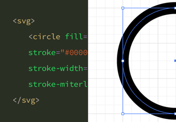
Quick Refresher in Hand-Coding SVG
Before we move on, if you need to remind yourself of the basics where hand-coding SVG is concerned, Kezz has you covered:


1. Inline SVG
Let’s start with an SVG, within a container, in our markup:
1 |
<div class="hero"> |
2 |
<svg viewBox="0 0 100 100" preserveAspectRatio="none"> |
3 |
|
4 |
</svg>
|
5 |
</div>
|
We’ll come back to the details of what we’ve done in a moment. Now add some basic styles to give our hero some dimensions and a gradient background:
1 |
body { |
2 |
background-color: #eaeaea; |
3 |
}
|
4 |
|
5 |
.hero { |
6 |
position: relative; |
7 |
height: 300px; |
8 |
background-image: linear-gradient(#4568dc, #b06ab3); |
9 |
}
|
That gives us the following:
But let’s imagine we want to have that bottom edge as an angle going up towards the right. We’re going to do that with our SVG. In it, we’re going to create a polygon with some point coordinates:
1 |
<div class="hero"> |
2 |
<svg viewBox="0 0 100 100" preserveAspectRatio="none"> |
3 |
<polygon points="0,100 100,0 100,100" /> |
4 |
</svg>
|
5 |
</div>
|
You’ll now see a large, black triangle in the bottom right of your page. Through our CSS we can style that triangle to suit our needs, filling it the same as our background so the hero appears to have been sliced at the bottom:
1 |
svg { |
2 |
position: absolute; |
3 |
bottom: 0; |
4 |
width: 100%; |
5 |
height: 10vw; |
6 |
fill: #eaeaea; |
7 |
}
|
That gives us:
2. Pseudo-Element + SVG
Our second approach improves on the first, in that content within the gray area won’t be cut off by overlaying a gray triangle. We’ll being again with a simple container div:
1 |
<div class="hero"> |
2 |
</div>
|
This time we’ll control the masking all from within our CSS, starting with the hero styles we used in the last demo:
1 |
body { |
2 |
background-color: #eaeaea; |
3 |
}
|
4 |
|
5 |
.hero { |
6 |
position: relative; |
7 |
height: 300px; |
8 |
background-image: linear-gradient(#4568dc, #b06ab3); |
9 |
}
|
Now we’ll add a pseudo-element to our hero, to which we’ll add the SVG as a background image. First, we’ll need to encode our SVG so that we can actually use it in CSS. So grab the SVG code we wrote last time, change the points to 0,0 100,0 0,100 in order to flip it round, head over to URL-encoder for SVG, and paste the contents into the box:


Copy the Ready for CSS snippet and paste it into the pseudo-element styles:
1 |
.hero::after { |
2 |
background-image: url("data:image/svg+xml, %3Csvg xmlns='http://www.w3.org/2000/svg' viewBox='0 0 100 100' preserveAspectRatio='none'%3E%3Cpolygon points='0,0 100,0 0,100' /%3E%3C/svg%3E"); |
3 |
}
|
You can also add a fill='' attribute if you like, after the viewBox attribute for example. Add some more properties to position and size the pseudo-element:
1 |
.hero::after { |
2 |
background-image: url("data:image/svg+xml, %3Csvg xmlns='http://www.w3.org/2000/svg' viewBox='0 0 100 100' fill='tomato' preserveAspectRatio='none'%3E%3Cpolygon points='0,0 100,0 0,100' /%3E%3C/svg%3E"); |
3 |
background-position: center center; |
4 |
background-repeat: no-repeat; |
5 |
background-size: 100% 100%; |
6 |
content: ''; |
7 |
height: 10vw; |
8 |
width: 100%; |
9 |
position: absolute; |
10 |
bottom: -10vw; |
11 |
}
|
That gives us this:
Thanks to our Ziggy Stardust colors we can clearly see our SVG like this. Now we just need to color the triangle (using the fill='' attribute) so that it’s the same color as the purple at the bottom of the gradient:
Note: thanks to Bob Proctor for pointing out that hex values in the fill attribute don’t seem to be recognised by FireFox. You’ll need to use RGB, or HSL, or name values.
The Importance of VW Units
There’s a reason we used vw units for the height of our SVG: we want the angle of our triangle to remain consistent no matter what the width of the viewport. If we were to use px units, the height of the triangle wouldn’t change for narrower screens, which would make the angle of the triangle more acute. Try it yourself!
3. The Sass Mixin
This final approach uses a Sass mixin to do all the heavy lifting, but it essentially achieves what we did in the previous example. Head over to the Angled Edges GitHub repo, grab the mixin, and include it in your project (I’m going to paste the whole thing into the SCSS window of a CodePen project).
Next, add our old friend the hero div to your markup. Add the basic styles too, so that we get the usual 300px gradient effect.
Then, within our .hero we add the mixin:
1 |
@include angled-edge(); |
The parameters we need are as follows: we need our triangle to be outside the hero, at the bottom. The position of the point where the angle begins is lower right, the color we’re after is the purple #b06ab3, and then the height of the triangle will be 100. The limitation of this is that the mixin doesn’t accept relative values for the height or the width.
Our mixin looks like this:
1 |
@include angled-edge("outside bottom", "lower right", #b06ab3, 100); |
And this is what we get:
For more details on the available parameters, check out the GitHub repo. Thanks go to Joseph Fusco for his hard work.
Conclusion
So there we have it; three methods for achieving angled edges. Each one has its merits, and practicing each one will give you a solid understanding of how SVGs can be manipulated for visual effect.
More SVG, Gradients, and Angles in Web Design

 How to Create a Loader Icon With SVG Animation


 How to Use CSS Gradients on the Web

 How to Create a Split-Screen Slider With JavaScript
 By
By


