

- Overview
- Transcript
2.5 LazySizes.js
LazySizes is a plugin for lazy loading images. Lazy loading delays the loading of a particular element until that element is needed.
For example, if you have a tall website and a couple of images right at the bottom, there’s no point in loading those assets unless the user actually scrolls to the bottom and needs to see them.
So let me show you how LazySizes works and the kind of difference it can make to page loading time.
Related Links
1.Introduction
1.1Welcome to the Course01:30
2.Handy JavaScript Plugins for Web Designers
2.1Headroom.js11:13
2.2ProgressBar.js15:37
2.3Cleave.js09:59
2.4ScrollTrigger.js15:26
2.5LazySizes.js09:32
2.6Swiper.js18:00
2.7Darkmode.js11:39
2.5 LazySizes.js
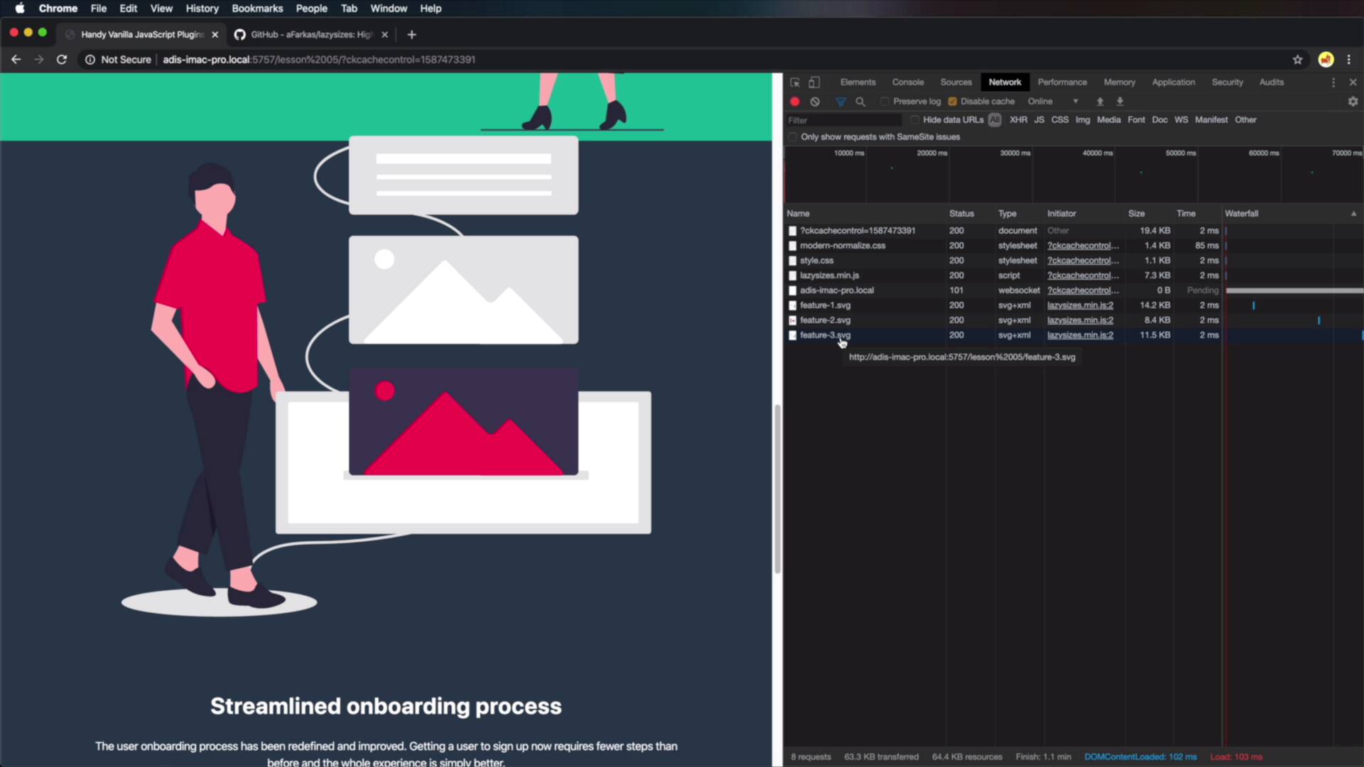
LazySizes is a plugin for lazy loading images. Now, Lazy loading delays the loading of a particular element until that element is needed. For example, if you have a tall website and a couple of images right at the bottom. There's no point in loading those assets unless the user actually scrolls to the bottom and needs to see them. So let me show you how LazySizes works and the kind of difference it can make to page loading time. As a demo, I have a very simple page here with four sections, and some demo content. Each one of these sections has an image that's loaded, Like this. And if we take a quick look in the Inspector under Network, you'll see that on page load, all three images are loaded. Now granted, these are small images, 14, 8, 11 kilobytes, they are SVG. But if you had like larger images that are 100, 200 kilobytes in size, loading all of these at the start could potentially slow down your page. Now because the images that are loaded are well below the fold and the fold being this line here. So whatever that you're seeing on your viewport on page load is considered above the fold. Below the fold is the content that you need to scroll to, okay? So this for example is below the fold, this is below, and this is below. Now because I'm not seeing any of these images when I'm first loading the page, it makes no sense to load them at that time. And this is where LazySizes, a JavaScript plugin is really handy. So if you go to the GitHub address, and you scroll down, you'll find how to install the script. You can download it directly or install via NPM and this is exactly what I'm gonna do. So open up Code kit, I'm gonna search for LazySizes, install and then I will go to my code here, I'll say script src=../node_modules/lazysizes/lazysizes.m- in.js. That's all there is to it, there's no initialization, it does everything by itself. Now to target the images correctly, so the image is that you want to lazyload, you would simply add a class of lazyload to them. Okay, so we're gonna add it there and we're gonna add it here and we're also gonna add it here. In addition to that, you need to change the src of the image to data=src. Because if you would just leave src as it's is default, the browser will automatically load that image. So now, if we take a look back, let's also open up the Inspector, Network. When I do a Refresh, you'll see that on this list of resources, there is no image, so the images are not being loaded. Now once I start to scroll down, you'll see that the first image was loaded, feature-1.svg because the plugin recognizes the scroll action. And it knows that eventually, I'm going to see that image so it starts loading it. Now as I get close to the image, you'll see that it's loaded. Now, it started loading the second image because I am getting close to that second image, and there it is right here. And as I scroll even further down, see, now it loaded image 3, so it's ready to go for me right here. And that's all there is to it really, it really depends the layout of your page, right? So when you're in mobile mode like this, you'll find that images are loading maybe a bit later than on desktop because you have a lot more vertical space. But on desktop, you have less vertical space, so as you scroll, you'll find that images are loading faster or slower than on mobile. But they do load properly, so when you get to them, they are visible. Now, one of the best features about LazySizes is that it works with responsive images and here's how that works. Right here, I have three png files, they are basically versions of this third image, so we have a small, we have a medium, and we have a large. And the plan is to load these images selectively based on the viewport size. So when I'm on a small screen, let's say a smartphone, I don't need to load this large image, right? It makes no sense, I'm gonna load the small one which is 800 pixels in width. But when I'm on a desktop, I'm gonna load the large one because it's 2,600. So here's how you can do that, I'm gonna use an example, this third image here, but obviously, this can be applied to any of the other images. So I'm gonna say img data-src* "feature-3.svg, I'm gonna leave this just as it is as a fallback. Now, I'm gonna say, data-srcset=2, the following, feature-3-small.png and I'm gonna specify its width in pixels. So the width of the actual image then feature-3-medium.png, this is 1200 pixels in width, and then feature-3-large.png which is 2600 pixels in width. The rest remains exactly the same, so what is this doing? Well, the normal syntax is srcset, we add a data srcset, because it needs to work with the plugin. But normally, it works something like this, you specify a list of images that you wanna load and their actual widths. Now depending on a series of factors, among which is the screen size, the browser will determine by itself which image to load. So to give you an example, if I'm on a very small screen, and I scroll down, you will see about the browser now loads feature-3-small.png, which is this. If I'm gonna increase my screen size a little bit, and I'm gonna do a Refresh. You'll see that the browser now loads feature-3-medium, because it needs that bigger image size. And when I'm viewing this on a large screen, you'll see that the browser now loads feature-3-large. So this can lead to huge bumps and page performance, it’s gonna seriously decrease the page loading time which is fantastic. Because you're no longer loading images that do not be shown right away, so this is definitely a plugin that I think you should use. All right, and that's how you can use the LazySizes plugin to increase the page performance. Now the next plugin on our list is called Swiper.js, and it's a free and customizable slider. More about it in the next lesson.


