
 Lessons: 6Length: 18 minutes
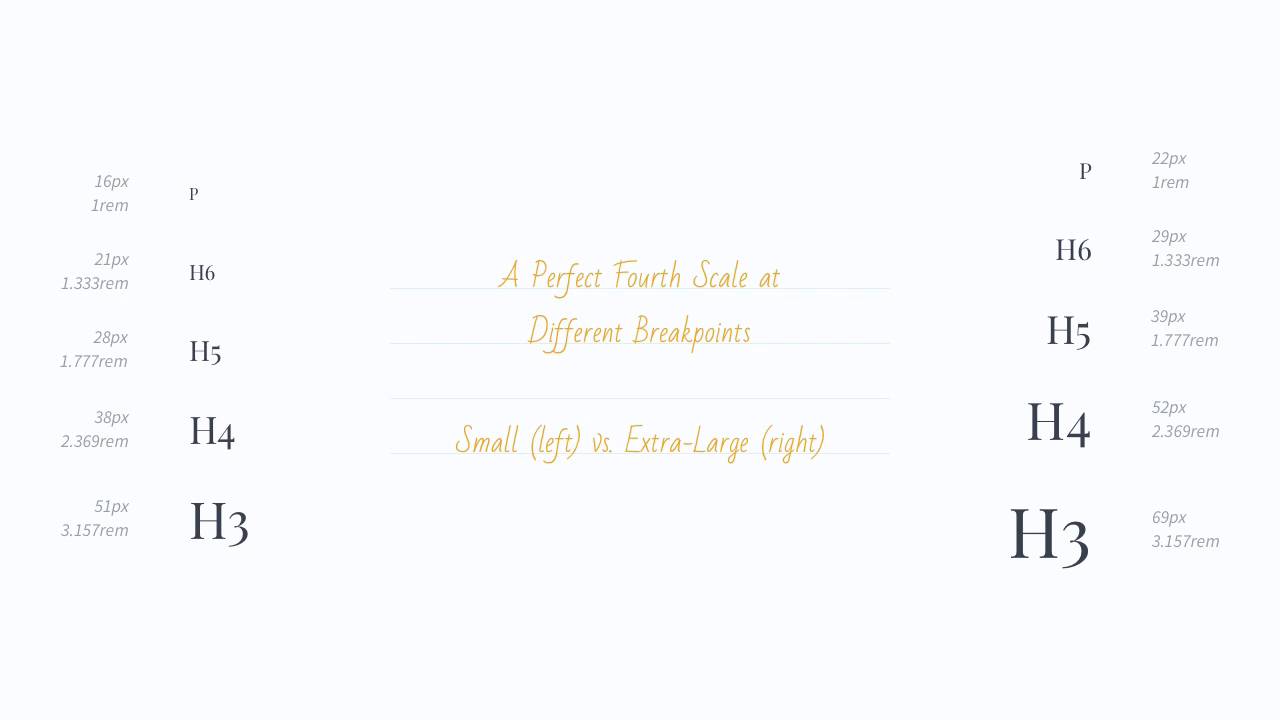
- Overview
- Transcript
2.4 Making Your Scale Responsive
Nowadays, we browse the internet from lots of different devices, and the vast majority of new websites are responsive. However, sometimes, designers and developers forget about making the typography responsive as well. They simply use the same font sizes on all devices and, whilst this isn’t the end of the world, you can create a better experience by using smaller fonts on smaller devices. Let’s find out how you can do that.
2.4 Making Your Scale Responsive
Nowadays, we browse the Internet from a lot of different devices, from smartphones, to tablets, to large desktops. And a lot of the websites nowadays are responsive, okay? But there's one thing that developers and designers often forget to do, and that is to make the typography responsive as well. They use the same font sizes for all mediums, so we have the same font size on a smartphone as you have on a larger desktop. And the thing is, you would get a much better experience by using smaller font sizes on smaller devices, because you have limited screen real estate there, okay? So to do this, you have two different ways. One, you can use different scales for different breakpoints. Or two, you can have the same scale but change the base font size on each breakpoint. I recommend the second option because it's easier to implement and personally, I think that you should use the same scale all around even if you change the base font size between breakpoints. In this example, you can see a perfect fourth scale being represented in two different breakpoints. On small screens, we start with 16 pixels for the base font size, and we turn it all the way up to 22 pixels for the larger screens. The ratio is exactly the same for all breakpoints, 1.333, but the font sizes will change. Now, from a technical point of view, this is done super simple with CSS media queries. The scale I showed you earlier would translate like this. We set all the size values using Ms, and then, at each breakpoint, we change the font size of the body element. The result is a responsive type scale that changes the font sizes on each breakpoint. So that's how you can make your scales responsive. Now, let's have a look at some tools that will really help you when working with type scales. That's coming up in the next lesson.


