


- Overview
- Transcript
2.4 Width and Height
In this lesson, we’re looking at sizing properties—more specifically width and height, which also have logical equivalents. These are a bit different than what you’ve seen so far because they’re not called “width” and “height” anymore. Let’s check them out.
Related Links
2.4 Width and Height
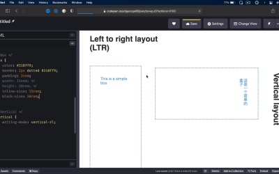
Welcome back to the course. In this lesson, we're taking a look at sizing properties. More specifically width and height, which also have their logical equivalence. These are a bit different than what you've seen so far, because they're actually not called width and height anymore. Let's check them out. Now for this demo, I decided to use a left to right layout. So horizontal and a vertical layout to illustrate the differences, because essentially, width is exactly the same thing on a left to right or right to left layout, same thing goes for height. So to illustrate how these can be used as logical properties, I'm gonna use a horizontal and a vertical layout. So here, we have a simple box that has a width and a height. And on the vertical layout, the writing-mode is set to vertical, right to left. Now right off the bat, we can see a small problem with this text here. We're using a margin-bottom of 4rems, but really, we should be using a margin-block-end of 4rems. And it creates a gap in between the text and the actual box. Now for the box itself, the way it's positioned or is displayed right now is incorrect, because we have 15rems of width, 30rems of height. And in vertical layout, this should be reversed. So instead of using width and height, we're gonna use inline-size, 15rems, that equals to width, and block-size as 30 rems, that equals to height. See the difference, this is how it's presented in a normal horizontal layout. So inline-size will be the width, block-size will be the height. On a vertical layout is the other way around. Inline-size will be the height and block-size will be the width. Now if I didn't have logical properties available, I would do the following. I would target vertical box, and I will set the width to 30rems, and a height to 15, right? So that will give me the same result, but because we have logical properties, and because they're pretty well supported in browsers, we really have no reason not to use them. Now one thing I want to mention here is that there are properties called min width, min height, max width, and max height. Well, guess what? They also have their logical counterparts. So you can easily say min-inline-size, let's say 20rems. That will say, okay, the inline-size, which is the width on a typical horizontal layout will be a minimum of 20rems. I can also say, max-block-size of, let's say, 20rems. So that could mean a maximum height on a horizontal layout of 20rems, or a maximum width on a vertical layout of 20rems. So I hope that's not too confusing. Basically, width gets replaced with inline-size, height gets replaced with block-size. And you can add min and max to either of these, and they will work just fine. And that's about it for these sizing properties. Now the final two properties on our list are position and float. Yes, that's correct. Float even though we're in 2021, there are still uses for the float property. And we're gonna play around with that in the next lesson. I'll see you there.


