
Dave Gamache's Skeleton Boilerplate provides the perfect foundations upon which to build responsive websites rapidly and reliably. We're going to use Skeleton and build a responsive page based on the Magazine design featured on Webdesigntuts+ recently. We'll be looking at everything from multiple background images, through to media queries, flexible media and mobile-friendly navigation. Let's get started!
First Steps
In this first video we'll download the Skeleton Boilerplate and prepare our project. We'll dive into the .psd layout and take whichever images we deem necessary, creating a sprite file for bits and bobs like the logos.
Alternatively, Download the video, or subscribe to Webdesigntuts+ screencasts via iTunes or YouTube!
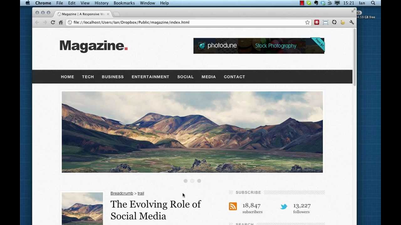
Structure and Columns
It's time to get stuck into the markup and some styling. In this video we'll examine the structure of our design and translate that into HTML using Skeleton's markup. We'll use the grid system supplied by the boilerplate and set out some of the columns in our page.
We'll also deal with some of the aesthetics by using CSS multiple background images on certain areas.

Alternatively, Download the video, or subscribe to Webdesigntuts+ screencasts via iTunes or YouTube!
Multiple Background Images
Browser support for multiple background images is pretty good, with Mozilla Firefox (3.6+), Safari/Chrome (1.0/1.3+), Opera (10.5+) and even Internet Explorer (9.0+) all cooperating nicely.
Unfortunately, non-supporting browsers won't understand the rules and therefore won't display anything at all. It's therefore advisable to use a suitable fallback, for example by implementing Modernizr and declaring an additional background rule specifically for offending browsers. Skeleton approaches this by using conditional comments on the <html> tag; if viewed in Internet Explorer 8 or earlier then it will be assigned the class "ie". You can therefore target those browsers specifically by using something like this:
1 |
/*ie multiple background image fallbacks*/
|
2 |
.ie .band.navigation { |
3 |
background: url(../images/bg_dark.png) repeat left 2px #343434; |
4 |
}
|
5 |
.ie .band.footer { |
6 |
background: url(../images/bg_dark.png) repeat left 2px #343434; |
7 |
}
|
8 |
.ie .band.bottom { |
9 |
background: url(../images/bg_bottom.png) repeat #343434; |
10 |
}
|
Additional Resources
Here are a few bits and bobs mentioned in the videos so far:
- The rather crucial Skeleton Boilerplate.
- More information on the Viewport Meta Tag.
- Tutorial on multiple backgrounds
- PSD source files for the Magazine design.
- Paul Irish's * { box-sizing: border-box } FTW.
- The brilliant LiveReload
 By
By


