
 Lessons: 12Length: 1.4 hours
- Overview
- Transcript
2.1 Viewport Units
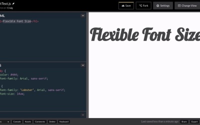
Viewport units in CSS allow us to create text which fluidly resizes based on the size of the browser. In this lesson, we’ll discuss the use of the vw unit in CSS and why it’s not always the best solution.
Relevant Links
1.Introduction
1.1Introduction00:47
1.1
Introduction
00:47
2.Responsive Sizing
2.1Viewport Units04:39
2.1
Viewport Units
04:39
2.2Responsive Headers With FitText12:11
2.2
Responsive Headers With FitText
12:11
2.3Responsive Text With FlowType.js10:04
2.3
Responsive Text With FlowType.js
10:04
3.One Character at a Time
3.1Kerning.js08:06
3.1
Kerning.js
08:06
3.2More Than Just Kerning11:59
3.2
More Than Just Kerning
11:59
3.3Lettering.js09:03
3.3
Lettering.js
09:03
3.4Animating Letters With Textillate.js06:51
3.4
Animating Letters With Textillate.js
06:51
3.5Specifying Options With JavaScript09:58
3.5
Specifying Options With JavaScript
09:58
4.One Line at a Time
4.1Lining.js07:08
4.1
Lining.js
07:08
4.2Animating Paragraph Lines03:29
4.2
Animating Paragraph Lines
03:29
5.Conclusion
5.1Final Thoughts00:48
5.1
Final Thoughts
00:48


