

Figma Tutorial
Welcome to this quick start guide to Figma; perfect for anyone who wants to learn all the basics, but doesn’t want to sit though hours of long videos. This is going to be quick, to the point, and with cool demos to practice with along the way. So let’s not waste any more time on this preamble—let’s get going!
Brought to you by Envato Elements
This Figma course is brought to you by Envato Elements, the world’s number one creative subscription. Check out Elements today and get unlimited access to millions of creative assets—UI kits, web fonts, vector graphics, 3D renders, video effects, and much more!
First Figma steps
Let’s assume you‘re starting completely from scratch with Figma. This video will:
- Show you how to create an account.
- Give you a quick tour of the dashboard.
- Show you how to organize your work with files, projects, and teams.
- Discuss plans (what Figma costs).
The first bit is dead easy. Go to https://www.figma.com/, click on the Get Started button, and create an account with your Google credentials, or your own chosen login details.


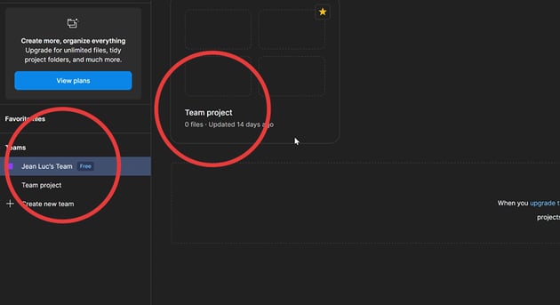
Once signed up and logged in, you’ll be taken to the dashboard.
There won’t be any files to start with, but you’ll usually find them on the main section of the dashboard. Figma uses the following hierarchy for organizing your work: teams, projects, and files. By default, Figma will have created a team for you when you first sign up, along with a starter project:


Within projects you can create design files and FigJam boards (we’ll discuss FigJam later).
For now, let’s talk about plans. Crucially, Figma is free. As we’ve just signed up, we’ll be using the starter plan, which gives us 3 files, 3 pages, and 1 project. We also get 30 days of version history (important for dialling back our projects to previous versions). The Professional and Organization plans get you progressively more.
Lastly, right at the bottom left of your dashboard UI, you’ll see a Figma Community button. Click it, and you’ll be taken to a huge resource of assets, templates, and plugins
Learning the Figma Editor
Before we get into Figma’s tools and features, let me show you around the Editor so you have an idea what each panel and button is about.
The Editor is divided into four parts: two sidebars, a top bar (the toolbar), and the canvas which takes up most of the screen. The canvas is where you’ll put all your frames, shapes, text, objects, and whist it appears to stretch infinitely in all directions, you actually have about 65,000px square to play with.
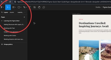
The left sidebar contains the layers, and assets panels, as well as access to the pages inside the file.


The right-hand sidebar has two panels; design and prototype. The design panel is populated with all kinds of properties, depending on what is selected at the time. For example , if you select a piece of text, the right-hand sidebar will make available all the properties you’d associate with text.


Finally, the toolbar which sits atop the canvas and stretches the entire width of the page, has three sections of its own.
On the left, you have the main Figma menu, plus all the Figma tools.


In the middle you’ll see the file name (which you can click at any point to rename).
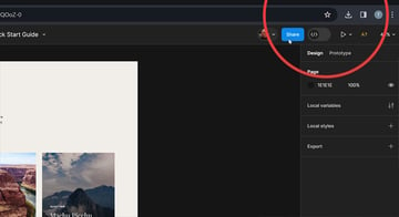
And on the right hand side we have options for sharing the file, the dev mode button (which we’ll cover later), prototyping options, and the zoom controls plus some additional options.


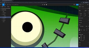
Layers, groups, and frames
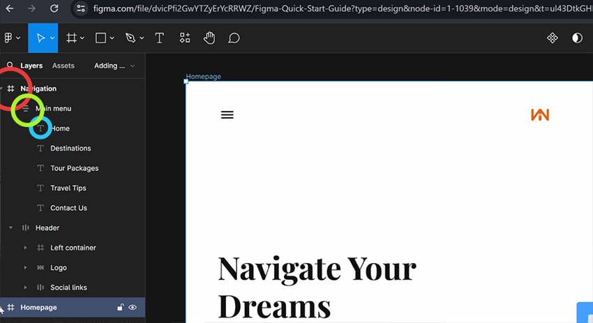
Structure is super important in any Figma project. Earlier we talked about organizing work using Teams, Projects, and Files. Well now we’ll look at organizing the files themselves, using layers, groups, and frames.
- A frame is a container for all of your elements. You can have multiple frames within a single page. Frames are great for defining layouts and setting boundaries.
- The next level down in terms of organization is groups. A group acts as a container for elements, but it doesn’t define boundaries. Groups get their dimensions based on the contents within them.
- Lastly, we have layers. In Figma, any element you place on your canvas is represented as a layer.
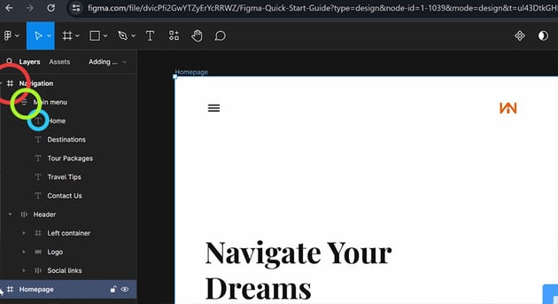
“Structure is super important in any Figma project.”
In this screenshot you can see frames (in red), which contain groups (in green), which then contain layers (in blue).

Whilst we’re on the subject, using frames has one more advantage: the ability to use layout grids. These are very similar to CSS Grids (if you’ve ever used those). Layout grids are applied to a frame by selecting the frame, then clicking the + sign, over by Layout Grid in the right-hand sidebar.


Here you can choose to display grids, columns, or rows, and define their attributes too. The resultant grid will act as the perfect guide for creating consistent layouts.
Get seriously creative with Envato Elements
Check out our collection of Figma-compatible UI kits on Envato Elements. Subscribe for unlimited downloads and get seriously creative!
Working with text
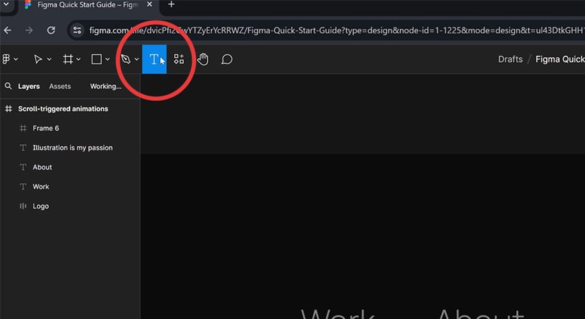
Let’s have a look at the available tools within Figma, starting with the one you’ll probably be using the most: the text tool. The text tool is available in the top tool bar, so click on it to select, click (or drag an area) on your canvas, and away you go:


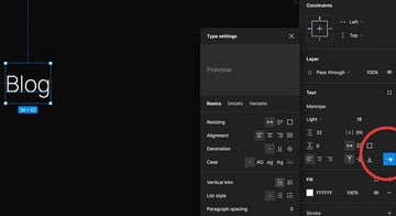
With your new type layer selected, you’ll see all the properties for type over in the right hand side bar. Along with the obvious candidates like font family, font weight, line height, and so on, you’ll be given additional options under the … icon. This way of working with properties holds true for all the tools.


Using shapes and images
Beyond type, you’ll likely want to add shapes and images to your design. They can be useful for patterns, masking, sections. In Figma, you can create pretty much any shape you need. And when it comes to images you can use both raster and vector formats.
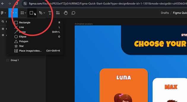
First, shapes. To add a rectangle, an ellipse, a polygon, or a path of any kind, go to the shape tools button in the toolbar.


As with text, once you’ve selected your tool, click or drag on the canvas to create what you want. And again, the properties available once you’ve done that will be appropriate to the object created.
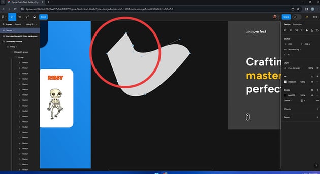
Adding an image, again, means we can select either a vector or a raster file to include on our canvas. In the case of vectors, we can scale them infinitely, and break them down into their composite paths and shapes.


A raster image is comprised of pixels, so doesn’t have the same ability to scale:
To add an image, either follow the option in the shape tools menu, or drag the file from your system into Figma directly. You can also copy and paste from anywhere on your system. Vector images will be added as a group, which you can then dial into in the layers panel.
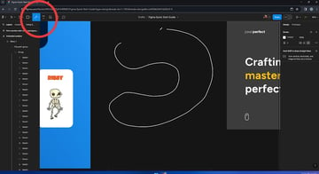
Shapes with the Pen tool
While we’re on the subject of vectors, let’s talk about the pen tool. Not all shapes are available under the shape tool options. If you need to create something more complex, head over to the pen tool. With points, and bezier handles, and curves, you’ll be able to create your own freeform shape on the canvas:


The pen tool in Figma is much like the pen tool in any other vector design program. Learning to use it is a skill in itself. To get to grips with the pen tool in Adobe Illustrator, check out this guide (and try your hand at the free exercise).


The Pencil tool
If you prefer working more freehand, the pencil tool will allow you to draw vectors directly on the canvas. If you have a Wacom tablet or stylus of some sort, this is ideal.


Raster images
That covers vectors for now, so let’s just jump back to images and talk about raster files for a moment.
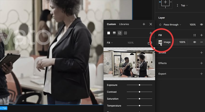
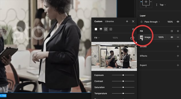
You can add a raster image in exactly the same way as you do with vectors, except in this case it will be added as a new layer, with the image as the layer’s background.


Working with colors
So far I’ve only touched briefly on colors, so let’s look a little deeper. We’ll start with the color picker.
When an object is selected on the canvas, depending on the object you’ll be able to see its stroke and/or fill colors in the properties inspector over on the right. Click on one, and you’ll be given the color picker; a color area which allows you to define the color you’re after.
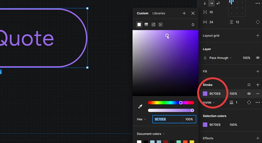


Additionally, you can define the color specifically by entering the code (HEX, RGB, CSS, HSL, HSB) or dragging the sliders.
Lastly you can select a color from the Document colors list (literally all the colors present in the document), or the Eye dropper tool which can be pointed anywhere on your canvas and clicked to select.
Multiple fills
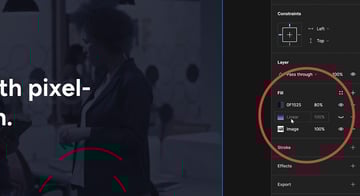
We saw earlier how images can be applied as an object’s fill. We can actually apply multiple fills, making each one visible or invisible depending on what we want. For example, here you can see the image fill, with a linear gradient fill on top, plus a solid fill on top of that. The two top fills have transparencies so the image can be seen through. And the gradient fill, denoted by the closed eye symbol, is currently invisible.


My favorite color feature in Figma
To round off this lesson, I want to show you my favorite color feature in Figma. If I select a bunch of objects, over in the right hand property panel I can see the Selection colors; all the colors present within the objects selected.
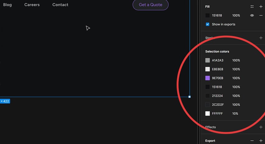
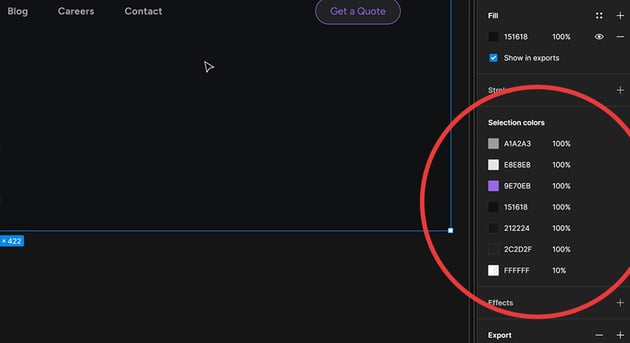
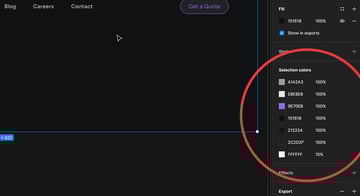
By changing one of the colors in that panel, it will change every instance of that color in the selection. This is a feature I haven’t encountered in any other design software. Kudos, Figma.
Working smarter, with Auto Layout
Arguably the most powerful feature in Figma is its Auto Layout. This is something I encourage you to learn as fast as possible, because it will unlock so much of Figma for you. When you’re done with this course, head over to our dedicated Auto Layout course and learn all you need to know!
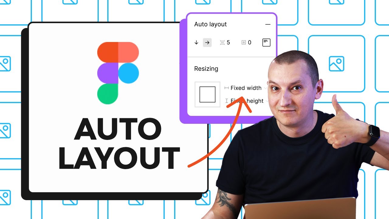
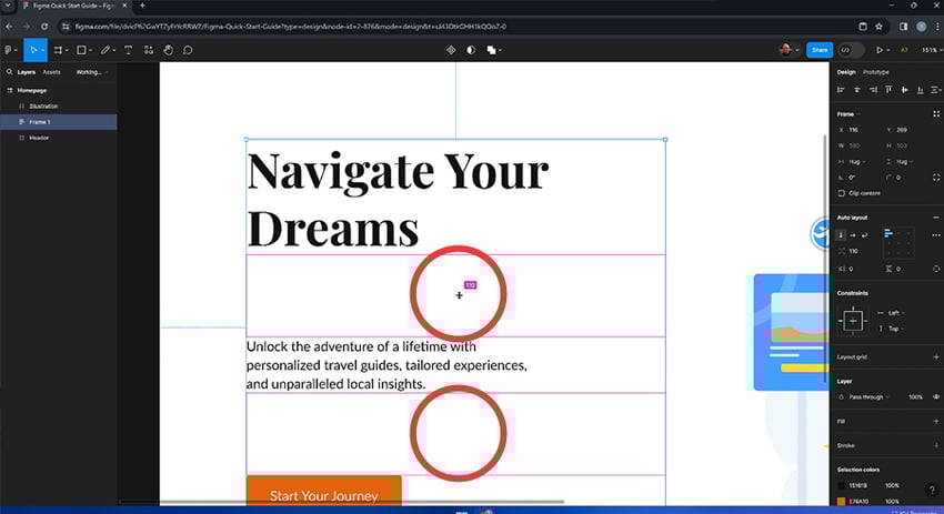
With Auto Layout, you can align and space elements, and keep them perfectly in relation to one another. Begin by selecting a few objects, then right-click to show the contextual menu, and select Frame selection. With these objects all being in a frame, we’ll now have Auto Layout options available in the properties panel.

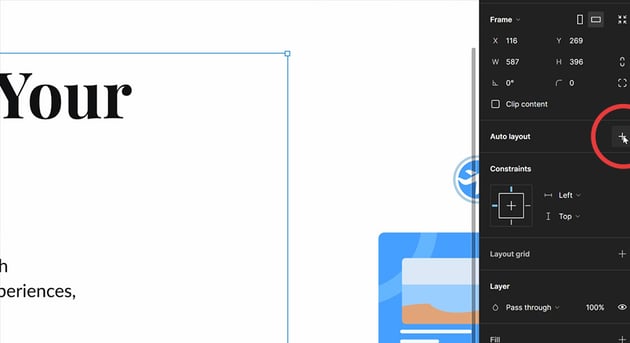

Click the + sign, and you can now choose the alignment properties you need. You can set the vertical and horizontal alignment, the spacing between elements, all by entering values, or dragging with your cursor.

Learn more about Figma’s Auto Layout possibilities with Tuts+.
Reusing elements with Figma Components
Figma components allow us to reuse elements within our designs, and change certain aspects of them, either selectively or across all instances of those elements.
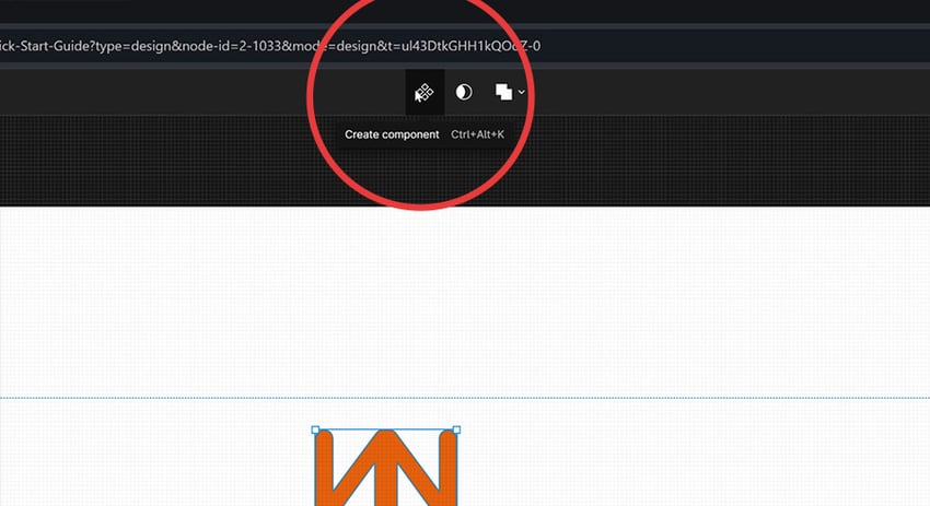
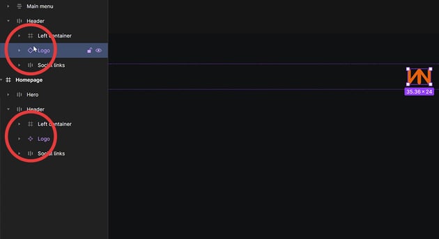
For example, let’s take these two logos:
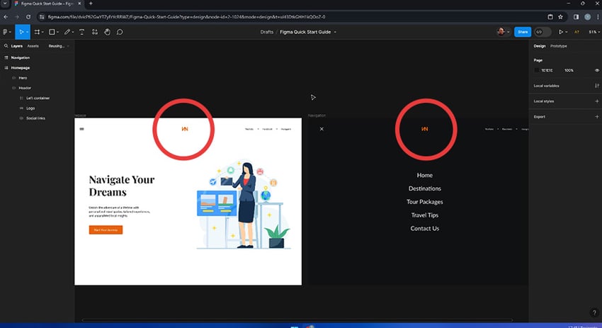

These are identical logos, but they’re totally disconnected from one another. If I change one, the other remains exactly as it is.
To enjoy the benefits of components, I select one (this will be the main, or parent logo) and then select Create component in the uppermost toolbar:
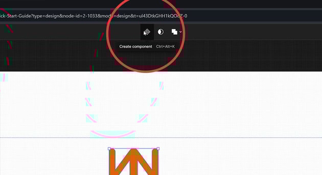

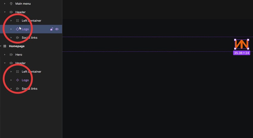
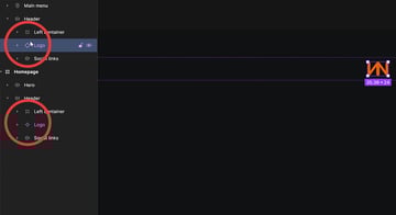
Our logo component can now be found in the Assets panel in the left hand sidebar. The logo on our canvas will now appear differently in the Layers panel too; it will be purple, and have a different icon.
By dragging an instance (or a “copy”) of the logo from our Assets panel, we’ll have another logo in our design, but one which is connected to the parent. As you can see, the parent logo (the lower one in the image) appears with the component icon in our Layers panel, and the copy (the instance) has a simpler icon.
Now, importantly:
- Any changes I make to the parent icon (the fill color, for example) will be applied to all instances too.
- Any changes I make directly to an instance, will affect only that instance.
To learn more about Figma components, you guessed it, we have a dedicated course on Tuts+:

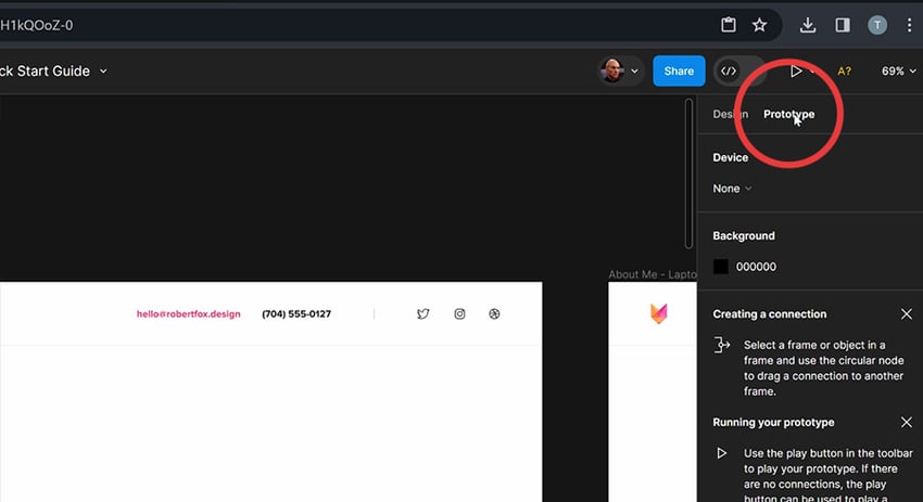
Prototyping in Figma
Prototyping is like taking your static design and turning it into a clickable model. Prototyping can help you understand how different parts of your design interact. Figma has lots of prototyping features, which have arguably helped it become the number one design tool for web, UI, and UX designers.
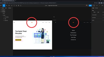
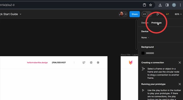
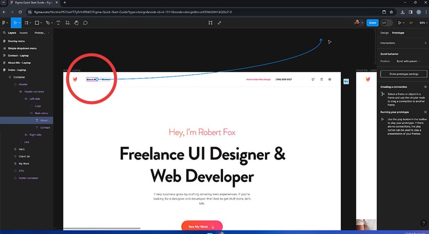
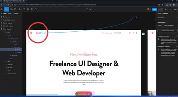
One common use of prototyping, would be to make one page link to another. So, to get this going, we would click on the Prototyping panel to the right of the screen:

Then you can click the + sign on the link you’d like to interact with, and drag an arrow over to the frame you’d like to link to.

This then opens up a dialog with options, allowing you to describe the actions needed.
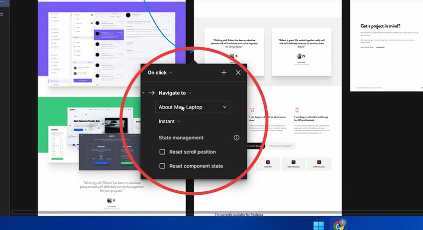


You can create as many of these links within a prototype as needed. You’ll, for example, need to navigate back to the original frame once you’ve clicked a link. All this should be taken care of to make a functional prototype.
To see it in action, hit the preview button (Shift + Space).
Deliver your best work faster with Envato Elements
That should have given you an introductory taster of what Figma is all about, don’t forget to check back for more in-depth courses on Tuts+!
Another thing worth checking out is our collection of Figma-compatible UI kits on Envato Elements. Subscribe for unlimited downloads!


