


In this tutorial you’ll learn about using CSS gradients on the web. I’ll give you some examples, some exercises (such as how to create gradients for borders), and I’ll also throw in some useful resources which will make creating gradients a lot easier.
Watch the CSS Gradient Tutorial
CSS Gradient Basics
In days gone by it wasn’t really possible to use gradients without relying on images, but developments in CSS mean that it’s now simple and reliable to create gradients from within our stylesheets.
In their simplest form, we define gradients as background images. We set the background image (just using the shorthand background is absolutely fine) as being either a linear-gradient or a radial-gradient, then we pass in the starting and the ending colors:
1 |
.box { |
2 |
background: linear-gradient(#000046, #1cb5e0); |
3 |
}
|
By default a linear gradient runs from top to bottom, giving us something like this:
We can change the direction by adding a new parameter before the colors, for example:
1 |
.box { |
2 |
background: linear-gradient(to right, #000046, #1cb5e0); |
3 |
}
|
Equally, changing this parameter to read to top right would create a diagonal gradient. You can make that diagonal exact too, by specifying something like 45deg (or whatever angle you choose).
Taking things a step further, you needn’t stop at just two colors. And you can use color names too, like this:
1 |
.box { |
2 |
background: linear-gradient(to right, orange, #ec38bc, #7303c0, cyan); |
3 |
}
|
In this case each of the four colors will occupy an equal amount of the space available, giving us a smooth, balanced gradient.
If we don’t want even distribution, but want one color to occupy more space than another, we can specify that value as a percentage directly after the color like so:
1 |
.box { |
2 |
background: linear-gradient(to right, #f05053 80%, #e1eec3); |
3 |
}
|
Giving us:
Radial Gradients
Moving on, we can use everything we’ve learned so far and change it to display radial gradients instead. Switching out linear-gradient for radial-gradient is all you need to do here.
1 |
.box { |
2 |
background: radial-gradient(#fdbb2d, #22c1c3); |
3 |
}
|
This radial gradient stretches to its parent element, so this rectangle ends up with an ellipse-like gradient. To constrain that gradient so that it remains a circle irrespective of the parent’s proportions, we can add the circle keyword like so:
1 |
.box { |
2 |
background: radial-gradient(circle, #fdbb2d, #22c1c3); |
3 |
}
|
Going further still, we can specify the source of the circle gradient too, so that it begins (for example) in the top left of the parent.
1 |
.box { |
2 |
background: radial-gradient(circle at top left, #fdbb2d, #22c1c3); |
3 |
}
|
The effect is subtle, but the difference between this and a simple linear gradient might be just what you’re looking for.
Real World Usage of CSS Gradients
Where might we use gradients in some interesting ways?
1. Hero Overlay
Here’s an example of an overlay, where the gradient is slightly transparent (it uses rgba values) and sits upon a photo.
The background property can accept several values which form a stack, the first being the uppermost and the last finding itself at the bottom of the pile. If we define a gradient first, it will sit on top of whatever we define afterwards. Take a look at this snippet and see if you can work out what’s happening:
1 |
.hero { |
2 |
background: linear-gradient(to right, rgba(75, 123, 211, 0.5), rgba(22, 215, 177, 0.3)), url(https://bg.jpg); |
3 |
}
|
Here’s the resultant effect:
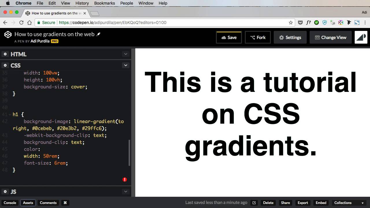
2. CSS Gradient on Text
Having a gradient on text is a great effect, though not wholly supported in a pure sense. Instead, we rely on the background-clip property (and its prefixed -webkit-background-clip friend), which is something of a hack but works very nicely.
We begin with a chunk of text (an h1 in this case) and apply a gradient to its background. The background-clip property, given a value of text, then removes the background from the whole block except for the area behind the text. The text color obscures the background of course, so we make it transparent in order to let the gradient shine through:
1 |
h1 { |
2 |
background-image: linear-gradient(to right, #0cebeb, #20e3b2, #29ffc6); |
3 |
|
4 |
-webkit-background-clip: text; |
5 |
background-clip: text; |
6 |
|
7 |
color: transparent; |
8 |
}
|
3. CSS Gradient Borders
Border gradients are something you might have seen on Envato Elements, and they’re a great way to visually spice up your UI. It’s subtly done, but take a look at the blue-to-purple linear gradient on these buttons’ borders:


To achieve this effect there are a couple of approaches. The first relies on us first giving an element (an anchor, a container, whatever) a transparent border. We then apply our gradient using the border-image property. Finally, we set border-image-slice to 1, in order that the gradient uses the full outline of the border.
1 |
.card1 { |
2 |
border: 5px solid transparent; |
3 |
border-image: linear-gradient(to bottom, #22c1c3, #fdbb2d); |
4 |
border-image-slice: 1; |
5 |
}
|
Here’s the result:
There are a couple of problems with this approach, however. Firstly, border-image isn’t universally supported in all browsers, most notably older versions of IE. Secondly, this approach won’t allow you to add border-radius such as you see in the Envato Elements UI. So let’s look at an alternative approach.
We begin by giving our div a position: relative. We then add a pseudo-element to it, giving that a negative absolute position of whatever we chose our border width to be (5px in this case):
1 |
.card2::after { |
2 |
content: ''; |
3 |
position: absolute; |
4 |
top: -5px; |
5 |
bottom: -5px; |
6 |
left: -5px; |
7 |
right: -5px; |
8 |
}
|
This will give us a solid gradient block covering the whole of our div. Adding a z-index of -1 will ensure that the gradient block moves to behind the div.
Next (phew, there are a lot of steps for this one) we add a border-radius to the pseudo-element equal to that of its parent (let’s apply 10px each). And then we give the parent a background of whatever we want; the same as the page background will make it appear transparent.
Finally, we once again turn to our friend background-clip, applying it to the parent and this time giving it a value of padding-box. This last action makes sure that the div’s fill runs to the edge of the border and no further.
So this final approach isn’t actually a border in the true sense, but it achieves the effect we’re looking for.
A third approach is possible, this time using box-shadow to achieve the effect. I recommend you take a look at Border-gradient mixin by John Grishin on CodePen to see how this works.
Accessibility Considerations for CSS Gradients
Using web gradients has the potential to impact the accessibility of your content. Here are a few ways to make use of CSS gradients while still ensuring your website can be accessed and used by the greatest number of people possible:
Understand and Implement WCAG Guidelines
The Web Content Accessibility Guidelines (WCAG) developed by the W3C are crucial for ensuring web content is accessible to everyone. These guidelines emphasize the need for web content to be operable, perceivable, understandable, and robust. Integrating these guidelines in your gradient design ensures that all users have access to the same information and experience.
Provide Fallback Styles
In instances where CSS properties like gradients are not supported by certain browsers, it's essential to provide fallback styles. This ensures that users with older or less capable browsers are not excluded. For example, you could use a solid color as a fallback for browsers that don't support gradients. The CSS cascade mechanism allows browsers to ignore unsupported styles and use the last available value for that property.
Use Accessible Text Over Images
When using gradients, especially over images, ensure that text remains readable. Techniques like using soft-colored gradient overlays and playing around with text styles and positions can greatly enhance readability without sacrificing aesthetics. For instance, positioning text outside of the image area or using contrasting colors can make the text more accessible.
Conclusion
So there you go! This primer on CSS gradients has given you the start you need, plus a look at how you can use gradients on the web. Whether you want to create a CSS border gradient, a radial gradient, or linear gradient, you hopefully have a better understand now of how to go about that.
If you’ve seen any other creative uses of gradients out in the wild please drop them in the comments section.
Useful Resources


- Web Gradients: A free collection of 180 linear gradients that you can use as content backdrops in any part of your website.
- UI Gradients: Beautiful colour gradients for design and code
- CSSmatic Gradient Generator
- PostCSS Autoprefixer
- Border-gradient mixin: by John Grishin
 By
By


