- Overview
- Transcript
3.2 Color, Spacing, and Typography
Welcome to lesson number five, where you’ll learn how to start creating your design system by tackling color, spacing, and typography. These are the fundamentals of any graphic design system.
Related Links
1.Introduction1 lesson, 01:50
1.1Welcome to the Course01:50
2.Design Systems3 lessons, 17:21
2.1What Is a Design System?09:13
2.2The Structure of a Design System04:00
2.3Types of Design Systems04:08
3.Creating Design Systems3 lessons, 21:06
3.1Design Tokens and Principles07:18
3.2Color, Spacing, and Typography08:08
3.3Going to the Next Level With Design Systems05:40
3.2 Color, Spacing, and Typography
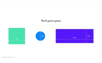
Welcome to lesson number five, where you learn how to start your design system by tackling color, spacing, and typography. I think the very first element you need to tackle is color, because color is everywhere. And it's a fundamental building block for any project. And if you're asking why it's so important, well, it's because every component in your project is made visible through color. Now when adding color to your design system, you can categorize it however you want. But a good idea would be to split it up in three categories, layout, UI, and semantic. Layout colors are used for the page layout. Borders, headers, footers, containers, and so on. UI colors are used for text, buttons and forms. And finally, semantic colors are used for elements or states with a certain meaning. Success, error, warning, information and so on. Now when you're creating these color palettes, there are two aspects you need to keep in mind. Number 1, name your colors in a clear and possibly descriptive way. So instead of referring to a color by its hex code, like #DCDOFF, refer to it by a more descriptive name, like lavender. How you name these colors is up to you, but it's much easier to discuss these with other people if they have names. Number 2, make sure your colors are accessible. That means that people with visual impairments will be able to use your product just like everyone else. And you might think this is not a big deal, but it is. Here's a fact for you. Globally, at least 2.2 billion people are visually impaired or suffer from blindness. The current world population is around 7.7 billion people. Do a quick math and you'll find that the percentage of people with visual impairments is around 29%. And I think that's a pretty big deal. Now the simplest way to make colors accessible is to add enough contrast. There are tools you can use to check this, for example, ColorSafe. You'll find the link in the lesson notes. Now to get started with the color palettes, you can follow this simple process. Number one, define the primary colors. These are the colors displayed most frequently and are usually tied to your brand. Number two, define the secondary colors. These are accent colors, really, not that frequent. Number three, define your tints and shades. So for every color, it's good to have a few variations. It doesn't mean you'll use all of them, but they're nice to have. Number four, define the neutrals or grays. These are usually made for text and backgrounds. Number five, define your semantic colors. These are usually red, green, yellow, and blue. But you can use various shades and tints to make them match your project. The second element you should tackle is spacing, and along with it, sizing. Sizing and spacing are core components of any design language. So you really need to pay close attention to this. There's a whole discussion on the subject on how big they are. We can probably make a full course on this, but for now, here are the essentials. When it comes to sizing, it's a good idea to use some sort of grid system or scale to define the measurement units. The 8-point system is very popular and very powerful. With this, you basically define your units and multiples of 8. And because 8 is divisible by 2 and 4, you make sure you don't get half pixels in your measurements. Therefore, avoiding anti-aliasing blur. You can also use a scale for your measurement units. This is also very popular because you can create a very nice rhythm. Each point in the scale is based on the previous one multiplied with a ratio. This is very similar to a typographic scale, if you're familiar with that. So those are a few tips on sizing, but what about spacing? Well, when you say spacing, you basically mean margin and padding. You can use the same eight-point system or a scale to define certain tokens for the various levels of margin or padding, like you can see in this example here. Now what about Versus REM versus pixels? Which one should you use in your design system? Well, I personally recommend REMs. I've been using them in most of my projects, and I like how flexible they are. So that's what I think you should do. But EMs certainly have their place, so do the pixels. If you want to learn more about when and how to use these, check out the lesson notes for an article by Kaz Bracey, where all of this is explained in more detail. The third component you should tackle is typography. And just like the header two, this is super important to any design language. The first thing is to include the typefaces. And for this, it's best you have a chat with the branding team to see which ones you should use. But if you're working solo, then try and figure out which ones align best with the brand that you're building for. The second step is to define the scale or the different font sizes you'll use. Here I recommend you use a modular typographic scale. And there are several tools that you can use to generate one, like archetype. Now I recommend you create tokens for the various font sizes you'll be using. It's not a great idea to use hard coded values for font sizes on different elements. For example, the Lightning system defines its font sizes as font size 1, 2, 3, and so on. Polaris names its font sizes display x large, display large, display medium, and so on, all the way down to body and caption. It's also a good idea to create tokens for the font weights. In CSS, you can specify font weights by their numeric value. For example, regular is 400, bold is 700, black is 900. Also, don't forget about the accessibility part for typography. And here are a few key points here. Always use font sizes bigger than 16 pixels. Don't use upper case letters for the entire body text. That's super hard to read. Use the appropriate line height for your text, because visually impaired people have a really hard time reading text with 100% line height or with very large or very big line heights, like 200 or 250%. And finally, make sure the colors you're using are accessible. So use the correct contrast there. Now, those are the first three elements you should include in your design system, color, spacing, and typography. But obviously, you don't have to stop there. So what else can you include in your system? Well, let's have a look at that in the next lesson.


