

- Overview
- Transcript
3.1 Images and Layout
Principle’s filename detection and canvas smart guides make it easy to transfer static designs into artboards. In this lesson we’ll walk through how to convert a static design of a mock “podcast publishing app” from Sketch into a scrollable, interactive version of the interface.
Related Links:
1.Introduction
1.1Course Overview01:00
1.2Introduction to Principle02:47
2.Principle Basics
2.1Interactions and Transitions03:04
2.2Custom Animations04:08
2.3Drivers and Keyframes02:49
3.Prototyping Interfaces
3.1Images and Layout07:54
3.2From Static to Dynamic07:00
4.Conclusion
4.1Conclusion01:21
3.1 Images and Layout
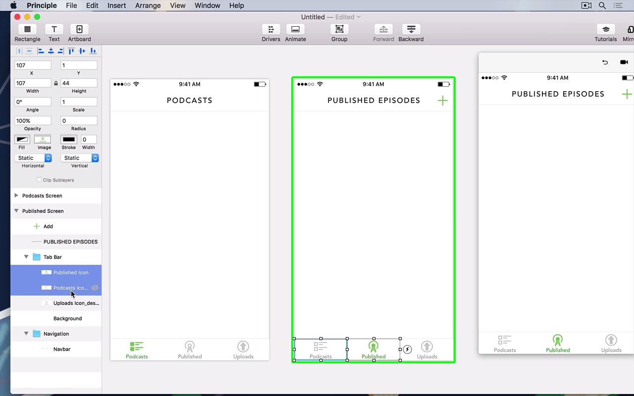
Now that we know how to use principle, let's put our knowledge to the test. Included in the short course are a few sketch files, go ahead and open them right up. They are mock design files of a podcast publishing app that I've designed. This is what it looks like, and you can see that it's a whole bunch of screens that we can turn into a more interactive prototype, right in principle. There are multiple views, views that we can animate in between using the transition between states. And you can see that the files are longer than a traditional iPhone screen. This is because we want our content to scroll so we can make our interface a little bit more interactive. To make it look as if we were playing with the real thing. So in case we've got our files here, we can just export i,t hit the export button up the top and make sure you've got export all. In this case, I'm gonna export it all to the desktop, that way I've got quick and easy access to it when I need to. Just do the same with the files that you've got right included with the short course. All right, so I've got my files here, in a place that's easy for me to access, it doesn't have to be the desktop. And to mock up our layout, as we did in sketch and principle, all we have to do is just drag and drop our items right into the principal canvas. Notice that even if our files are twice the size at two x, the retina file size, Principle is smart enough to detect the file name and scale the files accordingly. So right now we're just building the layout using Principle, by simply dragging and dropping. So I've done the navigation bar, now I'm gonna do the tab bar. By starting with the background, that is the background of the tab bar. And I'm gonna add the icons for the tab bar. In this case, the selected podcast screen icon for the tab bar. The unselected publish screen icon, just centering it using Principles smart guides. And finally, the uploads to bar icon, just like that we have mocked up or interface by simply dragging and dropping. So right now we've got a tab bar, we're gonna try and mimic the rest of the design. So let's tidy up our Principle file a little. A while back, I did mention something about making sure that every layer in Principle, has a unique name. In this case, this is what we're doing, we're tidying it up right now. So I'm going to group these files, and call it, tab bar. And group these ones and call it the navigation bar, or just navigation. That way we can refer to it when we need to, when we're scrolling through our principal design. All right, so let's now start designing the second screen. The layout's about the same. This time all we have to do is just duplicate it, because the layout's exactly the same. There's only a few things to change, like the title of the page, which we can just go into Navigation and then drop in the title of the page. Just like that, center it, by dragging and dropping using the smart guides. And finally, we're going to add the add button, this time on the screen instead of the other screen, as you would have noticed. What's great about this is that because we've just exported our assets, we don't have to stick to the original design. We can play around in Principle and see what we can do with Principle. So our design in Principle doesn't really have to be the same as the design we've done in the sketch file. So if you're following along with this video, feel free to do the same. Try and experiment and see what you can do. So right now I've adjusted the new icons for the tab bar and we're gonna clean this up again. I'm gonna call this the published screen. That way as we scroll through our layer list, we know which page in art board we're talking about. I'm gonna select these two and group them into a tab bar. So it's all nice and neat into a single folder. Finally, I'm gonna add these to the navigation bar so that our art board looks nice and neat. Just like that, we've got both of our screens. And clicking through each of them, we can see in our preview window on the left and on the right, sorry, that it's just scrolling through just like that. So let's reproduce the content that we've got here. As you can see, it's a whole bunch of items that we need to scroll through our view. To do this we can just drag and drop the assets that I've included in the source file. Go into the podcast folder, and then drag each of those little tiles in. All the tiles except for the last one called 2_empty@2x. So just like last time we just drag and drop. I'm using the keyboard to sort of nudge each of these shapes across so that they're nice and aligned. Notice here that when I move it across and drag it unwillingly into the art board, it sort of creates a new art board for me. This is great if you want to quickly prototype designs, but in this case, we're being meticulous and we want to make sure all our designs are in a single pane. To do this just structure thing that went out of the art board and then just drop it into the original art board. Until you see that blue border and then get to that green border, or just drop it into the art board and over the cross. Let's group our items, let's make sure they're aligned just like that. Before I group them I'm going to tidy this file up a bit. I'm just going to use the arrow piece to nudge it. Just to make sure a design looks a little bit more pixel perfect. Because you can see some of the borders on the top and bottom of each item sort of don't align, and they don't overlap correctly. So I'm just moving around with the arrow keys on my keyboard nudging it up and down just a few pixels up, so that they're nice and neatly aligned. Just like that, and those are items but we wanna scroll through our items so to do this let's do what we did earlier group it, change it to scroll vertically And we've got our design that can scroll. I'm gonna call this podcast scroll view, just to tidy up our layers a little bit, and there's our scrolling. But as you can see, it's not scrolling as we'd like to, it's scrolling a little bit too far, so we can just decrease the size of the group and we've got our content. But again, it's not very correct, because our scrolling is going above intended content. So we can just arrange it in layers panel to get exactly like this, just like that. As you can see, I have decreased the size of the group against that it doesn't overlap underneath the tab bar. So it only scrolls within that certain view. Next, let's do the same for this other screen. But I've done the work for you and all we've got to do is just drag the single page right into principle. You can of course do the same when you're doing your own designs. Now that we've got that done we can just group that so we can change the scroll view, call this published scroll view. I'm going to resize the group. Move it backwards that it's not overlapping the tab or. Change the scroll. Resize the group. Above the tab bar, and as you can see we've got content that now can scroll. If I move this a bit, we can now scroll. And just like that, we've mocked up our layout right within principle, exactly as we've got in the sketch file.


