


In this tutorial, I’ll show you how to use flexbox to create a responsive, multi-level, multi-column footer that sticks to the bottom of the page, no matter what.
What We’re Going to Build
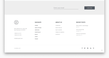
Here’s the demo we’re building. Check out the full screen version to properly appreciate its responsiveness!
Feel free to add some content to the <div class="container"></div> to see how the sticky aspect of this footer works too.
Flexbox is Great for Footers
Flexbox makes it possible to build flexible layouts that naturally adapt to different viewport sizes. Multi-level, multi-column footers are a good example of taking advantage of flexbox’s unique capabilities, specifically:
- the
flex-growproperty allows us to stick the footer to the bottom of the page no matter what, - the
flex-wrapproperty lets columns automatically wrap based on the viewport size of the user’s device, - the
justify-contentproperty makes it possible to display the columns in different arrangements (space-around,space-between,center, etc).
Once you’ve explored what flexbox can do for your footer layout, you’ll be free to get creative and see what is possible. Footers are the ideal place to help users continue on their journey; if they’ve reached the bottom of the page but still haven’t found what they were looking for, consider adding:
- Detailed navigation
- Calls to action
- Newsletter signups
- Social links
- Reassuring proof, such as awards, commendations, (genuine) privacy badges etc.
- Links for support or online help
- Branding
- Contact details
- Perhaps a reminder of your website’s personality to raise a smile or encourage the user that it’s worth hanging around


Footer Structure
Although it’s also possible to create a footer with CSS grid, flexbox lets us build multiple footer levels on top of each other, where each level wraps independently. The footer we will create in this tutorial has three levels, each of which is a separate flex container:
- main footer: four columns, with a newsletter signup form in the last column,
- social footer: six social icons centered on the page (this level won’t wrap),
- legal footer: three columns where the first two columns are positioned to the left, while the last column to the right of the screen.


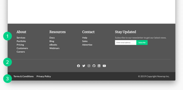
In addition, the footer will also stick to the bottom of the page—even when there isn’t enough content above it. We’ll achieve this sticky effect by making the entire <body> tag a column-based flex container.
1. Set Up the HTML
Let’s start with the HTML. I’ve placed all the content into a semantic <footer> tag and the three footer levels into three <section> elements. For the social footer, I’ve used Font Awesome icon fonts.
1 |
<body>
|
2 |
<div class="container"></div> |
3 |
<footer>
|
4 |
<!-- Footer main -->
|
5 |
<section class="ft-main"> |
6 |
<div class="ft-main-item"> |
7 |
<h2 class="ft-title">About</h2> |
8 |
<ul>
|
9 |
<li><a href="#">Services</a></li> |
10 |
<li><a href="#">Portfolio</a></li> |
11 |
<li><a href="#">Pricing</a></li> |
12 |
<li><a href="#">Customers</a></li> |
13 |
<li><a href="#">Careers</a></li> |
14 |
</ul>
|
15 |
</div>
|
16 |
<div class="ft-main-item"> |
17 |
<h2 class="ft-title">Resources</h2> |
18 |
<ul>
|
19 |
<li><a href="#">Docs</a></li> |
20 |
<li><a href="#">Blog</a></li> |
21 |
<li><a href="#">eBooks</a></li> |
22 |
<li><a href="#">Webinars</a></li> |
23 |
</ul>
|
24 |
</div>
|
25 |
<div class="ft-main-item"> |
26 |
<h2 class="ft-title">Contact</h2> |
27 |
<ul>
|
28 |
<li><a href="#">Help</a></li> |
29 |
<li><a href="#">Sales</a></li> |
30 |
<li><a href="#">Advertise</a></li> |
31 |
</ul>
|
32 |
</div>
|
33 |
<div class="ft-main-item"> |
34 |
<h2 class="ft-title">Stay Updated</h2> |
35 |
<p>Subscribe to our newsletter to get our latest news.</p> |
36 |
<form>
|
37 |
<input type="email" name="email" placeholder="Enter email address"> |
38 |
<input type="submit" value="Subscribe"> |
39 |
</form>
|
40 |
</div>
|
41 |
</section>
|
42 |
|
43 |
<!-- Footer social -->
|
44 |
<section class="ft-social"> |
45 |
<ul class="ft-social-list"> |
46 |
<li><a href="#"><i class="fab fa-facebook"></i></a></li> |
47 |
<li><a href="#"><i class="fab fa-twitter"></i></a></li> |
48 |
<li><a href="#"><i class="fab fa-instagram"></i></a></li> |
49 |
<li><a href="#"><i class="fab fa-github"></i></a></li> |
50 |
<li><a href="#"><i class="fab fa-linkedin"></i></a></li> |
51 |
<li><a href="#"><i class="fab fa-youtube"></i></a></li> |
52 |
</ul>
|
53 |
</section>
|
54 |
|
55 |
<!-- Footer legal -->
|
56 |
<section class="ft-legal"> |
57 |
<ul class="ft-legal-list"> |
58 |
<li><a href="#">Terms & Conditions</a></li> |
59 |
<li><a href="#">Privacy Policy</a></li> |
60 |
<li>© 2019 Copyright Nowrap Inc.</li> |
61 |
</ul>
|
62 |
</section>
|
63 |
</footer>
|
64 |
</body>
|
2. Define the Basic CSS Styles
Before getting started with the layout, let’s set up some basic CSS styles such as colors, fonts, and spacing. I’ve used the following style rules, however, you can use any other styling that matches your design.
1 |
* { |
2 |
box-sizing: border-box; |
3 |
font-family: ’Lato’, sans-serif; |
4 |
margin: 0; |
5 |
padding: 0; |
6 |
}
|
7 |
ul { |
8 |
list-style: none; |
9 |
padding-left: 0; |
10 |
}
|
11 |
footer { |
12 |
background-color: #555; |
13 |
color: #bbb; |
14 |
line-height: 1.5; |
15 |
}
|
16 |
footer a { |
17 |
text-decoration: none; |
18 |
color: #eee; |
19 |
}
|
20 |
a:hover { |
21 |
text-decoration: underline; |
22 |
}
|
23 |
.ft-title { |
24 |
color: #fff; |
25 |
font-family: ’Merriweather’, serif; |
26 |
font-size: 1.375rem; |
27 |
padding-bottom: 0.625rem; |
28 |
}
|
3. Stick the Footer to the Bottom of the Page
With flexbox, we can create a sticky footer with just a couple of lines of CSS. The code below makes the entire body of the page a flex container which is at least 100% of the viewport’s height (100vh).
1 |
body { |
2 |
display: flex; |
3 |
min-height: 100vh; |
4 |
flex-direction: column; |
5 |
}
|
6 |
.container { |
7 |
flex: 1; /* same as flex-grow: 1; */ |
8 |
}
|
The real trick lies in the addition of the flex: 1; rule to the .container element (which is above <footer> in the HTML). The flex property is a shorthand for the flex-grow, flex-shrink, and flex-basis properties. When it has just one value, it refers to flex-grow, with flex-shrink and flex-basis being set to their default values.
The flex-grow property defines what happens inside the flex container when there’s too much positive space (i.e. the flex items don’t span across the whole container). Its default value is 0 which means that all the remaining space will be equally allocated between the items. So, when we set flex-grow to 1, .container will get all the remaining space on the screen. At the same time, <footer> will get no extra space, so it will be automatically pushed down to the bottom of the page.
4. Line Up the Main Footer
Now, that the footer is neatly stuck to the bottom of the page, it’s time to line up the columns of the main footer.
The .ft-main element will be the flex container and the flex-wrap property will let the footer wrap into multiple rows based on the viewport size. To prevent columns being too narrow, I’ve also set a 200px minimum width for each flex item.
1 |
.ft-main { |
2 |
padding: 1.25rem 1.875rem; |
3 |
display: flex; |
4 |
flex-wrap: wrap; |
5 |
}
|
6 |
.ft-main-item { |
7 |
padding: 1.25rem; |
8 |
min-width: 12.5rem /*200px*/; |
9 |
}
|
The main footer doesn’t use any specific alignment properties on smaller screens. As a result, flexbox automatically aligns each column to the start of the main axis (which, in the default case, is the left of the screen).
However, on larger screens, it looks much better when space is allocated more precisely. So, I’ve set justify-content to space-around for medium-size and to space-evenly for large screens. When you are creating another footer layout, I’d recommend some experimentation with different values of justify-content so that you can see which one fits best with your design.
1 |
@media only screen and (min-width: 29.8125rem /*477px*/) { |
2 |
.ft-main { |
3 |
justify-content: space-around; |
4 |
}
|
5 |
}
|
6 |
@media only screen and (min-width: 77.5rem /*1240px*/ ) { |
7 |
.ft-main { |
8 |
justify-content: space-evenly; |
9 |
}
|
10 |
}
|
5. Style the Newsletter Form
The last column of the main footer contains a newsletter signup form which requires some extra attention. I’ve added the flexbox layout to the <form> element, too, so that the input field and the submit button will be neatly lined up on all viewports. Thanks to the flex-wrap: wrap; rule, the submit button will nicely slip below the input field when the viewport gets very small.
Besides, when the newsletter form wraps, there will also be some white space between the two elements due to the margin-top property set on the submit button. I’ve also added the same margin-top value to the input field so that flexbox will display it precisely next to the submit button on larger viewports.
1 |
form { |
2 |
display: flex; |
3 |
flex-wrap: wrap; |
4 |
}
|
5 |
input[type="email"] { |
6 |
border: 0; |
7 |
padding: 0.625rem; |
8 |
margin-top: 0.3125rem; |
9 |
}
|
10 |
input[type="submit"] { |
11 |
background-color: #00d188; |
12 |
color: #fff; |
13 |
cursor: pointer; |
14 |
border: 0; |
15 |
padding: 0.625rem 0.9375rem; |
16 |
margin-top: 0.3125rem; |
17 |
}
|
6. Line Up the Social Footer
Creating the layout of the social footer is relatively simple, as it’s just an unordered list of a couple of small icons. As the icons are really small, this footer level doesn’t need to wrap. The justify-content: center; rule aligns it to the center of the main axis at every screen size.
1 |
.ft-social { |
2 |
padding: 0 1.875rem 1.25rem; |
3 |
}
|
4 |
.ft-social-list { |
5 |
display: flex; |
6 |
justify-content: center; |
7 |
border-top: 1px #777 solid; |
8 |
padding-top: 1.25rem; |
9 |
}
|
10 |
.ft-social-list li { |
11 |
margin: 0.5rem; |
12 |
font-size: 1.25rem; |
13 |
}
|
7. Line Up the Legal Footer
The legal footer contains three elements: two links on the left and a copyright notice on the right. To achieve this layout, we can use the same flexbox trick as for the sticky footer. There, we have used the flex: 1; rule on the .container element, so flexbox allocated the entire positive space to it and pushed the footer to the very bottom of the page. Here, we can do the same thing.
Although .ft-legal-list is a row-based flex container while .container is column-based, we can follow the same logic. If we set flex-grow to 1 for the second column, it will automatically push the copyright notice to the right of the screen.
On mobile viewports, everything looks nice, too. In this case, flexbox displays all three elements below each other, aligned to the left of the screen.
1 |
.ft-legal { |
2 |
padding: 0.9375rem 1.875rem; |
3 |
background-color: #333; |
4 |
}
|
5 |
.ft-legal-list { |
6 |
width: 100%; |
7 |
display: flex; |
8 |
flex-wrap: wrap; |
9 |
}
|
10 |
.ft-legal-list li { |
11 |
margin: 0.125rem 0.625rem; |
12 |
white-space: nowrap; |
13 |
}
|
14 |
/* one before the last child */
|
15 |
.ft-legal-list li:nth-last-child(2) { |
16 |
flex: 1; /* same as flex-grow: 1; */ |
17 |
}
|
Check Out the Demo
And, that’s all; our multi-level, multi-column, responsive, sticky footer is done! Check out the demo again to remind yourself how it looks like at different viewport sizes:
Conclusion
Flexbox allows us to create complex flexible layouts with much less code than before. Using the techniques and tricks presented in this tutorial, you can create any footer layout you want, with any number of levels and columns.
The biggest advantage of flexbox footers is that you can use different wrapping, sizing, and alignment rules for each level. As a result, you can keep the footer completely content-aware without having to use JavaScript or (many) media queries.
Learn Flexbox Basics
Flexbox syntax is varied and often confusing! Even if you’re familiar with flexbox, it’s always worth reminding yourself of the basics.


 By
By


