Introduction
In this UI design beginners' course, you'll jump into Adobe XD and learn to wireframe a fictional app. We'll then add some design and pick some colors, and there'll be plenty of pointers and a bit of design theory sprinkled throughout. By the end, you'll know how to work on a user interface (UI) design project from start to finish.
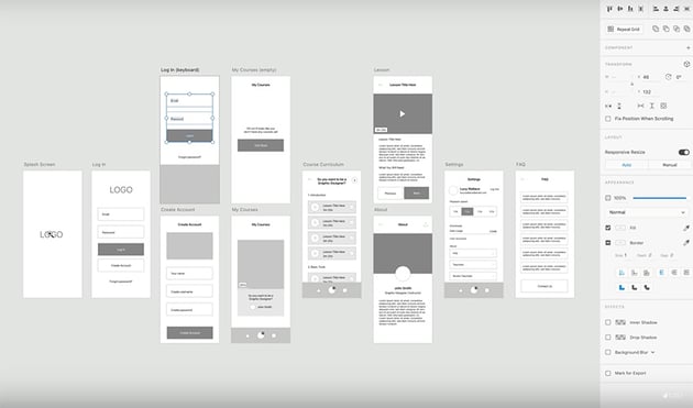
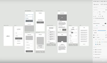
We'll start by opening Adobe XD, starting up a new document with screens sized for the iPhone 14, and creating a wireframe.
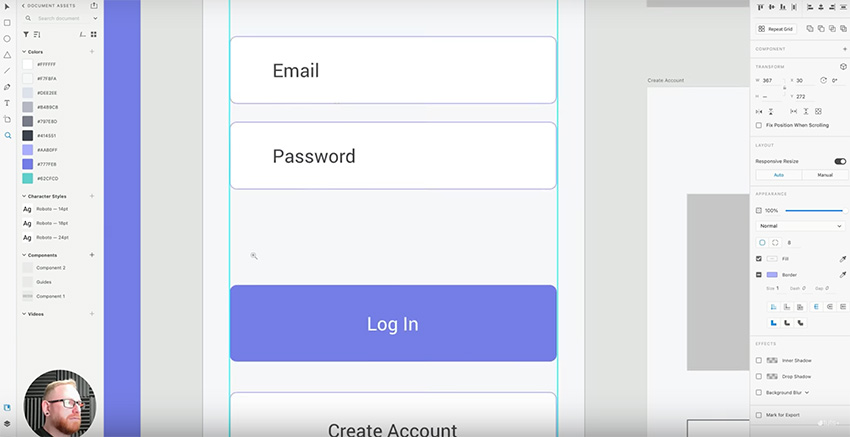
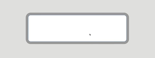
Here's the wireframe I've created:

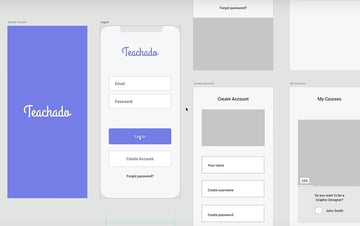
Now let's assume we've got sign-off from the client and can start adding some design to the app. Here's the same wireframe with some basic styling applied:


Watch the video to see more details of the design and styling at each stage of the process.
Sizing, Spacing, and Positioning Touch Targets
It's important to pay close attention to sizing and spacing when it comes to things like buttons or "touch targets" where users are going to tap or interact with the device.


These touch targets should be large enough that users can easily select them, but they should also be spaced apart enough so that users with chunky fingers like myself can easily select the thing we want.
Lastly, they should be placed somewhere within the UI where they can be easily seen and acquired by the user. For example, do you want the user to be able to use the app one-handed or do they need to use two hands? Get clear on things like this as early in the UI design process as possible.
Custom or Default Guides?
Using guides is essential to help you keep everything neatly aligned. There are a couple of different ways of creating guides. You can create your own "guides" component using lines, or you can use the default layout grid provided by Adobe XD.


Often I use components for guides because they give me more options for designing things just the way I want them. But in this UI design project, I'm going to use the built-in layout grid because the snapping is a bit more responsive. So if you want a complex grid, create it yourself, but if you just want basic guides to keep the horizontal margins consistent, then the default layout grid will work for you.
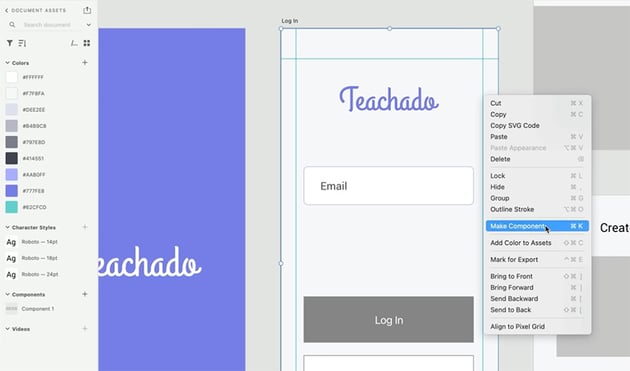
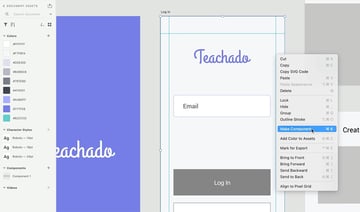
Building Your Own Collection of Components
You'll find that as you work on the project more and design more elements and icons, the process will gradually speed up because you're reusing those elements across different artboards.
I recommend creating components for frequently used items, e.g. text boxes and buttons. It can save you a lot of time in the design process. That's because if you change the styling of a master component, then all the other instances of that component automatically get updated too. So you don't have to go through and change each one individually.
To create a component, just right-click > Make Component or press Command-K.

Consistent Shadows and Light Sources
Drop shadows are a useful way to make your design look more realistic and give a bit more definition to the edges of a screen. However, one thing to consider is the direction of the shadow.
Here's an example of a subtle drop shadow separating the nav bar from the background in my design.

Have a Break! Make a Cup of Tea
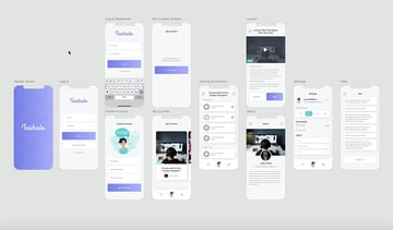
We're about halfway through the course now, and we've made a lot of progress on our UI design:


So let's have a break and make a cup of tea!


When you're ready, we can move on with the rest of the course!
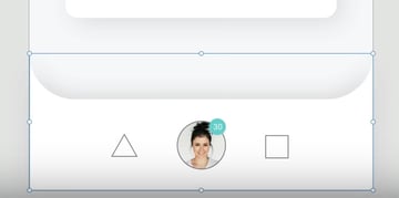
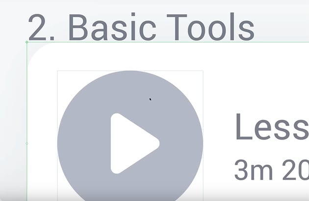
Judging Visual Weight and Alignment
As we add buttons and icons, one thing you may notice is that sometimes you have to judge alignment by eye instead of by the numbers. Consider this example:


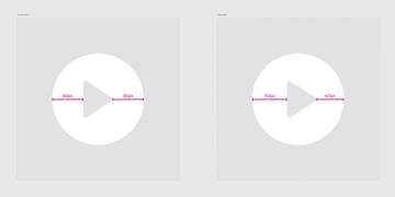
The play icon on the left is technically centrally aligned within the circle, with an equal distance of 80 px from the left and right edges. However, it looks off.
So in these instances, we have to eyeball it and judge for ourselves if the visual weight of the design looks centrally balanced. In this case, the icon on the left looks centrally aligned and is the better choice, even though the pixel values are different on each side.
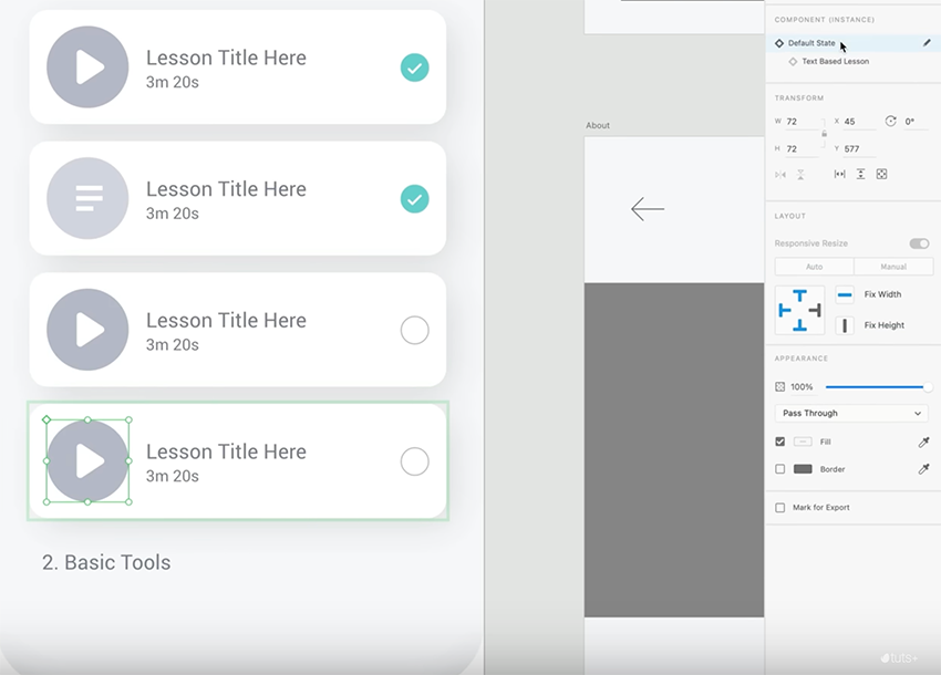
Another technique that can help when creating buttons and icons is to use the "state" property. Simply select an element and, in the toolbar on the right-hand side, click the plus icon and choose New State.

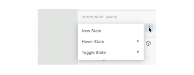

Then you can create multiple versions of the same icon with different formatting. For example, create one version of a box that's checked and one unchecked. Or create a video icon and a text icon. Then, it's easy to toggle between the different states in your design.


Align Text, Not the Bounding Box
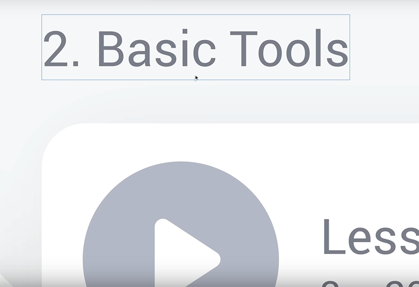
Something to be aware of when designing with text and objects is that sometimes your bounding box will be bigger than the text. For example, if I want this white box to be 20 px below the "Basic Tools" text box, I'll get the wrong outcome if I rely on Adobe XD to tell me how far away it is.
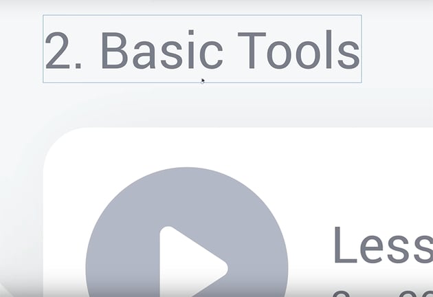
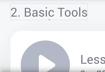
That's because it's measuring from the edge of that blue bounding box, not from the edge of the text itself. So to get the proper alignment, you need to manually move the box to line up with the edge of the text.


Then you can move it down 20 px from there (press Shift-Down Arrow twice).
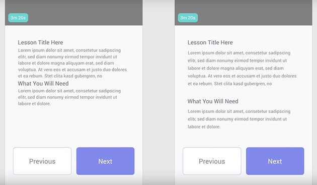
Proximity in Design
Another thing to keep in mind, especially when designing with text, is the principle of proximity in design.
In the example below, you can see what a difference this makes.
In the design on the left, you can see it's been done incorrectly: the relevant information is not grouped together, which can cause a user some degree of confusion.
On the right, you can see it being done correctly: the titles are paired with their related descriptive text, and there is a clear gap between separate pieces of information.


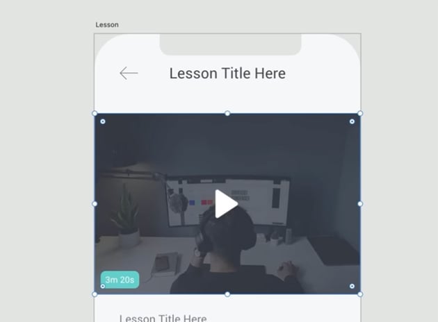
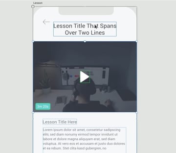
Designing for the Worst-Case Scenario
In general, it's good to consider the worst-case scenario when designing a user interface. For example, what if the final app has much more text, or long paragraphs that span multiple lines? It's best to design your app to accommodate these cases, instead of making it look good with small placeholders but then running into problems later on.
For example, I initially designed this header with the simple placeholder text "Lesson Title Here", but I decided to make it longer so that the design will also work with longer titles that run onto two lines. I had to move some of the other elements down on the page, but it works better this way.


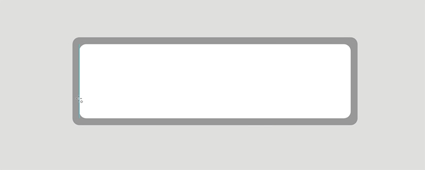
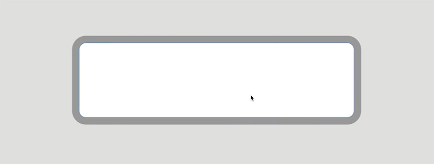
Matching Nested Border Radiuses
One detail that can help your design look more consistent and professional is to pay attention to the border radiuses of different elements.
This is especially important when you have a rectangle inside a rectangle, both with rounded corners. If the border radiuses are different, it can look slightly off.
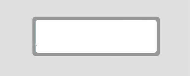
One way to get this looking better is to take the inner rectangle and draw a circle that fills the radius exactly.

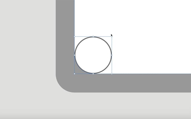
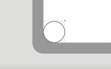
Then scale it up from the center using Option and Shift until it touches the other rectangle.
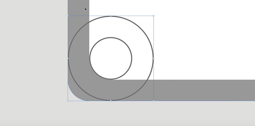
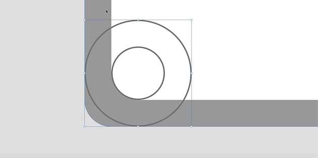
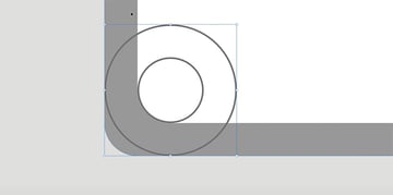
And then adjust the border radius of the outer rectangle so that it lines up with the circle.
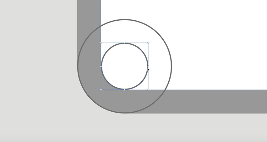

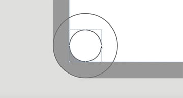
Now you'll have a rectangle with border radiuses that are consistent.
Now we can use the techniques we've covered in the course to add some more components to this design and make some final tweaks to get everything looking great. Here's the final result:


Remember you can check the video for more detailed instructions on each stage of the design. Now, that wraps up the course! We've covered a lot of different techniques for UI design in Adobe XD. I hope you can now take everything you've learned and apply it to your next creative project.
What do you want to learn next? Check out more UI design tutorials here on Envato Tuts+:

 What is Adobe XD?


 How to Create a Hotel Booking UI Design in Adobe XD


 How to Create a Finance App UI Design in Adobe XD

 How to Create a Music Player App UI Design in Adobe XD

 20 Best Premium UI Kits for Adobe XD and Figma


 12+ Best Adobe XD Wireframe UI Kits for Designers (2024)

Or watch one of these excellent videos from our YouTube channel.