

- Overview
- Transcript
2.3 Variants
Not every component or element is going to look the same all the time. In this lesson, you will learn the RSCSS way for creating variations of existing components and elements.
Related Links
1.Introduction
1.1Introduction00:52
1.2What Is RSCSS?02:14
2.Components and Elements
2.1RSCSS Components and Elements03:35
2.2Styling Components and Elements09:11
2.3Variants07:20
2.4Positioning Components06:24
2.5Nested Components07:44
2.6Nested Variants06:02
3.Other Considerations
3.1Creating Helper Classes02:57
3.2CSS File Structure02:15
3.3Using the Inverted Triangle06:49
3.4Planning Out Your Site07:11
4.Conclusion
4.1Final Thoughts00:44
2.3 Variants
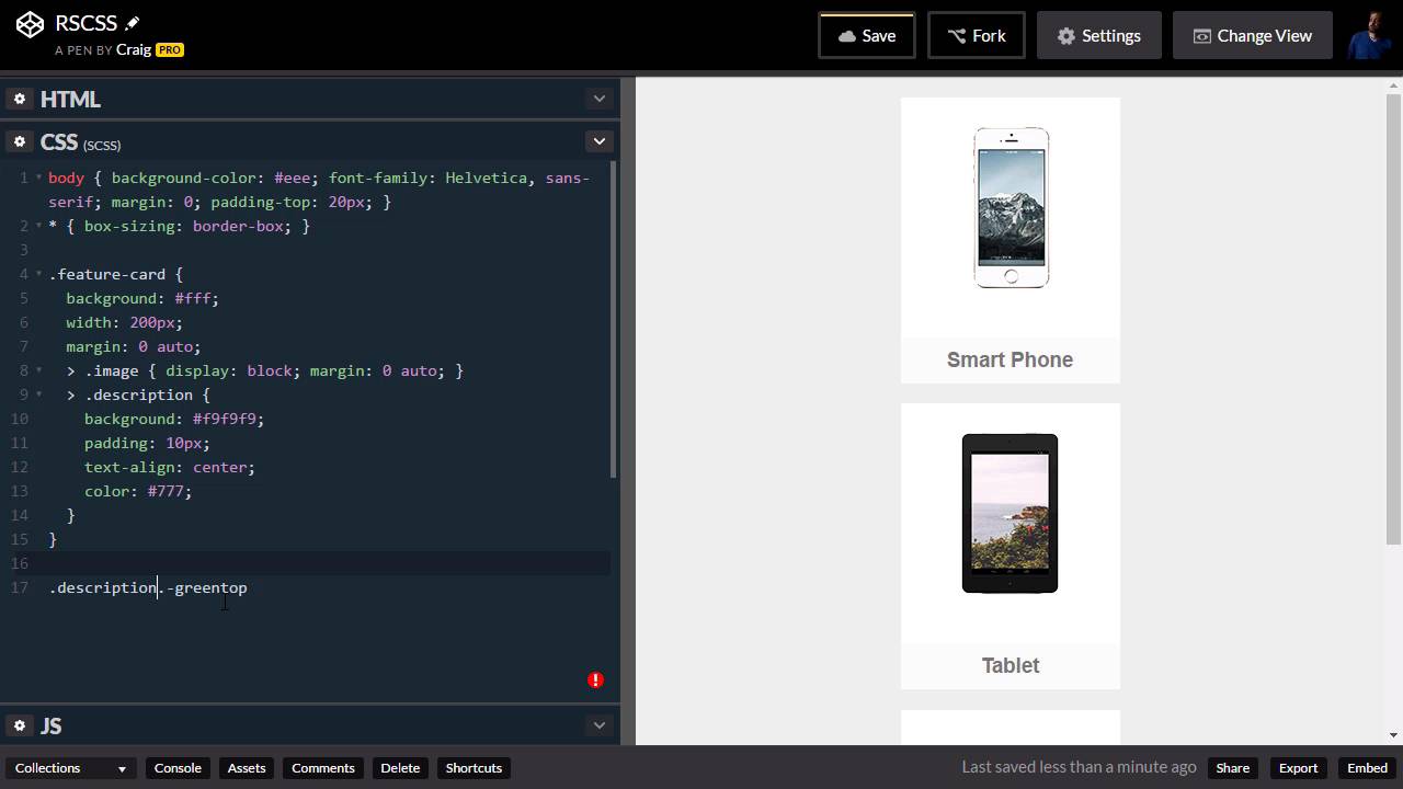
Hello and welcome back. In this lesson we're gonna talk about using variants with RSCSS. Sometimes you may have a component that you're reusing in several places throughout your site. But they have slight variations in them. Maybe the text color, the description color is a little bit different. Maybe the background color or border color is different. Maybe it's a different size, and it needs to be styled differently when it's at a different size. Either way, for small changes like this, you don't wanna have to create a whole new component in order to make it work. Instead, we wanna use a variant on a component. And RSCSS provides a very simple way to do that. So let's take the component that we created in the last lesson. We're gonna pick up where we left off, and you can find our starting pen here in the course notes for this lesson. Once you've opened up that URL, go ahead and click on Fork to create a new copy of it. Or, if you're still working with the file that you ended with in the last video, you can just continue using that one. So I wanna take a look in this video at a couple different variations on this component that we could create. So I'm gonna create two more copies of it in our html. I'm just going to copy that, paste it twice, and then just to add some variety, I'm going to put different images in these. So our second one is going to have an image of a tablet, there we go. And our third one is going to have an image of a desktop computer. And, there we go. Okay, so that's not our variant, that's just changing out the source attributes for images. For the variation let's say that for one of our variants we wanna add a colored border to the top. So we're gonna leave our original one alone, and then for our second component here, our second instance of that component, we're gonna add a colored border to the top of the footer. Now our footer is just this H3 with a class of description. And first of all, let's change the text on these as well, so we're not confusing ourselves. Our second one is a tablet, And our third one is a desktop. There we go. So for our tablet, let's say again that we wanna create a variation where it has a top border that is green, for example. And we might have a couple of different colored borders that we would use there. So the idea behind naming these variants in the RSCSS system, is you would start the name with a hyphen. Generally, these variants would only have one word, but again, if you need more than one word, that's okay, just squeeze them together and don't put any hyphens in between them. So we have our H3 with a class of description here, I'm gonna add a second class and I'm gonna call it greentop and the reason why I'm calling it green is because maybe we want some text that we want to change green later on or something like that. So instead, I'm gonna call it greentop to indicate that we're going to add a top border on it that's gonna be green. So let's expand our CSS here and let's take a look at how we would do that. So since this green border that we're gonna add does not really depend on it being part of this feature card, we can create a new rule for it down below. And so the way we would do this is first we would point to the element that we're discussing, which is the description element. And then we would simply add our second class here, which is .-greentop. Now you'll notice that there's no space here, because we're not looking for the greentop variant inside the description. We're looking for a description that also has a class of greentop. So there's no space there. And then we can apply our rule. So here we will use the border-top property. I'm gonna create a 4 pixel solid border, and I'm gonna give it a value of 47a951. And now we can see that our second component here has that variant applied to it. Now this is how you would do it with regular CSS, but again we're using Sass here, so we can make this a little bit simpler. By nesting it inside that description rule. But, instead of just saying .-greentop, we need to use the ampersand here to indicate that this the same element here as this, it is not a child element but it is the same element. So we need ampersand dot hyphen greentop and by messing it this way, we can do something very similar with other colors. So we could have hyphen bluetop and we could have something similar here bordertop, four pixels, solid, either we use this still blue color here. Then we can do something similar again with the redtop. So again we'll just using the same border with the different colors. So four pixels solid and then the red one would be A94751. And we gotta use the right symbol there, there we go. And all we would need to do is to jump into our HTML and change that class, so here we have greentop. You just change that to red top and it would change the color of that border. Or again, we could do blue top and do it that way. So that's pretty straightforward. Let's go ahead and do one more example of a variant. We've done a variant on an element. But you can also do variants on a component. So let's say we want our feature card, maybe we want a rounded version of that feature card. So we would create a variant name co- rounded, so hyphen rounded and then we can jump into our CSS and make that happen. And this is going to be the last one down here at the bottom. So we have our future card rule here, we have our children of that future card and maybe below that children we can add our variant here so ampersand dot and then -rounded and we can just set a border-radius here. And let's try eight pixels. And you'll see it rounds the corners. Now you'll see it didn't rounds the corners of our footer, so we will need to do a little bit more here. So we'll just nest this rule inside. And we will say .description. And then for the description inside those rounded items we would also have a border-radius Of eight pixels. But we don't all four to be rounded. We just want the bottom left and bottom right. So we might be more specific here. Bottom left radius, eight pixels. Copy that. And then we'll change the second one to bottom right radius. And there we go, now we have a rounded version of that same item. So those are a couple of different examples of of using variants in RSCSS system. Thank you for watching and I'll see you in the next lesson.


