

- Overview
- Transcript
2.2 How to Achieve High-Performance Animations
To achieve high-performance animations, we must do two things: animate properties that are animation-friendly and use hardware acceleration.
Let’s dig a little deeper.
Related Links
1.Introduction
1.1Welcome to the Course01:31
2.Web Animation Performance
2.1An Introduction to Web Animation Performance04:46
2.2How to Achieve High-Performance Animations24:44
2.3How Browsers Work Behind the Scenes04:17
2.4How to Measure Animation Performance10:33
2.5CSS vs. JavaScript Animations06:42
2.6A Simple Example of Animation Optimization09:48
2.2 How to Achieve High-Performance Animations
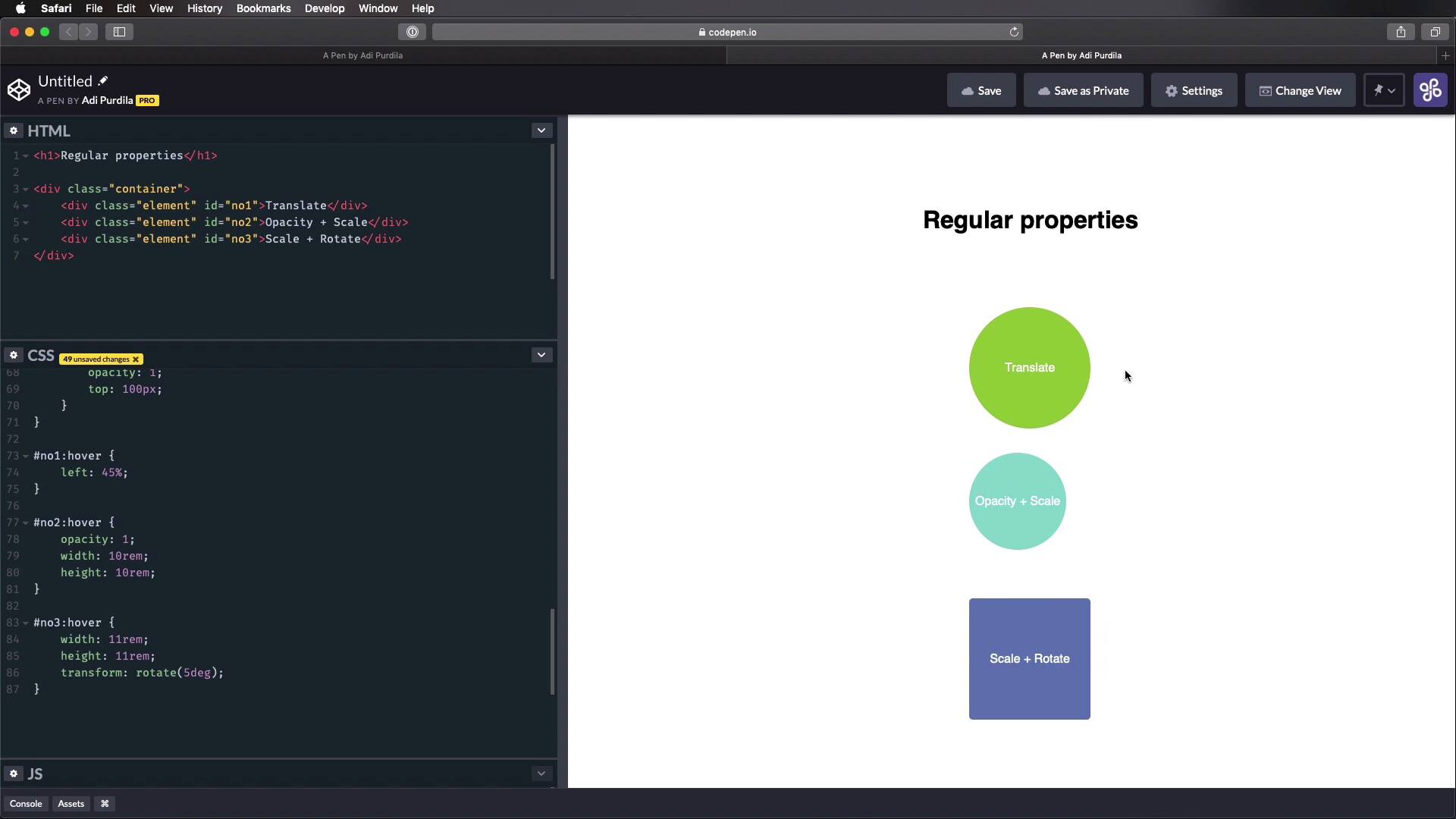
To achieve high performance animations, we must do two things. Number one, animate properties that are animation friendly. And number two, use hardware acceleration, so let's dig a little deeper. So what's up with these animation friendly properties? Well, they are CSS properties that are actually optimized for rapid changes and screen updates. They're also called composite layer properties, and you'll learn why they're called that in the next lesson, where we take a look under the hood and see how browsers work. For now, the animation friendly properties are transform, opacity, and filter. And the browsers can animate these really efficiently. Now, you might think that's pretty limiting, only being able to animate stuff with these three properties, but actually, you can do a lot with them. Transform allows you to change the position using translate, change the size using scale. And also rotate, skew, and apply a perspective using the respective values. Opacity allows you to change an element's transparency, which can be really useful sometimes. And filter, you can add various effects like shadows, color corrections, glows, and more. So as you can see, not very limiting. The benefit of using these properties is that the browser has to do the least amount of work, and that means it's not taxed as much. And it can reach that 60 FPS standard more easily and also do it more consistently, and that results in smoother animations. Now let's see an example of how you can use these properties to animate an object. I prepared a simple demo for you here. It's a simple HTML page with an h1, a container, and inside the container, we have three elements. And we're gonna apply some different effects to each of these elements. Here, I have some demo styles, they're not really important to our demo, I'm just setting some colors, some initial styles. So let's start actually with the h1, and I wanna do an animation where it just slides in from the top and changes its opacity. So I'm gonna say h1, first, I'm gonna do a transform, translate y, that means translate on the y axis or vertically. I'm gonna say 100 pixels, and that will give me my final position for this h1. Next, I'm gonna create the key frame animation. I'm gonna call it slideIn, and I'm gonna have it execute over one second. Next, let's go ahead and create that animation, so keyFrames slideIn, so at zero, I want this to start with actually zero opacity. And also, I wanna push it somewhere on the top outside of my viewport. So I'm gonna do a transform again, translate y, and I'm gonna say -500 pixels. So this is just gonna push it outside. Now I want to add an intermediary step here. So I want it to come a little bit further down and then just bounce right back up in its final position. So I'm gonna add another step, let's say at 50%, I'm gonna do a transform, translate y 200 pixels. So that currently looks like this, so that's pretty good. And finally, we can add 100% and we can set the opacity to 1. And also transform, translate y, and let's just set this in its final position of 100 pixels. Right, so that's my animation for this h1, as you can see, very simple, we just use a keyframe animation. We defined the duration, but we can also define a delay, the number of repeats, the direction of the animation. Currently, this works just fine, now, let's see about these other elements. When I target the number one, and I'm gonna do an animation on hover. All right, and I'm simply gonna say transform again, translate x 2 rems. So that will basically do this, whenever I hover it, it's gonna move it to the right by 2 rems. And one other important thing to note here is that, on these elements, I actually have a transition set that allows me to achieve this nice animation. Because without the transition, it would just be a sudden change, see. So adding the transition there will actually create the animation. And here, I'm actually transitioning all properties, but you can specify which ones you want to transition. For example, if you want to transition the transform, you would do it like this. And if you wanna transition, maybe another one, let's say opacity, maybe 0.2 seconds, you can do with like this. For me, I'm just gonna keep it real simple. Let's move on to the next one, opacity and scale, it says here. So let's say number two on hover, we're gonna do opacity 1. Because by default on number two, we have an opacity of 0.5 set, and a transform: scale of 0.8. That means this is by default scaled down to 80%. So we're setting the opacity to 1, and transform scale will bring it back to 100%. So the animation looks like this, see how smooth that is, very nice. The next one, we have scale and rotate, so let's see, we have number three on hover, transform, we'll do scale 1.1. And let's also add a rotate in here, you can add multiple transformation, let's say 5 degrees. Okay, so now this scales up to 110%, and also rotates 5 degrees clockwise. So that's how you can use transform and opacity to create elements. And because these are animation-friendly properties, the browser will have a much easier time creating animations with them. Now to see the other side of the coin, I'm gonna create a quick demo with the same elements here. But I'm gonna animate other properties to achieve roughly the same effects. And I'm gonna animate stuff like top, margin, width, and stuff like that. So let's create a new pen here, and I'm just gonna do a quick copy and paste on the HTML. And the generic demo styles that we use. These are a little bit different than what you saw before, because my elements are now positioned absolutely on the page. And I'm doing that so I can achieve roughly the same layout as before. And on each of them, I'm setting top values, and I'm setting width, height. So let's scroll over to the Animation related. And let's animate the H1. So H1, we'll start with that. Let's set a position to absolute, and let's also set a top, one of the pixels and left at about 40%, put it roughly in the middle. And then I'm gonna say animation, same title, slide in one second. Let's create that animation. We're gonna set its opacity to 0 and the top to -200 pixels. That should do the trick. Okay. Next 50% Let's set the top to 200 pixels. And finally 100% we're going to set the opacity to 1 and the top two 100 pixels. All right, so this is how it looks like, the same animation basically, but with different properties. Let's do a, Quick refresh here. This is our optimized animation. And this is our unoptimized animation. So it looks, you know, roughly the same, but the reality is behind the scenes, the browser has to do way more work to make this happen. Now, let's move on to the next and we'll target #1:hover. And here we're just gonna specify a left of 45%, because by default it's set 40%, Right? I don't know if you can notice it. But already on this computer the animation is. I'm definitely not getting 60 FPS here compared to this. Maybe my screen recording software or The final video that you see won't be at 60 FPS, it will probably be around 25 FPS. But from where I'm standing, this is silky smooth, and this is a bit jagged. Maybe you can see that on the video as well but you'll find links to these pens on in the lesson notes so you can check them out for yourself. Let's see about the next example here number two. So number two, we're gonna set the opacity to one and instead of using scale, we're gonna manually set the width and height. It starts at 8 rems and we're gonna bump it up to 10 rems. Right? And here it is. And finally, on the third example Well sort of width, slightly higher than what we had initially. And also here we're gonna use a transform rotate, because I don't know of any other properties. And our property in CSS that will rotate apart from transform, so, that's fine. But here, it's the same thing. These silky smooth, all of them, these, not so much. And I'm able to see that with the naked eye without even opening up a measuring tool. So the approach that you saw me take here on the second pin, I'm calling these using properties that are unoptimized or regular properties, this is something you should avoid. Right? So animating margin, padding top, left, right bottom with height. You should avoid animating these. And there are a few good reasons for that. First of all, every time we change the value of these properties right, like width height, the browser has to calculate how the new values affect the layout of the entire document. Now, imagine changing those values like 60 times a second. Can you imagine how many or the amount of calculations the browser has to make, and this is simple page, right? I just have three divs in it, but imagine like on a full webpage with text and containers and other elements in it. Calculating or recalculating the position of elements is actually one of the most expensive operations your browser can do. And I'm talking expensive in terms of resources. Now, it's totally fine to use these animations, to use these properties, excuse me, on load. All right, so when you're setting their initial styling, that's totally fine but not in an animation. Now, there are cases where you can't just be limited to these three properties. Like for example, what if you want to animate. The change in text color, background color or for some reason you want to animate the margin or the padding. Well, if you have to do that, go ahead and do it. That's totally fine. Just be aware of the impact that's going to have on your performance overall using these. Let's say non-optimized properties should be kept to a minimum but it doesn't mean that you can never use them ever again. Right? Just as I said, be aware of the impact it's going to have on performance. Now that concludes the first part, right? Use animation friendly properties. The second part is use hardware acceleration. So what does that mean, use hardware acceleration? Well, it basically means offloading some tasks to the GPU instead of the CPU, okay? It goes like this. Every computer and device you can use to load a web page has a CPU or a central processing unit. And a GPU or a Graphics Processing Unit. We know them casually as the processor and the graphics card. Now, in your reality, the graphics card is just another type of processor, only more optimized for visual and graphics heavy operations. If you remember from the previous lesson, the browser has to do a lot of things. To render a page, right it has to do a DNS lookup, an HTTP request and then has to render HTML, execute JavaScript, and so on. Now, all of this is executed by the CPU, okay? The processor. Now wouldn't it be better if the visual parts of this process are handled by the GPU? It would make sense but in reality, that's not what happens. At least, not unless we specify it. So, that's what I mean by hardware acceleration, okay? It means, delegating certain tasks to the GPU instead of the CPU. So, by offloading some of those visual, I mean graphics intensive tasks to the GPU which by the way, is more suited to handle this type of work. We're taking a lot of stress away from the CPU, which is not gonna get bogged down with these expensive operations and it's gonna be able to do its thing. Which is to render a webpage, execute JavaScript and all the other expensive stuff. So that will lead to an increase in performance. Now, how do we use this hardware acceleration? First, we have to use the animation-friendly properties, transform, opacity and filter. And you should do that because the browser will automatically hardware accelerate the transitions or key frame animations on these properties. Now to demonstrate that I'm gonna show you a quick example in CodePen. So, let's say I have an element here in the HTML and that's all the HTML we're gonna need really. And let's do some very simple styling like adding padding on the body, and the elements. Let's do a background color, width, height, and then I'm gonna add the transition to it, and I'm gonna transition the transformed property over, let's say, 0.3 seconds. Okay, so now, the element on hover, I'm gonna say transform, I'm gonna say translate 3D. Since I mentioned this properly, I might as well show it to you 20 pixels on the x-axis, 0 y, 0 z. Okay, so now, I have a simple animation, right? Now, I chose Chrome here for a reason. And that is the excellent diagnostic and measuring tools it has. Now, I'm gonna open up the inspector here. And actually what I'm gonna do first is go to a light view cuz I just want this page to be loaded. So I'm gonna inspect it and open up the diagnostics tools we need. Make sure you have your console opened, if don't press escape. And then go down here where it says rendering, click that. And now you have a couple of options. You have an FPS meter, which is gonna show you a handy FPS meter here. It's gonna give you a real time FPS count. But also, the stuff we're interested in is layer borders. So, this will add borders around all layers and tiles in the page. And it's very helpful to see when the browser creates compositing layers. And these are used for animations and these will eventually be sent to the GPU. So, if we hover now, on this element, see how we got that orange border? So that basically means that this element is now pushed in its own compositor layer. And these compositor layers are being handled by the GPU, which is fantastic. But notice that, if I activate paint flashing, and this basically will paint the page or the region's green whenever there is a new paint event going on. So if I hover on this, see how it changes and it flashes green. And also, I don't know if you can see it, but my page briefly flashes green. And that is because once the animation starts or it ends, it basically moves that element from its own compositor layer back to the outer layer here. And that triggers a paint. And that's not really something we want to do, because paint is usually the most expensive operation a brother can do. So to prevent this from happening, here's what we can do. We can use the will-change property, and it goes something like this. We go to the element, and we'll say, will-change. And we tell the browser, hey, this property is gonna change. Then the browser will be able to make the necessary optimizations to prepare for that. So now if we do a refresh, you'll notice that even from the start, our layer here or our element is put in its own compositor layer. And it's there all the time even before or after the animation. And notice that I am not triggering the paint event anymore. So that expensive paint is not being applied anymore to the page, which is fantastic. So that's how you can use the will-change property. You put it on the element, and you specify which property you will change. Now, you can also put it in auto and let the browser figure things out. But it's better if you specify the property directly. So this and a combination with animating the correct properties will ensure that you have high performance animations. You can use or you can create animations without will-change and they'll perform very good. What will-change is actually just the cherry on top. It really takes things to the next level. Now, the will-change property is great, but we actually have to be very careful not to overuse it. We must use this property only where it's needed, only on the elements that we know will change often. Because if you use it all over the place, this will actually negate any kind of gain that we will get from it. Because by using will-change, all of these compositor layers will be created for all of these elements, and that will be a huge load on the GPU. So, the fact that we're using it like this will actually be worse than not using it at all. So, just be careful on where to use it. Just as I was saying, just by using these hardware accelerated properties is a huge gain. Using will-change is optional but it can help. Also bear in mind that this property is fairly new, so not all browsers support it, as you can see from this chart. If you're targeting non-supporting browsers and still want to benefit from hardware acceleration, you can use the translateZ hack as you can see here. And this will basically use a 3D transform to force a new layer. So to sum it up, never animate top, left, right bottom margin padding with height, unless you absolutely have to. Instead use the animation-friendly properties, transform, opacity and filter. Use will-change, the will-change property on the elements that you know will update or will change often, but don't overuse it. So, now we know how to create silky smooth animations. But to understand this even further, we need to understand how browsers work under the hood, and we're gonna take a look at that in the next lesson.


