

- Overview
- Transcript
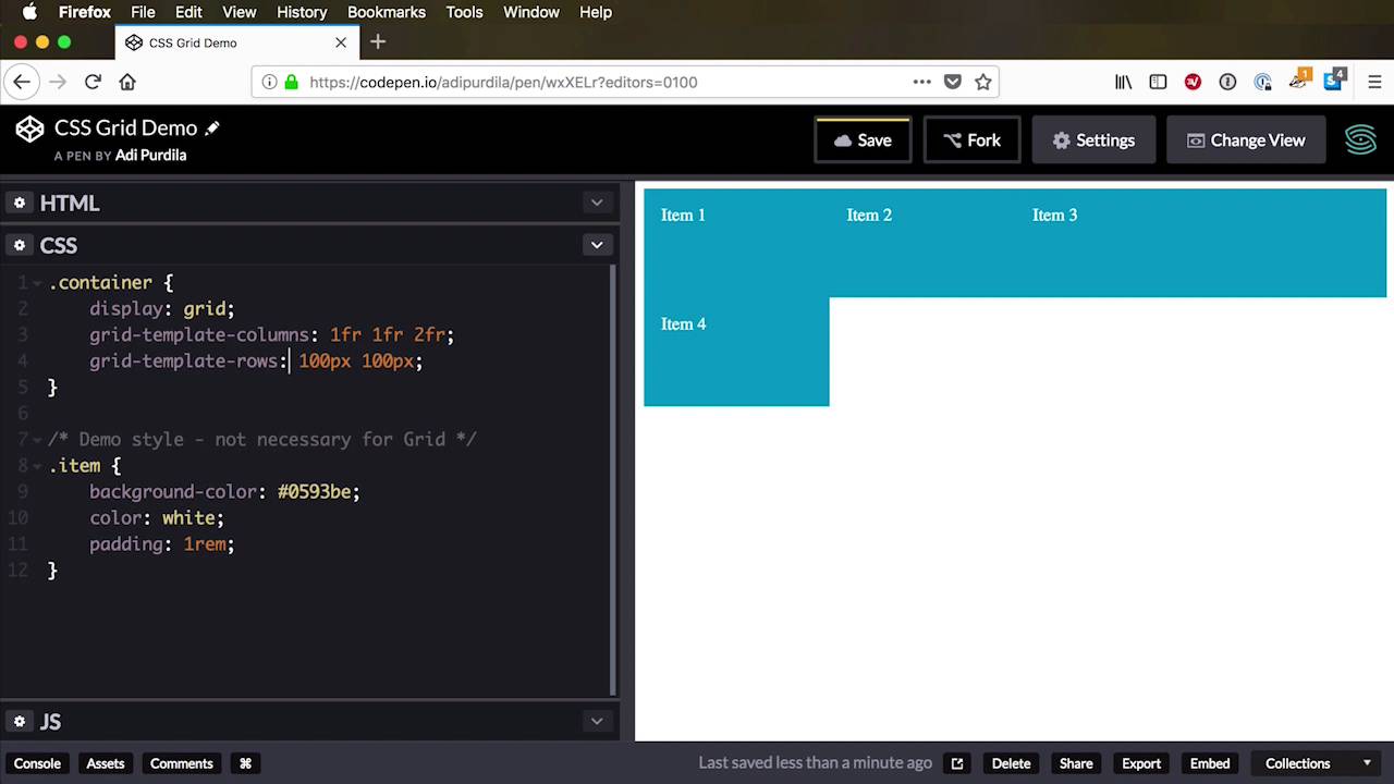
2.2 Defining Rows and Columns
Once you’ve defined a grid container, you need to define the rows and columns. If you remember the terminology lesson, you’ll recall we talked about “tracks”, right? A track is the space between two adjacent grid lines. So if it’s the space between row line 1 and line 2, then that track is a row. If it’s between column line 1 and column line 2, then it’s a column.
The row and column definition is applied to the grid container—let’s take a look.
2.2 Defining Rows and Columns
Once you define a group container, you need to define rows and columns. If you remember from the terminology video, we have tracks, right? And a track is the space between two adjacent grid lines. So, if we're talking about the space between column one or column line one and column line two, then we have a track that way, vertical. If we're talking about row line one and row line two, that space between those row lines is another track, it's a row, it's horizontal. So the column and row definition is applied to the grid container in CSS, and it goes something like this. We start with the columns or the rows, it doesn't really matter. Let's do the columns first, grid-template-columns. And then in here, you will basically define how you want your columns to look like. And you do that with a list of items separated by a space. So if I were to say, I want 3 columns each of 100 pixels in width, I would do this. 100 pixels, 100 pixels, and 100 pixels. And there's a little typo here, and there you go. We now have 3 columns, each a 100 pixels in width. Now we have four items and grid use something called the auto-placement algorithm. We'll cover that in the next lesson to place the four item in the next row. Now currently, the rows have an automatic height. But what if we want to set a different height to them? Well, we can do that by using grid-template-rows. So depending on how many rows we want, we do the same thing. We create a list with the items separated by a space. So let's say we want two rows. All right, so let's say 1 row should be 100 pixels in height and the other row should be 200 pixels in height. Okay, so now we have 2 rows, 1 that's 100 pixels in height and the other that's 200 pixels in height. And that's the easiest way to define rows and columns within the grid. Now if you want a shorthand notation for these two, there is one, it's called grid-template. And it basically goes grid-template-columns, and grid-template-rows. And you would replace these with the actual values that you want. So, excuse me, it goes rows then columns, so it's the other way around. So for example I would replace grid-template-rows with 100 pixels, 200 pixels. And I would replace this 100, 100, and 100, and it's exactly the same as doing these 2 independently. So you define rows first, columns after that. Now, I'm gonna use the normal code here just to make things a bit clearer. Now, what kind of units can you use when defining these rows and columns? You can use pixels, as you saw. You can use percentages, so if you want, for example, two columns each having half the available width. You would say 50%, 50%, and that would create 2 equal columns in width. Same goes for rows, you can use other units here as well. So for example, you can use view port height to get the height of the veiw port. So we can say something like, I don't know, 25 view port height and 75 view port height. So the first row will be 25% of the view port height, the other will be 75%. You can ems, you can use rems. Also with grid you can use a very cool new unit called fr or a fraction. And it's basically refers to a fraction of the available space. So here's how it works, let's go back to our columns here. And I'm gonna say 1fr, and 1fr basically means, take a fraction of the available space. And because we just set one column, that column spans the entire available space. If I were to say 1fr, 1fr, then the browser calculates, well, let's see how many frs we have, how many fractions. We have two fractions, yeah? 1fr plus 1fr equals 2 fractions. So, we split, we divide the available space in two. And the first column receives one fraction of that space, which is half and the second column receives another fraction. I can say, for example 1fr, 1fr, 2fr. So, what happens now? The browser calculates how many fractions we have. 1, 2, plus 2 equals 4, so we divide the available space in 4, and we get the width of a fraction. So we applied that width to the first column, which is 1fr, to the second column, again, which is 1fr, and to the third column, it has 2 fractions. So we get that one unit, and we multiply it by 2. And we get the width of the third column, which is also great. So that's the fr or fraction unit. Something else that's really cool about the whole grid syntax is the repeat function. So let's say for example, that for your rows, let's say you want to have two rows, that's are 100 pixels each, right? Well, instead of repeating yourself like this you can simply say, repeat. The first parameter is the number of repetition you want to and the second parameter is the value you want to be repeated, 100 pixels. So this is exactly the same as saying 100 pixels, 100 pixels, yeah? It's exactly the same. If you have three values like this, so you have three columns, you'd simply change the repeat here, and it does exactly the same thing. So if I were to have a funky layout like this 1fr, 1fr, oops. Right? So we have this layout where we define five columns each with 1fr. Well, I can replace this syntax with, repeat(5, 1fr) and it does exactly the same thing. Now I wanna show you something cool and this is a tool inside Firefox. I’m not sure if Chrome or the other browsers have it. Let me just change the view here to a full page for example and we’re gonna Inspect this grid. Now by default Firefox has, A grid inspector. So if you go to layout, we have the div container that's defined right here. I can also click on this little target icon and it takes me directly In my source code. And it also shows me a label here where it says grid. With this label, I can immediately see that my element is defined as a CSS grid. And you can also see a representation right here on the left. Well, what's nice about this inspector is that I can turn on the overlay grid and this is so cool. I can display the line numbers, I can display area names. We haven't really talked about area names, but you can do that if you want. And we can also get a representation of the grid right here. So currently, we have it defined as five columns, and let me just open this in the editor mode so we can make some changes here on the fly. So I have defined this as five columns of 1Fr and we can see the representation here 1, 2, 3, 4, 5 columns. I also have rows defined each a 100 pixels. So in here, we have 1, 2, 3 rows. And you can see that the browser highlights those specific areas on the left side which is fantastic. So if I were to change my layout to let's say four columns, now let's save that. Let's also do a refresh here, now you can see that we now have four columns. So, what's great about this inspector is that you can see the grid lines, yeah, there's grid line 1 or row line 1, row line 2, row line 3, and row line 4. And for columns also we start from 1, 2, 3, 4, and 5. Now notice for a four-column grid, we have five column lines. So we always have one extra line, because the very first line starts at the edge of our grid container. Also we can see, I'm not sure if you can see all of these, but we have some negative lines here. So, you can reference to the grid lines by using their positive value and it goes from left to right. Or you can use their negative value and they go the other way around. So for example grid line 5 in our case, it's also considered grid line -1. Grid or column line 4 is also known as column line -2. And the same thing goes for the row lines as well. Let me just resize this so we can see all of them, there we go. So it starts from the very bottom, right? So row line 4 is considered to be row line -1. And it goes in the opposite way, so from bottom to the top. Finally, I wanna show you how to create grid gaps or gutters. A gutter is basically the space between two grid columns, or two grid rows. Or to keep to the terminology a gap is the distance between two tracks. So to create a grid gap, you're basically say, grid-gap, and let's say 10 pixels. So that would create a 10 pixel distance between the grid items. And it does that for both rows and columns. So if I were to change my layout to have three columns so that we can display the fourth item on the second row. You can see that we have 10 pixels between columns and 10 pixels between rows. You can of course change the gap between columns and rows individually. So if I say 10 pixel 20 pixel, oops, I meant to do that, so we just need a space here. 10 pixel the first one refers to the gap between rows. 20 pixels refers to the gap between columns. So I'm gonna save this and now if we go back you will see those changes reflected in the grid as well. If we take a look at the grid inspector in Firefox, you can see how the gaps are being represented. All right, now these elements were placed automatically on my grid by the browser using its auto-placement algorithm. More about that in the next lesson, but how do you place these items individually or manually? How do you place them exactly where you want? Well, we'll learn about that in the next lesson.


