

- Overview
- Transcript
2.3 Placing Elements on the Grid
In the previous two lessons, you learned how to create a grid container and how to define rows and columns inside that grid.
Now let’s see how you can place elements in your grid.
2.3 Placing Elements on the Grid
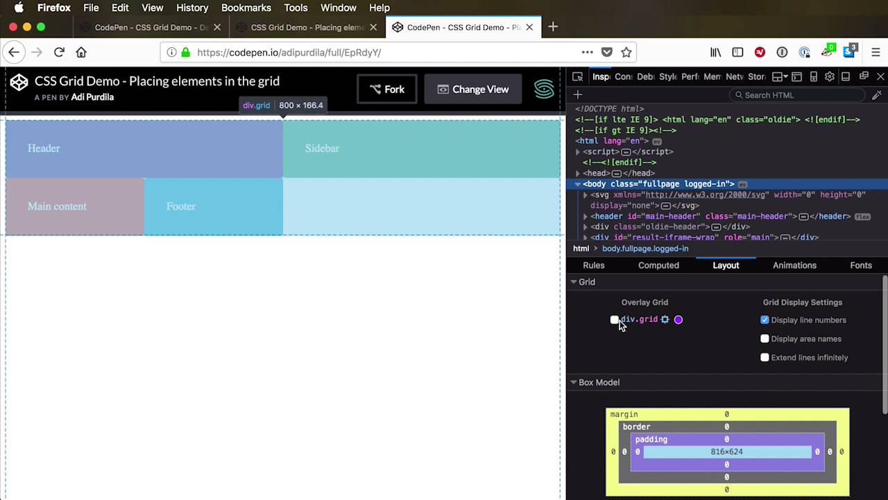
In the previous two lessons, you learned how to create a grid container, and also how to define the grid rows and the grid columns inside that grid container. Now, in order to place elements inside your grid, you basically have two options. Number one, you can let the browser automatically place the elements for you. Or two, you can place those elements manually by using certain CSS properties on the actual elements. Now, option number one, let's talk about that for a little bit. Because by default the browser has something that's called an auto-placement algorithm. And that algorithm will basically take your items, your grid items, in the order they're defined in your markup. And it's gonna start to place them, starting from the top left corner, and going to the bottom right corner. And it's gonna place each one in one cell, and then move on to the next cell, and then it's gonna place the second item. The third item,it's gonna place it in the third cell, it really depends on your layout. Now, one quick note here, if the layout's direction property is set to rtl, which is right to left, then the auto-placement algorithm will place these items in reverse order. So it's gonna go from top right to the bottom left. To show you that in a better perspective, I'm gonna change the view here, let's say to full page. So I'm gonna use the example that we've worked on previously, all right? So here is our grid, our layout direction is set to default, basically. So in our markup, we have item 1, 2, 3, and 4, and again see how the grid places them, we have three columns and three rows. So it places item 1 In the first cell, item 2 in to the second cell, item 3 and then it goes to the next row, item 4, item 5, item 6, if we ever have that many. So if, for example, I were to go back to my editor and change, let's say I want two columns. And I'm gonna remove the rows, by removing the rows, the browser will, it doesn't mean that you don't have rows anymore, no. The browser will automatically create rows for you and it's gonna size them according to the content that you have in those rows. So let's also add a few more item, let's add like three more. There's gonna be item five, six and seven. So notice how the browser just automatically filled in that grid. Let's go back to our inspector here. Yeah, so it went item 1, 2, okay so we just have two columns fine, let's move onto the next row. Item 3, 4, and there it goes again, we create another row, 5, 6, and 7. So that's how the auto-placement algorithm works. The browser scans your markup, it takes the items in the order that you set in the markup, and it starts placing them in the grid. Now, if you wanted more control over that, if you want to place your items individually within your grid then you can use certain CSS properties that will allow you to do that. And to demonstrate I'm gonna create a new demo here. And basically I want to replicate the layout that I showed when we did the comparison in-between boot-strap, foundation, grid, and all that stuff. So it's a very common layout, right? In almost every website nowadays you can find a header, you can find a side bar or main content, you can find a footer right? So let's try and recreate that, and see how we can place the elements in our grid. To do that I've copied some demo styles from that particular demo. This is just to set a background colors, a little bit of padding, and a border radius to each individual demo unit. So in the HTML, I'm gonna start with a , but again, as I said, this can be any name you want. So we're gonna have a header, I'm gonna give it a class of demo. I'm gonna say header, and then I'm gonna have an aside, also with a class of demo, and this will be our side bar. I have a main with a class of demo, this is the main content. And a footer with a class of demo, this is the footer. All right, so this is what we have so far. Now let's go back to CSS, we're gonna target our grid, we're gonna set display to grid. And then let's say I want the traditional two-column layout for my grid. So I'm gonna say grid template columns, let's say 1fr, 2fr. So far so good, let's also save. We're gonna change the view here so you can actually see how the grid works. Right, so we have two columns defined, the rows are filled in automatically by the browser. Now let's say that I want the header to span the entire width, well how would I do that? Well, I can go into my header and I can say this, grid-column-start. I can specify the line number at which I want that to start. So, if I want this to start right here at column line 2, I can simply go and say, start at line 2 and it's gonna start right there. It's too bad this doesn't refresh automatically, it would've been interesting, but, oops, I need to save it first. Right, so now our header starts at column line two, but maybe I want it to go the full width, as I was saying. So, I can start at line one, which is also the default behavior. So we can ignore this all together, but I'm gonna leave it here just so you can see the syntax. And I can specify column end, so at what grid line do I want this to end? Well I can end it at number 3, so I can say grid-column-end: 3;, and that's gonna go from line 1 to line 3. Now let's say for example that I'm gonna change the number of columns in my grid, I'm not gonna have two columns, let's say I want three columns, right? So I can say something like 1fr, 1fr, 2fr. Well, in that case my header does not go the full width, it goes from grid column line 1 to grid column line 3. And you can see that better represented here. It goes from 1 to 3, because we now have 3 columns, we have 4 column lines. But also notice that -1 always represents the very last column line. So we can use that to our advantage, I can say the grid-column-end: -1;. And this will make sure that that element ends always at minus one, or always at the end of the grid no matter how many columns I have defined, which is fantastic. There is a shorthand, and I strongly encourage you to use this, it's called grid-column. And it basically sets grid-column-start, slash grid-column-end, so I can say 1 / -1;, and then it's gonna be exactly the same as these two. All right, now the sidebar, let's say that the sidebar is actually in an okay position here. But I want the main content to span the rest of the available space right, so If we take a look at our grid, I want the main content to span from column line 2 to column line 4. So I can say main, grid-column start at 2 and go to 4. And that brings it from column line 2 to column line 4. I can also say -1, and its always gonna go to the end. Now something else I can do here, is I can say span 2 and it's gonna have the exact same effect. Span followed by a number basically means span that particular number of columns. So in my case we start from column line 2, and span 2 basically means span one column and then another column. If I were to say span 1, which is actually the default behavior, it'll only span one column. So, you know it really depends on how you want to approach this, let's stick with span two. Now for the footer, I can say grid-column: span 3;. And grid-column: span 3;, notice that I didn't use this notation. grid-column-start is actually be default 1, so you can omit that if you want. In here I just said on how many grid columns I want this element to span. In my case I have three grid columns defined, and spanning on three grid columns. Now you can do the same for rows, so right now we don't have any rows defined, but let's say that we're gonna define some rows. Let's say that I want, I don't know, a big row at the start, that's 100 pixels. I want another one that's 300 pixels, and the footer, I don't know, another 100 pixels, right? So we have this layout currently, so let's save that. Let's do a quick refresh, so we have row 1, row 2, and row 3. Now I can take these elements, and I can specify on which row they need to start. So if I want the sidebar to start on row 1, I can do that no problem. Let's target the aside here and I can say grid-row-start: 1;. And that's gonna move the sidebar and it's going to start on the very first row. Now by doing that the grid automatically pushes the header one row below it. I can also specify on which row I want a specific element to end, so I can say grid-row-end; for example 2. And that's gonna make our aside end on row line 2, which is actually this one. But if I say grid-row-end: 3; it's gonna end on row line 3. Let me show you that again in the inspector. Yeah, so we have row line 1, row line 2, and row line 3. There's also a shorthand notation, so I can say grid-row simply 1 to 3, and it's gonna replace these 2. It does exactly the same thing. Now, with this I can play around, basically. And I can say something like well, maybe I want the sidebar to be full width from top or full heighth from top to bottom, how do I do that? Well I can say for example grid-row: 1 / -1;, it goes from the very first row line to the very last row line. What else, the header, let's say I want it to start from column line 2. The main content also starts from column line 2, and let's say I want the footer to start from 2 as well. All right, or maybe I want the side bar to be on the right side, we would change the header, main, and footer grid-column-start to 1 so they both start right here. And I would change the aside starting position to let's say -1 because -1 Is the very last column line. So I'm gonna say -1, and this should actually be for our grid-column, so it starts at -1. And let's say I want it to span a single column, and then I can say grid-row: 1 / -1;, so it goes from 1 to -1 which is the the last one here. And the main content let's say it goes from 1 and it spans 3, so it occupies the rest of the content. So you can see the possibilities here are endless, you can create even very funky layouts like where the header just occupies one little space here. And the main content occupies one little space here, and maybe the footer is right here. So grid gives you this kind of flexibility and control over the grid items, and you can place them wherever you want. And as I was saying, because this is all made in CSS, you can use media queries. Like for example, on smaller screens, I can set a media query where my sidebar will start from the left and not the right as I have here. And, my footer will be above the content, I can do all sorts of crazy things like that. And, this just scratches the surface, basically, of what you can do with CSS Grid. It's such an amazing system, you can create really, really awesome layouts with this. I showed you the basics here, but I strongly encourage you to dig a little bit deeper and learn as much as you can about CSS grid. Because I think it's here to stay, and this is what we'll be using for layouts in the next couple of years. Now all this is awesome, but what about browser support? [LAUGH] I think that’s the question that’s on everyone’s mind, so I’ll try to answer that in the next lesson.


