- Overview
- Transcript
2.3 Masonry With CSS Grid Layout
In this final lesson, you’ll learn how to create a masonry layout with CSS Grid Layout. This would probably be my next choice after multi-column and, as you’ll see in a little bit, this method actually has great potential for creating a true masonry layout. So let’s begin.
Related Links
1.Introduction2 lessons, 05:37
1.1Welcome to This Masonry Course01:19
1.2What Is a Masonry Layout?04:18
2.Creating CSS-Only Masonry Layouts3 lessons, 31:01
2.1Masonry With Multi-Column Layout09:34
2.2Masonry With Flexbox09:43
2.3Masonry With CSS Grid Layout11:44
2.3 Masonry With CSS Grid Layout
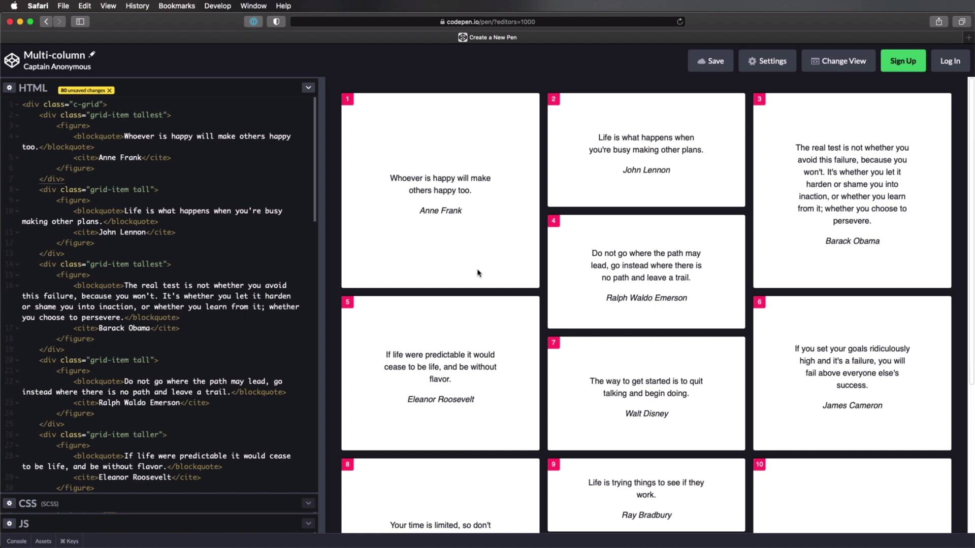
Welcome back to the course. In this lesson, you'll learn how to create a masonry layout, with CSS grid layout. And this is actually would be my next choice after multi column. And as you'll see in a little bit, this method actually has a great potential, for creating a true masonry layout, so, let's begin. As usual, I have prepared a simple demo for you here, I have a container with a class of C-grid, and inside a few Divs with a class of grid item, and each grid item contains a blockquote inside. Now, I've also added a couple of different classes to each grid item, short, tall, tallest, taller, and so on. And I've just vary these, across my markup here, and the result is something like this. As far the CSS, I've also added some presentation styles early, nothing to do with creating a masonry layout, is just to style these a little bit, and you'll also see that I have these numbers on the top left corner of each item. Just so we can see the order in which these items are displayed. Now, to create a masonry layout with CSS grid, we need to do the following, and just like I did in the previous examples, I'm gonna do this for a large screens only. So I'm gonna start with the media screen, and I'm gonna set the minimum width at the same value of 768 pixels. So then, I'm gonna target the C-grid container, and I'm gonna set a display to grid. Next, I'm gonna set up some columns, and some rows, so I'm gonna say grid, template, columns. And I'm gonna do repeat, autofill, and I'm gonna do a min max, of let's say 30% and one FR, All right, so that's gonna create, three columns in this configuration. And it's also gonna affect the height of all of these items because, each item will be as tall as the tallest item in its row. Let's also set some auto rows, so I'm gonna say grid, auto rows, I'm gonna make these four rams tall, like so. And I'm also gonna set a grid gap of one ram, Just all I have some spacing between these items. Also, I'm gonna target grid item, and I'm gonna set its margin zero, that's a left over from the styles for smaller screens. All right, so now to make this work, all I'm gonna do, is define the short, tall, taller, and tallest classes, to properly size these items. So for short I'm gonna say, grid row span two I'm gonna just copy this, and that's gonna be tall, Taller, and tallest. Obviously you can name these whatever you want. So tall is gonna be span 3, taller is going to be span 4 and tallest is going to be span 5, Alright? And with that, we now have, a masonry layout. So, if you didn't understand what happened there, is we basically defined our columns and our rows, and we said these classes, to give us different heights for these elements, and by doing that, we have a masonry layout. Now, let's put this to the test, is it a true masonry layout? Well, criteria number one, was that elements have different heights. So that's checked. Criteria number two, the items are ordered in rows and not in columns. Well, kind of sort of. You can see that we have one, two, three, four, five, six, seven, eight. So we're almost there, but not really, because as soon as I decide to change some of these values, let's make for example, now this first one, tallest, right? That's gonna change, how these items are ordered. So we now have one, two, three, four, five, six, seven, so, maybe you can get the first three items to be ordered like this, but the rest will just be ordered depending on how they're arranged in the page. So, on criteria number two, I think that's a pass. And on criteria number three, are the columns contained? Yes, they are. And are the column, or is the column number defined? Well, it is defined because we just defined it here, all right? So, if I want I can say, a min max 25% of all one FR, or 20%, and that's gonna change the four columns. So, we are actually controlling the number of columns that are being displayed. So, let's check on number three. Now the big drawback to this approach is that we need to define, the height of the elements ourselves. Unlike multi column, where the height was undefined, right? That approach worked with items of different heights. So this is definitely not perfect, but it's pretty close, and if the order, of the columns is not a big problem for you, then you can successfully use this method to create a masonry layout. Also, if you're not bothered by the need to define the height of the elements first, then again, this is a good approach. Now, at the beginning of this lesson, I told you that this method actually has great potential, for creating a true masonry layout, and that's true. Let me show you what I mean. I've prepared a very similar example to what we've seen before, we have roughly the same HTML, and roughly the same presentation styles. The only difference is, right here, I'm not defining the height of the items. Instead, I'm just setting this play grid, template columns, just like we did before, I'm setting a grid gap, but here is the most interesting part, I'm setting grid, template rows to masonry. Now this, in Safari, doesn't do anything, because, this is a property value that is currently experimental, and only works on Firefox nightly under a flag. There is no guarantee that this will become part of the actual CSS spec, as I was saying currently is just experimental. So, it doesn't do anything in other browsers than Firefox nightly. So, let me bring in Firefox nightly and show you how this works. Alright, this is Firefox nightly, as you can see here, and a lot of the bat, it still doesn't do anything, because we need to specify, that we wanted to use the new masonry property. So, I'm gonna open up a new tab, I'm gonna say about, Config, and I'm going to search for masonry, and where it says layout.CSS.gridtemplatemasonryvalueenab- led, Let's change that to true. So now, if we'll do a refresh, you'll see that we now have a true masonry layout, where the items are different height, they are ordered properly in rows. So we have one, two, three, four, five, six, seven, eight, nine, ten, eleven, and so on. And we also have a specified number of columns, defined by this of course, and the columns are contained. So this is, the closest that we're gonna get, to a true masonry layout, with just CSS, the problem is that this is only experimental. We don't know if this will find its way into the official CSS spec at some point, but as far as CSS only solutions go, this is it. Alright, so that was method number three, CSS grid layout, and as you saw it gets us pretty close to a true masonry layout. I'm not sure if the experimental value that I showed you will make its way into the official CSS spec at some point, I hope it will, but you never know. For now, don't use that in production, it doesn't work except in Firefox nightly. And, if you're looking for a true masonry layout, then you should go for one of the two JavaScript powered solutions I showed you, or just some other JavaScript power solution that you can find if you do a quick Google. Otherwise, if you're willing to make some compromises then, one of the three CSS only solutions I showed you, will get the job done. With that said, thank you very much for watching this course, I hope you found it useful. I'm Adi Padilla, and until next time, take care


