- Overview
- Transcript
2.1 Masonry With Multi-Column Layout
Welcome to the first lesson of this chapter, where you’ll learn how to create a masonry layout with CSS by using the multi-column layout module.
Related Links
1.Introduction2 lessons, 05:37
1.1Welcome to This Masonry Course01:19
1.2What Is a Masonry Layout?04:18
2.Creating CSS-Only Masonry Layouts3 lessons, 31:01
2.1Masonry With Multi-Column Layout09:34
2.2Masonry With Flexbox09:43
2.3Masonry With CSS Grid Layout11:44
2.1 Masonry With Multi-Column Layout
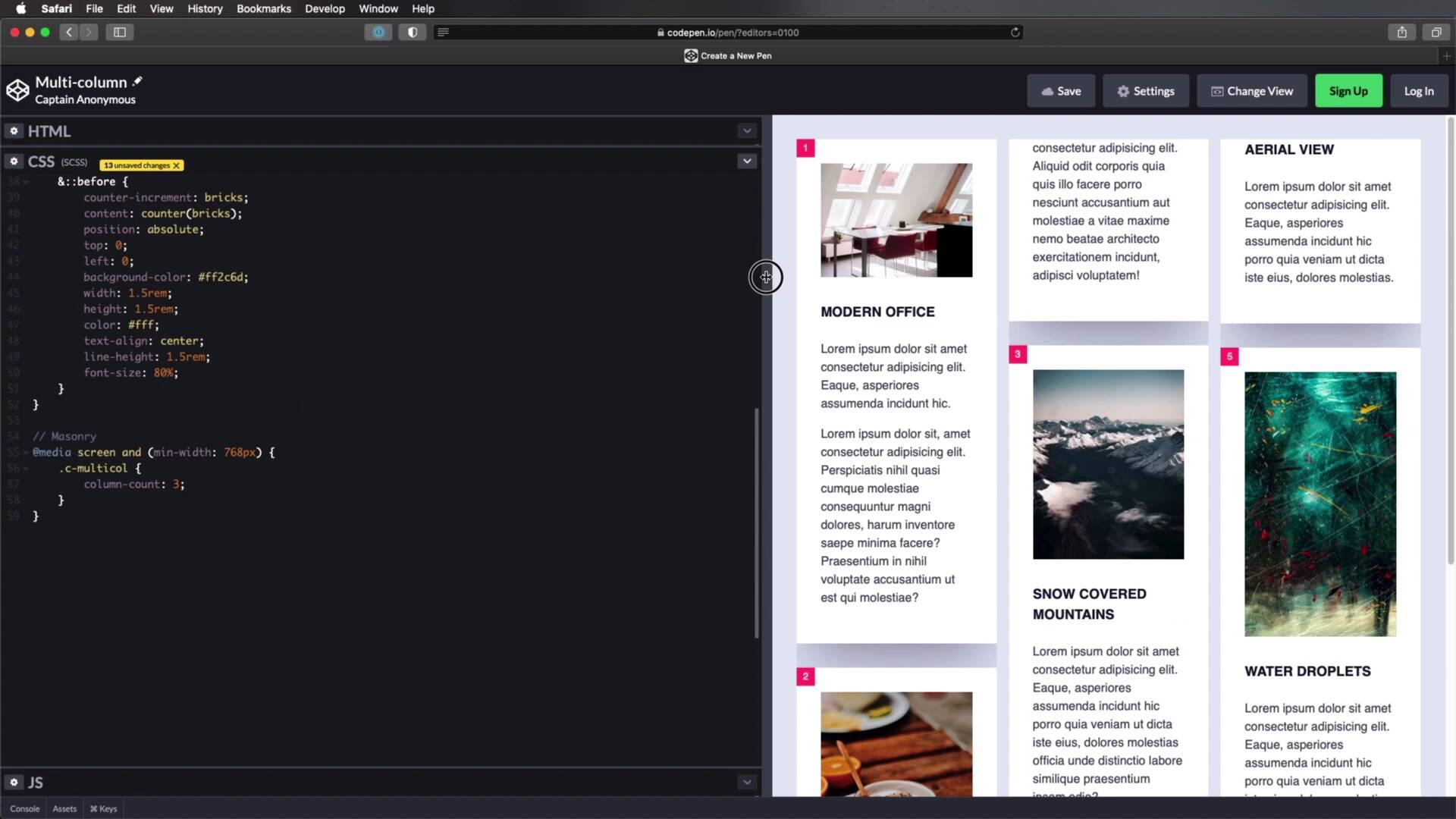
Welcome to the first lesson of this course, where you'll learn the first method for creating a masonry layout with CSS, and that is by using multi-column layouts. Before we begin, I'd just like to mention that I've already covered multi-column in more depth in the short course on Envato Tuts+. So if you want to learn more about this, check out that course first. Otherwise keep watching this lesson, where I'll explain the basics of using multi-column layouts and how to apply that to create a masonry layout. So let's begin. I have a very simple demo set up for you on CodePen. Basically I have a container with a class of c-multi-col, and then several divs with a class of post. Each post contains an image, an h1, and some paragraphs. Now, you'll notice that these images are taken from Unsplash, and you can find links to all of these in the lesson notes. But you'll notice that I'm getting images that are different heights. So for example this one is 600 in height, this is 800, this is 1.000, 1.200, 1.400, and so on. Now, currently I added some very simple styling here and I'm just gonna turn in SCSS here as a preprocessor. Because it really makes no difference to creating the multi-column layout, it's just to simplify the code that I'm writing a little bit. What you see here are just styles for presentation only, so let me quickly guide you through these. I'm doing a reset on all elements, where I'm setting box-sizing to border-box. Then I'm setting some generic styles on the body, just margin, padding, font-family, and so on. I'm initializing a counter called bricks and this is for counting the actual elements that I have on the page, the actual posts. So this is the first one, this is the second one, third one, and so on. Then I'm just setting some styles for the paragraphs, h1s. And on the post itself I'm setting a nice white background color, some padding, some margin, and I'm using a nice box-shadow. I'm setting the images to 100% width and display to block, so that they're always gonna be resized to match their parent container. And then, I'm generating these pink counters with a before pseudo-element. And that's all there is to it. Now, how do I take everything that you see here and create a masonry layout? Well, let's introduce multi-column layout. This is actually very simple to use, and I'm only gonna use it on large displays. Because on small displays like mobile screens and stuff this layout actually works just fine, but on larger displays I'm gonna do the following. I'm gonna say @media: screen and set a minimum with of 768 pixels. So here I'm gonna target c-multi-col. This is the parent, the general container for all of my cards, let's call them. And there are several ways you can get started with multi-column. You can set a column count like this, let's say 3. So that will split up the content in three columns, all right? Here is column one, column two, column three, regardless of the width of my page, okay? Here it goes to a single column because I have this breakpoint, but other than that, it rearranges the content so that it fits within three columns. Now, notice something is not quite right here because the content is broken up. See how a part of this card is showing up here? To prevent that, it's really simple. You just target the element that you don't want to break, and you would say break-inside: avoid, and that's it. Now, there is no more breaking up of the content. And actually, let me just remove this box-shadow, because I think it just makes things a little bit harder to see. So as you can see, this approach splits up my content into three columns. You can also set a column-width instead of column-count. So by setting a column-width, let's say, I don't know, 20vw, That's gonna create as many columns as it needs to to fill up the entire viewport. Here it's creating four columns, but if I change this to, for example, 30vw, it creates three columns. So depending on how wide you want those columns to be, it's gonna determine the number of those columns. And with multi-column layout, you can also specify a gap between columns. So if I set 2rems here, it's gonna add a gap of 2rems between columns, and notice that that particular change will give you a different number of columns. Now I have two columns, what if I resize this a little bit further? It's gonna be three columns. So setting column-width, as opposed to column-count, will actually give you some flexibility here because it will automatically calculate how many columns it needs. So that's pretty cool. Now, this is the first approach, right, using multi-column layout. Is this a true masonry layout? Well, let's remember the three technical requirements. We have items of different heights, check. Number two, the items are ordered in rows and not in columns. Well, that's not exactly true because we have item one, two, three, four, and five. So number two is not applied here. Number three, do we have a set number of columns, and are the columns contained? Yes, we have. So this approach checks off numbers one and three of the three technical requirements we talked about in the previous lesson. So while this isn't a true masonry layout, we're actually very, very close to one. Now, are there any drawbacks? Well, not really. I think this is the closest we're gonna get to a true masonry layout with using just CSS. Even browser support is not a big issue, because as you can see, apart from IE 6 through 9, which let's be honest, there are very few people still using those browsers nowadays, the rest of the browsers are supporting CSS multi-column layouts. So that's fantastic. I guess the only drawback is the one that we mentioned, that items are not ordered properly in a row fashion. Instead they are ordered in a column fashion, so one-two, three-four, five-six, and so on. But other than that, I think this has the greatest potential. All right, so that was the first method with CSS multi-column layout, and that's definitely the easiest one we're gonna cover in this course. And actually, the one that will give us the best results. Now, if you're not happy with how this works and you're looking for other methods, I have two more to show you. The next one is Flexbox, and we'll talk about it in the next lesson.


