

- Overview
- Transcript
2.2 Masonry With Flexbox
In this lesson, you’ll learn how to create a masonry layout with Flexbox. Contrary to how the name sounds, this method is actually the most inflexible, but you can use it in certain situations. So let’s begin.
Related Links
1.Introduction
1.1Welcome to This Masonry Course01:19
1.2What Is a Masonry Layout?04:18
2.Creating CSS-Only Masonry Layouts
2.1Masonry With Multi-Column Layout09:34
2.2Masonry With Flexbox09:43
2.3Masonry With CSS Grid Layout11:44
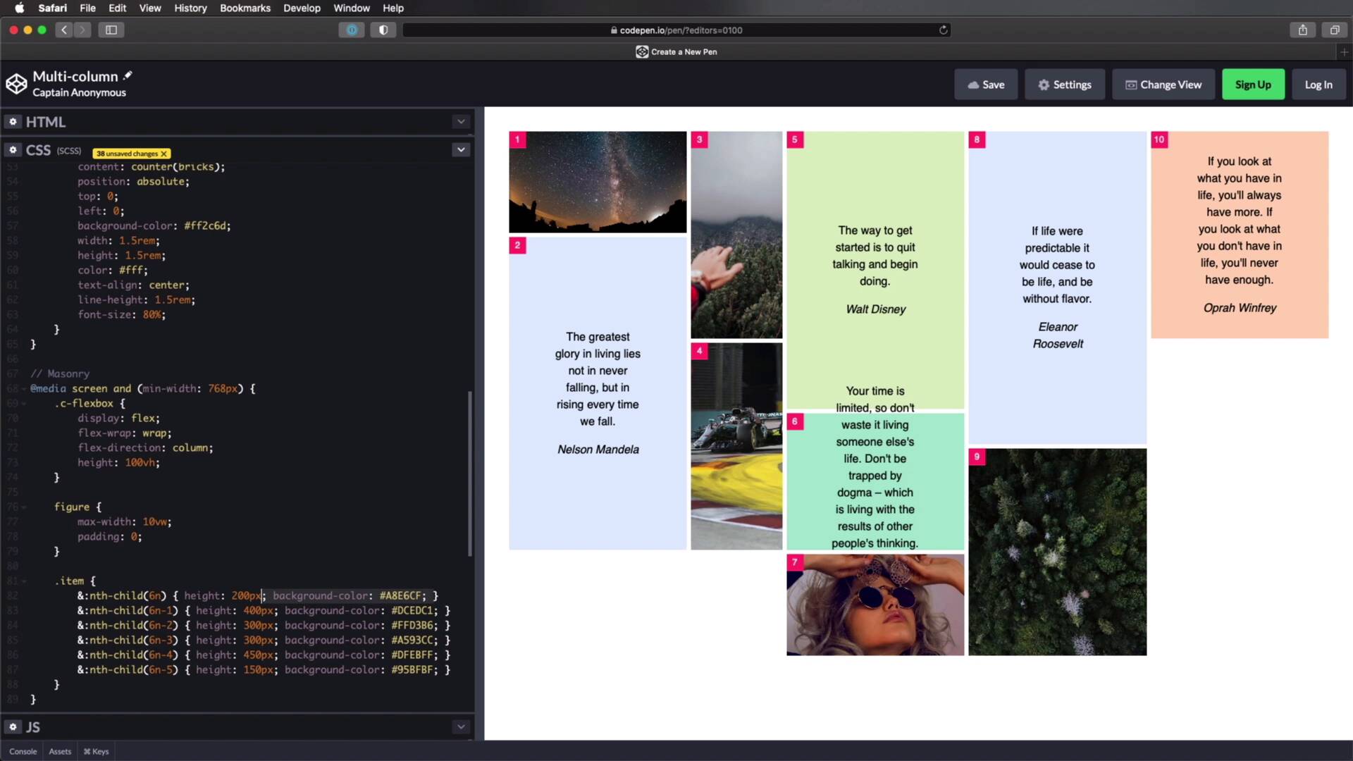
2.2 Masonry With Flexbox
Welcome back to the course, in this lesson, you'll learn how to create a masonry layout with flexbox. Now, contrary to its name, this method is actually the most inflexible of all. But, you can still use it in certain situations, so let's begin, I've prepared a simple down for you, I have a container with a class of c-flexbox. And then inside a couple of divs with a class of item. Now, some of these divs, have a background image applied to them like this one, others have a figure with a block quote and a site inside of them. So this is what we currently have, these are all random photos from Unsplash. Now in terms of styling, again I just went ahead and wrote some presentation CSS, we're starting with the usual resets, and then I'm just styling the figures the block quotes. And for the items, I'm actually setting the same counters, so we can see the numbers on each item, and I'm also setting a different background color for each item, and I'm using the nth-child selector to do that. So now, how can we use flexbox, to turn this into a masonry layout. Well, it works very simply with flexbox, but it has one major drawback, the height of the container needs to be fixed, that's the only way this will work. So I'm gonna do this for larger screens for small screens, I'm gonna keep this layout just like I did with the previous lesson. So I'm gonna say @media screen and(min-width 768 pixels). And here I'm gonna { target .c-flexbox, and I'm gonna set a display:flex;}, so let's see what that is doing, it's doing this. Basically it will line up all of our items, in a single row. Now, to get our masonry layout, we need to make sure these elements will wrap on a new row when they get to the edge of the container. So for that, we can say flex-wrap, and we'll set that to :wrap; and that will give us this result, not exactly what we're looking for. However, we can set the flex-direction, To column; instead of row. So now, all of the items are, again stacked, not exactly what we're looking for. In order to make this work we need to set as I was saying previously a fixed height, under container, so let's set this to 100 viewport height. All right, so now we're starting to get some results, as you can see, these are now displayed sort of in a masonry fashion. But, they're kind of overflowing and we have the scroll bar here, and we don't want that. So what we need to do, is we need to set a different height, a fixed height for all of these items. And actually first, I'm going to set a max-width of :10vp; width on the actual figures Because those were taking up a lot of space, let me also remove the padding. All right, so now let's set the height, to do that, I'm gonna use the exact same principle that I used here. So I'm gonna copy that, I'm gonna say item, and I'm gonna paste these in. And let me just quickly go and remove the background-colors because we don't need those right now. And what we need to do is set the height to either a fixed value like so, or we can use percentages. Now before we do that you might wonder what is up with this nth-child(6n), nth-child(6n) basically allows us to select every sixth child of the item element or every sixth item. 6n-1 is every fifth, item 6n-2 is every fourth, item and so on. And by doing this, I'm able to create kind of a pattern where every sixth item will have a certain height, every fifth will have a certain height, and so on. So for this, I'm gonna say 33.333%, so a third every fifth item will be two-thirds, so 66.666%. Every fourth and fifth item will be 50%, and then maybe we can throw in some quarters here. So let's say 75%, so three-quarters and 25%, All right? So this is what it looks like, this is how you can create a masonry layout with flexbox. Now, right off the bat, we can already see some problems with it, if you're just gonna do images, then, this is actually pretty good. But if you're gonna put other types of content in it, you might run into issues just like you can see here. This at some point will get too big for its container and it will just overflow. But again, because we're using background images, they'll be, Resizing accordingly and it's actually gonna look pretty good. Another issue is that items, are not ordered in rows. So we have item 1, 2, 3, 4, 5, 6, and so on. So, technical requirement number two if you remember well, that doesn't pass here. Technical requirement number one was that each item has a different height, and in our case, that's true. Requirement number three stated that the columns need to be contained, so we have that here, and their number is defined. That is a little bit questionable, because the number of columns in our case is dictated by the number of items we have in our markup, all right? If I delete, let's say, these two items, Instead of five columns, we'll have three columns. So, this approach fails, at technical requirement number three. However I decided to show you this because, it's actually a pretty cool way of creating an image gallery. I added this extra content so you can see that, you can add some content that's different than images but, I wouldn't use this for anything other than an image gallery. But for an image gallery, it's actually pretty, pretty cool. But the biggest drawback in terms of styling is that, you need a fixed container, a fixed height container, and you need to set fixed heights to all of the items. In terms of browser support, well, this is Flexbox. So whatever browser or supports flexbox, will support this type of layout. All right, and that's method number two for creating a masonry layout, and even though you need to write a little bit more code with flexbox, this method is pretty simple to use. Now, for our third and final method, we will be using CSS grid layout, and that's coming up in the next lesson.


