

- Overview
- Transcript
4.6 Narrow the Margins
In this lesson, you'll create another animation. Using the CSS width property, you will narrow the visible margins of the page as the scrollbar moves down.
1.Introduction
1.1Introduction00:42
1.2Frameworks for the Win06:05
2.Easy Parallax Scrolling With Parallax.js
2.1What Is Parallax Scrolling?04:56
2.2Setting Up the Site06:47
2.3Bootstrap Basics08:03
2.4Structuring the Header12:49
2.5Structuring the Body11:21
2.6Parallax Backgrounds08:27
3.Scroll Events With Wow.js
3.1Downloading Wow.js05:03
3.2The HTML09:27
3.3Simple Animations06:39
3.4More Animations13:06
4.Scrolling With Skrollr
4.1Downloading Skrollr05:31
4.2Data Attributes14:07
4.3Filling Out the Content11:25
4.4Styling the Slides04:38
4.5Slide and Fade10:05
4.6Narrow the Margins11:04
4.7Nested Animations07:26
4.8Animating the Shuttle05:38
5.Bonus Content: Creating Scrollable Navigation
5.1jQuery Click Events05:53
5.2Animated Scrolling With jQuery05:52
5.3Setting Up Your Scroll Positions13:49
5.4Detecting the Current Position11:00
5.5Manual Scrolling Issues06:15
6.Conclusion
6.1Conclusion01:39
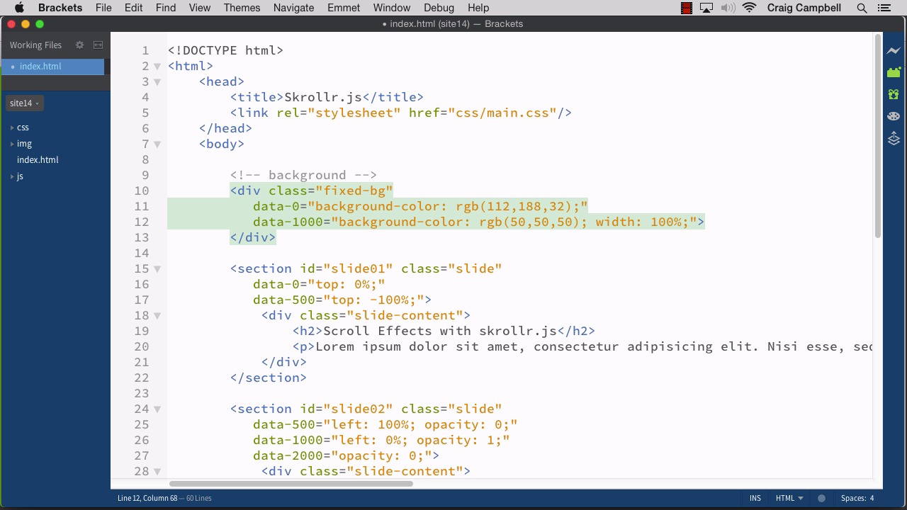
4.6 Narrow the Margins
Hello and welcome back to Scroll Events Made Easy. In this lesson, we're going to move on to our third slide here, and the third slide's animation is gonna be pretty straightforward, but, we're also going to animate our background div at this point. So, we have this background div that's just been sitting there through the first couple of slides. But as it animates to the third slide, we're going to reduce the width of that background div to give us some margins at the edges of the page, and that's gonna animate in as we scroll down. So I've created a new folder called Site14, and all the changes we make in this lesson will be saved there. I'm gonna jump over to Brackets, and I've got Site14 open here. And let's get started. So I'm gonna scroll down to slide03, and now, we're going to uncomment that particular section. So if we were to save that and refresh our page, you'll see that slide03 will be there throughout the entire process of scrolling up and down. And what we wanna do with it is I want to animate it down from the top. So instead of the usual scrolling motion, which would bring our text up from the bottom as we scroll down, we're going to go in the opposite direction. I'm gonna bring it in from the top and fade it in as we go. But the new thing that we're gonna be doing in this lesson is going to involve the background div. So let's go ahead and create our animation for this first, for our slide content, or for our slide03, I should say. And we're gonna start with data-, and remember our first animation from slide one to two took place over the course of 1,000 pixels technically, but its really just a unit that we made up for the purposes of this particular lesson. Because we don't have any content that's relying on the default scroll behavior of the browser. So really, when we say 1,000 pixels, technically it really doesn't matter whether it's pixels or whatever. It's just an arbitrary number for our purposes. So we're gonna start here at data-1000, at the end of that first animation. And I'm gonna set the data-1000 CSS to the following. We're gonna use the top property. And I want to animate it down from the top. So I wanna start it off at a value of -100% because I want it to be completely above the browser, and it's also going to be invisible. So I'm gonna set the opacity to 0. Then, as you can imagine, in the data-2000 attribute, we're going to finish it up by bringing our top property down to 0% and our opacity up to 1, so that we'll fade it in as it moves down from the top. So now, we have a new number, we have a higher number. Our highest number up to this point was 1,000. So skrollr.js gave us just enough scroll bar room to move it up and down 1,000 pixels, but now we've got it to 2,000. So when we refresh our page, that scroll bar should be getting shorter because we have more room to scroll. So if we were to save that HTML file, jump back over to Chrome, take a look at the height of the scroll bar here, and then refresh, you can see that it is significantly shorter now because we have further to scroll. So we're going to scroll down from one to two, two comes onto the stage, we'll keep scrolling. And now we can see slide03 come in. Now, obviously, we want slide02 to move off as well, but now we've got slide03 coming in from the top. And let's go ahead and animate slide02 off. So let's jump back into our code and we're gonna go back up to slide02. So for slide02, we could move it off the same way we brought it on, we could push it back off to the right if we wanted. We could push it off to the left if we wanted it go in the opposite direction. But what I'm gonna do is I'm just gonna fade it back out for that animation as it moves from 1,000 to 2,000, we're gonna fade it out as slide03 animates in over it. So I'm just gonna create another data property for data-2000, and we're gonna set this equal to opacity: 0. So we're just going to fade out from 1 to 0. So let's save that, jump back into our browser, scroll up to the top and refresh. And so we scroll down for our first animation, that looks good. And as we continue to scroll down, we'll see that first animation fades off as the next one moves down and fades in. So now, what we wanna do is as we move down for this third slide, we also want the margins of the page to come in a little bit. And the way we're going to do that is we're just going to adjust the width and the positioning of that background div. So if we jump back into brackets and move back up to our fixed-bg div here, all we're gonna do as I mentioned is we're going to change the width and positioning. And this is gonna happen starting at a data value of 1,000. So we're gonna start with data-1000. We already have a rule for data-1000, so we can just add a couple more items here. So we're gonna start off using the width CSS property, we're gonna start off at a width of 100%, and we're also gonna start off with a left value of 0%. And we'll eventually add another property here, but we'll just leave it at that for now. Right now let's just alter the width. But we'll change our width to 100%, and then for data-2000 which would represent the end of that transition from slide02 to slide03. We're going to set the width here to 60%. And you might already have a good idea of what that's gonna do, but let's go ahead and save our file and take a look. So we'll refresh our page, and we'll scroll down, from one to two looks fine. But as we move from two to three, we kind of get what we're going for in that the width of that background does animate down, and it does narrow up. But the problem is it's flush against the left-hand side of the screen. And we can't use margin zero auto to center it because this is a fixed element. The position, the CSS position property is set to a value of fixed, which means that zero-auto doesn’t work. And I can prove that to you if we jump back into our code going to CSS, our main.css, and then for our fixed-bg, we'll set our margin here to zero space auto. So we'll save that and refresh, and we'll see that that does not work. We can refresh it again and scroll back down, and we'll see that that does not keep it centered because it is a fixed element. So we're gonna get rid of that margin: 0 auto, save our main.css file, jump back into our HTML file, and we're going to have to adjust the positioning here. So what we're gonna do, is we're going to alter the left property. So by default, our left property is set to 0%, we're going to repeat that here because that's where we want it to be at the start of this animation, we want it to be flush with the left side. So as we reduce the width by 60%, the remaining, let's go ahead and look at our screen again. The remaining area over here on the right is the remaining 40%, and we wanna cut that in half. If we've got 40% of the width of the browser window here, then we want 20% on the right and 20% on the left. So if we just move this entire div over 20%, we should be okay. So we'll jump back into our code, and for data-2000, we'll set our left value to 20%. So we'll save that, refresh our page and there we go, let's just make sure the animation looks good. So we'll start at the top, scroll down from one to two, that still looks fine. And from two to three, we now have a nice animation where it looks like we're narrowing the margins of the page. Now, we obviously are gonna get into some trouble if we start to try to resize this too much because the text will basically overflow everything and it just won't look good. So we could go in and adjust the CSS a little bit. That's not really the main focus of this course, but we can go and spend a little bit of time on that. Let's jump over to our main.css, and for our slides. And by the way, we're going to encounter this issue slightly with all of our slides. If we go back up to the first slide for example, and reduce our width, you'll see that it's going outside the edges. So we could create a bunch of media queries here to make it look good at all browser sizes, but I'm gonna just cheat and do it the easy way. So instead of setting our, where did it go? We have our slide content here. Instead our widths to 600 pixels, I'm gonna set our max width to 600 pixels, and then before that, we're gonna set our width to, let's try about 30%. We might end up changing that, I'm just playing with the numbers here a little bit, and we'll use a percentage instead. So we'll save that, and jump back over to our browser and refresh. And that might be a little too narrow, we'll bring that up to 40%, save it and that looks pretty good. So then, we can we can resize it, and everything still looks okay. We might create some media queries and make the text a little smaller at certain break points, but that's not too bad. In fact, we could come in here and get rid of the padding inside our slide element. Now, that's going to nudge out content up a little bit, but we can play with that as well. So now, if we resize it, it gives us a little more room to work with, and that's not to bad. So then, if we wanted to nudge this down, we can just add some top margin to our slide content. So we have margin: 0 auto, and we could also add margin-top of, let's do maybe 60 pixels. Or you could do a percentage, since you're dealing with browser heights and all that good stuff too, but we'll just set it to 60 pixels for now, refresh the page. We've nudged that back down. And now, let's see what it looks like once we get to the narrower margins. So we're gonna move this over, and that actually works really well. No matter how narrow it gets, the text is still going to fit inside this darker area because we're using percentages for everything now. So we've got 20% of the width on the left, 20% on the right, and then 60% in the middle, and then our paragraph here is just 40%. So that gives us plenty of wiggle room in there, and it won't get too narrow for the text. But that's how you can use scroller.js to narrow the margins of your page. Thank you for watching, and I'll see you in the next lesson.


