- Overview
- Transcript
2.6 Style Your Page’s Typography
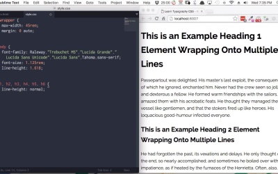
In the final lesson of this course, you’ll take a basic HTML page like the one you created in the previous course “Start Here: Learn HTML Basics” and apply typography styling to it based on everything you’ve learned so far.
Related Links
1.Introduction1 lesson, 00:54
1.1Welcome00:54
2.Learn CSS Typography6 lessons, 59:00
2.1Intro to CSS09:20
2.2CSS Font Properties08:32
2.3Web Safe Fonts, Custom Fonts, and Font Stacks09:16
2.4CSS Line Height and Vertical Margins05:40
2.5Units to Use in Typography11:25
2.6Style Your Page’s Typography14:47
3.Conclusion1 lesson, 01:25
3.1Wrapping Up01:25
2.6 Style Your Page’s Typography
Hi welcome to the final lesson of Start here.Learn Typography CSS. So far you've learned all about what CSS is and how to work with that syntax, you've learnt about CSS front properties, you've learned about web site fonts, custom fronts, fonts stacks. You've also learnt about vertical spacing in typography and you've learned about different types of units. Now in this lesson we're gonna take everything that you've learned and we're gonna put it into practice by styling the topography for this HTML page here. This is the same HTML that you created in the last course and you've been using throughout this course. So you've got the same head section, you've got the same div of class wrapper inside the body section. And then for the purposes of this lesson, we've added in a bunch of extra text. So what we've done here is a bunch of headings and paragraphs and then we've got each level of heading 1, 2, 3, 4, 5, 6. And then all the headings grouped together are not explain why that's done that way a little bit later. Now as for our CSS, we have the same style the CSS file but one thing has changed. Instead of the max width here being said 35rem, we've got it set to 45rem. So right now everything is just set to default, there is nothing in this typography that has been customized in any way. And we're gonna start styling our typography by selecting and applying a font family. And the reason that you do this first is, the decisions that you make on font size and weight and what have you will often have to depend, at least to a degree, on the font family that you choose. Some fonts a little bit bigger than others, some are a little bit smaller than others even if all the settings are same, some are heavier, some are lighter. So it's always a good idea to stop by, adding in your front family first. And the front that we're going to use is Raleway from Google fonts. So using the same method that we did in our previous lesson, go to Google fonts and search for Raleway. And then, you gonna check Normal 400, Normal 400 Italic, Medium 500, Semi-Bold 600, Bold 700 and Ultra-Bold 900. Then, click the snippet down here and copy it and then back in your HTML. After the link element that is connecting your stylesheet, paste in this snippet that you got from Google Fonts and save. Now in our CSS, we gonna apply that raleway font to everything through our entire website. And we gonna do that by setting a font-family on the body element. So everything in your site is gonna be contained in the body element so everything will be affected. So set up the body selector, we'll add out font family property and then we'll set raleway font name as the value. Now save and you should see the raleway font applied to your whole website. Right? So there we go. There is a new front is applied to all of the headings and all of our paragraphs. Right? So hopefully from the lessons that you've done so far you should know the next step is and that is to set up a font stack. So we're gonna go to cssfontstack.com, and we're gonna choose an appropriate font stack to fall back on. Now, probably the one that's most similar to our raleway font would be Trebuchet MS, so we'll copy that font stack. And that will place it into our font family property here and delete that extra font family property we don't need. Just replace it with a comma and now there's our full font family all set up. For the next thing we're gonna do is set a default font size for all of the regular text on our page. This is going to affect our headings. But it will affect our paragraph tags and it will also affect any other type of text element that goes into the sign. And we're just working with paragraph tags to keep things a little bit simpler. But this will also affect things like unnoted lists and block quotes for example. Now you remember from our lesson on the units to use with typography that we don't want to set a base font size in fixed pixels. Because we wanna make sure, that a user can have some control of the display size of the text. Instead we're gonna to set our font size in ram units. So also here in the body selector style, we're gonna add our font-size property and we're gonna set it as 1.125rem. So you can see that that has increased a font size a little bit. And that 1.125 rem is the equivalent on default settings to 18 pixels. And we've gone with that because nowadays the default of of 16 pixels can be a little bit too small. And now you see that was sitting the font size against the body element and it's also possible to set aside what font size by using the HTML element but there's a good reason that we haven't done that. And has to do with creating layouts that are flexible, responsive and scalable. And that's something we get learn about in the course that comes after this one. But for now just make a mental note of what we've done here with setting the font size on the body element. And you'll learn why that does matter when you come to do the course on learning how to do CSS layouts. All right, so next up we're gonna apply a site width line height. So once again inside the body element, we're just gonna add a line height property and we gonna set that to a value of 1.618. And don't worry too much how that line-height looks on headings because we're gonna set that line height separately in a little bit. This line height is for regular texts like paragraphs. Now, I personally like a line height of 1.618 or 5. But, you can feel free to set that to whatever you think looks right. All right, so that's all about body defaults in place. Now, we're gonna start styling the headings. Now, if you take a look at the headings here. There's a couple of things that are deliberately done with how this dummy text is laid out. For each one of our headings, I've made sure that we have an example of each one wrapping onto multiple lines. Now you need to do this so you can check that the line height is good for that heading. If you are only testing your typography on single line headings, you'll never know if your line height is any good. Now also have these headings in between paragraphs of text because most commonly headings will be placed above paragraphs of text to introduce different sections. And part of the process of creating a typography is making sure that the headings look right leading into paragraphs. And then after that, the last thing that we've got is each heading stacked one on top of the other. Because another way that you commonly see headings used is to create headings and subheadings. So for example, some man might use an h1 element to create a main headline. And then right underneath that they might use an h2 element to create a subheading. So you have to make sure that headings look good when the stacked one under the other. All right now to get the ball rolling without headings, the first thing we're actually gonna do is just set the line-height for all of these headings back to a setting of normal, because as I mentioned the 1.618 line-height isn't really suitable for headings. So we're just gonna put them back to the defaults and we're gonna do that with this snippet of code. Now, whenever you see multiple selectors separated by commas, that means that this style will apply to all of those selectors. So, line height normal will now apply to all six different types of headings. Now this is just in here temporarily we'll get rid of it once we've put line hides in for all of the headings. Now the other thing that we're gonna do is set the margins for our headings to 0. Now this just helps to get rid of the extra spacing that we have in between headings and paragraphs and in between headings and other headings. So it just puts us back down to a blank slate so that we can build up from scratch. All right, so now, we're gonna add the font whites that we want for each one of our headings. And we're doing font whites first because the size and the spacing that we have for each one of our headings might change depending on the front weight that we give to each one. So we're going to make our h1 level heading, the highest level heading, the heaviest. So create our h1 selector and our font weight property and we're gonna set it to 900. Which is ultra bold then for our next setting, for our h2 heading, we're gonna do the same thing again. Add our font weight, and this time, we're gonna set the font weight to 800. And this is just gonna help a little bit with differentiating between the main headline of a page and a sub header. Now, we'll add in our h3, which we'll set to font -eight 700. Once again, that will help to make it look a little bit less important. Still clearly heading but a little bit less important. And we're gonna have h4 also set to font-weight 700. So just copy and paste that and it change the selector to h4. Now h5, we're gonna drop down our font weight once more. We're gonna set that to 600 and then for h6, we're gonna use the lightest font-weight of 500. So it's still a little heavier than the regular text front weight of 400 but it's the lightest of all six headings. Because if that is our fonts right set up for all about headings,now we can set up our font size but default in a browser to me headings are a little bit weird. The two smallest headings, Heading 6 and Heading 5 are actually smaller than regular texts and to me that doesn't really set them aside as headings. So the first thing that I wanna do is increase the size of the edge six heading. So it's not smaller than the texts that it's supposed to be introducing. We're gonna set it to font size 1.25rem. And now for our h1 level heading on the other end of the spectrum we wanna make it nice and big, so that it stands out as a proper headline. Now for this one we're gonna set font size 3.3rem. All right, so now we've got a nice big prominent heading and that's a great size for introducing an article or welcoming people to a business page for example. And once again this can be done to your taste, you don't have to do it the exact same way that I'm doing it. So now that we've got our highest font size and lowest font size, we can fill in the remaining font-sizes so that we have a gradual shift from the largest font-size down to the smallest. So lets set out h2 to font-size 2.3rem, h3 will be 1.85 rem, h4 will be 1.55 rem and h5 will be 1.4 rem. All right, so now, we've got a nice gradual shift in the size and the weight of our headings. Okay, now we're ready to set the line heights for our headings. And we're gonna go up here and we'll just comment out this margin setting. Because when everything crunched up can make it a little tricky to decide on good line heights. Now what we're shooting for is to set a line height for each one of the headings that just looks right. So for our h1 tag, we're gonna set a line height of 1.35. All right, so just show you that full screen. So, let me go that's nice and readable. There's a good amount of space to allow for easy reading from one line to the next. For our h2 headings we're gonna have line height 1.45, h3 will be 1.6, h4 will be 1.7, h5 will be 1.6, and h6 will also be 1.6. All right, so let's check out what we've got. And so each one of our headings now has a nice comfortable amount of space in between one line and the next. So the only thing left to do now is to get the margins right. At the moment, the spacing in between our headings is not quite right and also the spacing in between headings and paragraphs is not quite right. So before we do that we're gonna get back up to, our style here for all the headings. We can get rid of this line height normal now because we have a line height for all of the headings. And we're gonna re-enable setting these margins to zero so that we're building up from a blank slate again. Now we only want to add a top and bottom margins to our headings. We wanna leave the left and right margin set to zero. So we're gonna use some shorthand. So for our h1 tag, we'll add our margin property and then we're gonna put in two numbers. We're gonna put in 0.8em then we're gonna make a space and we're gonna put 0. Now, this is a shorter way to set the vertical margins and the horizontal margins. This first number here sets out vertical margins. So both the top and bottom margin will be set to 0.8em the second value here sets our horizontal margins. So the left and right margins, will have a value of 0. And you'll notice that this time we're using the unit and that's because we specifically want to size our margins, depending on the font-size of the heading. So to speed things along a little bit, you can just copy this whole line paste it down into your h2 to tag and change this first value to one. Now we'll do the same thing for the h3 tag we change that to 1.3. H4 will be 1.5, h5 will be 1.6em and h6 will also be 1.6em. All right, now let's see what we have. Great so now we've got some really nice spacing around the outsides of our headings. It's got a good amount of vertical gap in between each of the headings and the paragraph tags. And when we go down and look at our heading stacked on top of each other you can see that we have a nice graduation of spacing. The front weight is flowing smoothly, the font size is flowing smoothly and so is the vertical spacing in between these headings due to the line height and margin settings that we've implemented. So now our typography is complete. Everything is looking just right and we just have one more step and that is to delete this snippet of code here. We no longer need those margins because we've set all of the margins for our heading tags. All right, so now you are done. You've completely setup the typography for this basic HTML page. So that wraps up the final lesson of this course. I hope you'll join me in the last video, where we're just gonna recap everything that you've learned. And then I'll let you know a little bit about what's coming up in the next course in our Start Here series. So see you in the final video.