
 Lessons: 7Length: 41 minutes
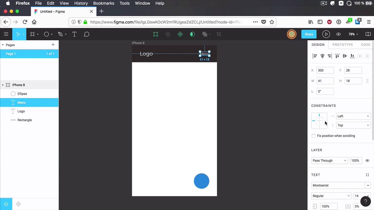
- Overview
- Transcript
2.3 Layer Constraints
“Layer constraints” is a feature that allows you to define element behavior on resize. This is very useful when creating responsive elements or pages; you can anchor some elements, make them stretch, and make sure other elements move or remain positioned accordingly. Let’s take a closer look.
2.3 Layer Constraints
Linear constraints is a feature that allows you to define the elements of behavior on resize. And it's very useful when creating responsive elements and pages. Because you can basically anchor elements to various portions of your frame or you can make them stretch. So let's have a quick look at how this works. I'm gonna create a simple frame, let's say I wanna design an app for a smartphone. And let's create a frame for, let's say, an iPhone 8, okay? And I'm gonna have certain elements in here. Let's add a header. And let's add some text. Let's say logo. Let's reduce the font size of that a little bit. And let's also duplicate this. And let's say Menu. Let's make that smaller as well, okay. And let's also add like a button here, like a call to action. Now, I'm gonna keep this very, very simple so you can understand. What is it that I'm doing. So right off the bat, this looks just fine, right? But what if, at some point, you decide this is actually not the right size that I wanna design for. Maybe I want this to be on iPhone 8 Plus, okay. So you go in and you change this to an iPhone 8 Plus and the size of the frame changes. But then you also have to manually re-size this bit, move this element, move this element. And when you're designing something that's very complex and you have a lot of elements then suddenly this becomes pretty time consuming. Hopefully, or thankfully, you can use layer constraints to automate this process. So basically Figma will do this for you. So here's how you do it. Let's go back to our original size here. And we'll start with the background. So the background, I wanted to stretch so if I resize my frame, I want this header background to stretch along side with it. To do that, we go to the constraints section. And we click this little button right here where it says left and we choose scale, okay? So now if we are gonna resize. This frame, that particular element will scale alongside with it on, of course, just make sure you have the horizontal axis selected, because you can also do it on the vertical axis. But in terms of vertical, I wanted to anchor, anchor it to the very top. So when I resize my frame, this element will always be anchored to the top. Now, what about the logo, right? The logo is actually okay. We don't have to change that but what we do have to change is the main behavior because I want this menu and I want it to be anchored to the right side. So I'm gonna select anchored to the right and anchored to the top. So now, when I resize my frame, the menu stays right there. Same goes for this called action. But I don't want it to be anchored to the top. Instead, I want it to be anchored to the bottom and to the right, okay. So now, when I change my canvas size from an iPhone 8 to an iPhone 8 Plus, my elements will be automatically repositioned and resized in the case of this background, to match my new frame dimensions. And that is super, super cool. Now, when I was tampering with these, you might have seen this check box, fixed position when scrolling this is actually a feature for prototyping. So let's go ahead and group this up. And I'm going to set fixed position when scrolling. Now, when I prototype, I have the option to choose a device size. So let's say, for example, that I choose an iPhone 8. And when I go ahead and preview this. I have the option to scroll my page. Notice that when I scroll this element scrolls alongside with it because it's not fixed, but this header is fixed. So one of those things that's just a prototype thing, it doesn't actually do anything in your design portion here in sigma. Well, it does make a change. It adds a subsection here on the layers panel where it says fixed and scrolls. Basically to differentiate the layers or the groups that are fixed and the ones that scroll alongside with your page. But this doesn't actually stay fixed. If you scroll inside your canvas like this. It's just for prototyping. Now, what other options are there for the constraints? Well, you saw how to anchor elements to the size but it can also anchor them to the center. Notice that we have a center value here. And what that does is basically if you have another item in here. Let's duplicate this. And we'll call it, I don't know, Nav2. Well, let's also. Make this smaller, you can anchor it in the middle, so with this selector I can say that when I resize this horizontally I want to keep it in the center. So i'm going to select center from here, and now upon resize you'll notice that the element always stays in the center of my element, which is fantastic. And that's a quick look at layer constraints in Figma. Now, coming up is version history. This is a feature that allows you to browse the entire history of your document, and if you want, assign names to each individual version. More about that in the next lesson


