
 Lessons: 7Length: 41 minutes
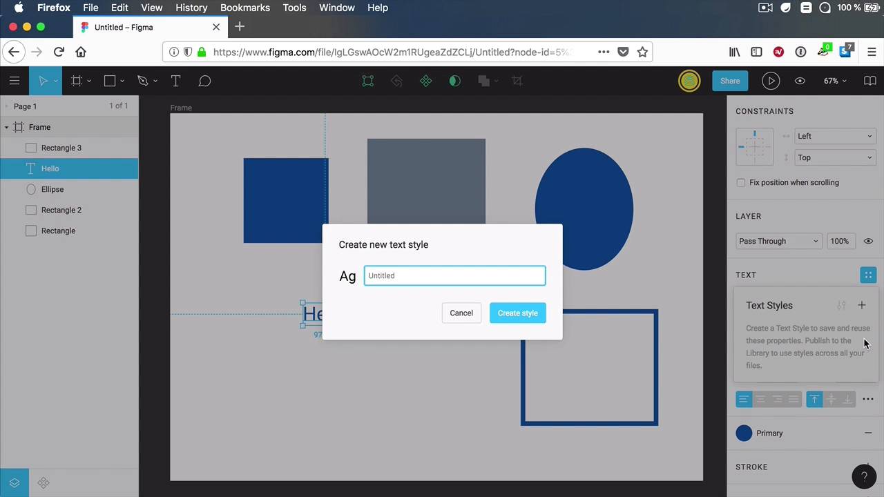
- Overview
- Transcript
2.5 Styles
Figma styles represent a new way of defining and applying a set of properties. You can create reusable styles for colors, typography, layout grids, and effects, and then sync those styles across your designs. You can also share them with your team so everyone can use the most recently updated version.
2.5 Styles
Figma styles represent a new way of defining and acquiring a set of properties to a particular element. Basically you can define styles for colors, typography effects and layout grids. And you can save these, you can share them with other people and you can sync them across all of your files. And you can also share them with your team so they always use the most up to date versions. Let's have a closer look and see how these work. So let's say, for example, that I have. A rectangle here, I'm over simplifying these so you can understand the process. Let's make it a blue rectangle. Now if you go to the fill section you'll see this quadruple dot icon here. And if we click it we get color styles. And if we hit on plus we're creating a new color style, let's call this primary, okay? So now, when we click inside the frame or outside the frame or when we don't have anything selected we can see local styles. And in here, color styles, primary the new one that we just created. Now, please be aware that this style is now created. It's independent, it doesn't need this element to exist, right. So, this I can resize, I can move wherever I want, I can even delete. It's not gonna delete my color style, okay? Now, let's say that I want to create another element with the same color. Well, I can create another rectangle or I can create another oval or another element. It doesn't really matter. And I'm gonna select these, I'll go to fill, click this icon again, and select Primary from the list. And that's gonna give me the same color. Now, if I want to change the color, let's say I want to make this a green instead of a blue. I can hover over my local styles and click this icon. And doing that will open up the edit style panel. I can change its name. I can add a description if I want to, let's say Primary color. And I can change the color from here. So let's say I wanted this to be a green, that's cool, let's change this to a green, like that. And notice that the change is instant. All of the elements that we're using that color, now have the updated style, which is just fantastic. Now using a color doesn't necessarily mean that I have to use it as a fill, right? I can use it for text, so for text here under the fill color, I can choose this one or I can use it as a border. So let's create another rectangle, I'm gonna give it a fill of white. But I'm gonna do the stroke. I'm gonna use that color. Let's make it a ten pixel stroke. And the same thing happens when I go to edit this. And I change it to a different color, all the instances of that colors will change. It doesn't matter if it's a fill, if it's a border, if it's the color of a text. It's all gonna change instantly and that is just great. Now, if at some point I don't want to use a specific color on an element, I can simply select the element, hover over its color, here, and click Detach style, or simply delete the style. So if I hit Detach, and I change the fill to something else, only the fill of that element will be change. The color style will not be affected. And if I want to remove it completely, I just click the. Minus sign and that gets rid of the fill completely. Now what else can we do? Well, we can add styles for text, right? So here we have a style applied for the color but we can also create styles for typography for text, right? So I can create this, I can say, I don't know H1 and I can create a style for H1. And then I can create one that's a little bit smaller for. H2, right? And here we can change the font size and maybe I want this to be center aligned or maybe I want to be bold. I can specify different properties for it, right? So I can edit it from here, maybe make it bold, and the cool thing about this is that text styles and color styles are different. So if, for example, I were to create another color style here, let's call this Secondary. Okay, I could choose, a different fill for this text, so I would have a different text style and different color style applied to it. And it can change between these really easily like, this really cool, also what's cool is that I can have a block of text and I can highlight portions of it and apply styles to it, right? So right now this is using the H1, but maybe I want to use the H2 inside. All right, so now I have a block of text that's using H1 for a portion of its contents and H2 for the other portion. This is really cool, I actually haven't seen this kind of functionality in any design app out there that includes sketch, SD. I haven't seen this in other apps. When you apply a style to piece of text, then every letter, every character in that piece of text has the same style. We cannot simply select the portion of it and apply a different style to it. It doesn't work like that but in sigma it does so that's a really, really big plus. Now coming back to styles, we saw how to apply these to color, typography. You can also apply them to effects. So if for example, I want to apply a drop shadow here, right? I can go to effects and I can click this icon. I can say, I don't know, drop shadow and that creates the drop shadow effect and then I can go ahead and edit this. I can change the properties to blur, the x, the y, the color, the transparency and I can apply that to, for example, this item, right? Effects, I can choose drop shadow from here and its going to have the same drop shadow that I created here. You can also create styles for layout grids so if we select our frame we have the option to create layout grids, alright? Let's do that and it adds Ten pixel grid, but you know, I can change this to a column grid if I want to, and I can go ahead and save that. I'm going to call it Column grid, all right. So that style is now there when I need it. Do I create the new page or a new frame. I can simply use the same grid as I did in the other page. Maybe at some point I decide to I designed this for an eight column grid, but maybe I want to do that for a 12 column grid, okay? Well you only change the grid in one place. So he made the necessary changes, the grid will update, to all of the other grid instances, and that's the power of styles. Now, that's a quick look at styles, there is one more thing you can do with them and that is to share them with your team. And you do that with something called team library. We'll cover that in the next lesson.


