
 Lessons: 7Length: 27 minutes
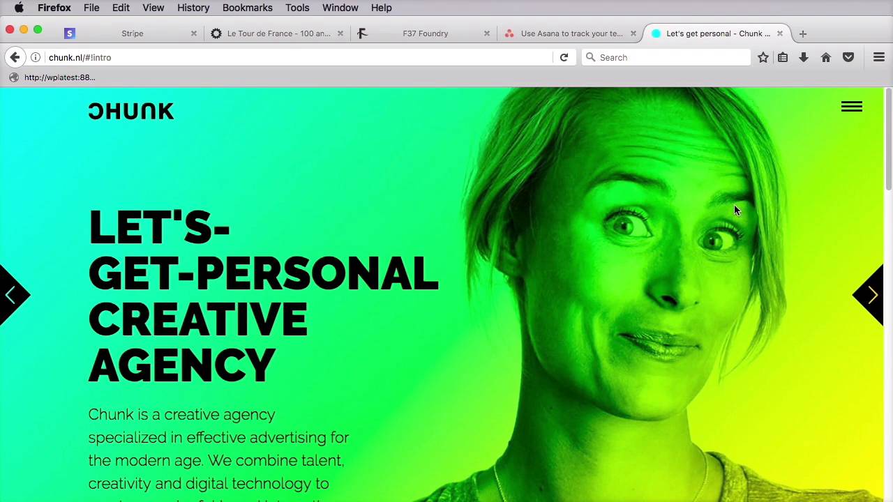

- Overview
- Transcript
2.3 Bold Colors
We all use colors in a webpage design (unless we’re creating a black and white page, of course).
Usually, we go with the web-safe colors, and we’re doing so because I guess we’re used to seeing them being used all the time and we feel confident using them in our own projects. Let’s see if we can get a bit more creative with colors.
Related links
- stripe.com
- 100ansdetour.fr
- f37foundry.com
- asana.com
- chunk.nl
- webgradients.com
- gradients on caniuse.com
1.Introduction
1.1Introduction00:35
2.The Creative Patterns
2.1Big Typography05:49
2.2Geometric Shapes04:27
2.3Bold Colors03:34
2.4Duotone03:37
2.5Microinteractions04:16
2.6Virtual Reality04:19
2.3 Bold Colors
We all use colors in our web page design, unless we're doing a black-and-white design, which is highly unlikely. But other than that, color is always present. And we usually go with the web-safe colors. The reason for that, I guess we're just used to see them all the time in other people's designs. So we're confident about using those colors in our own projects. Now, I think we need to be more brave In our approach to using colors. As we've seen recently, some very big brands have made big efforts to try and break the ice and try out new things when it comes to using colors. Take for example the news Spotify and Instagram logos. They went from a more conservative approach to a very bold one by using highly saturated and vibrant hues, not to mention gradients. And it's not just logos. Bright, vivid colors are popping up all over the place. Take stripe, for example. They're using this bright blue on their home page. Or the website for 100 Years of Tour de France. It uses this bright mustard color that, you don't see that often. F37 Foundry has a very cool website that allows you to preview their typefaces in these brightly colored pages. Asana uses lots of vivid gradients throughout their website. Some brands even go a bit crazier than the others and use very bright gradients, like this one from Chunk. This is actually a technique called duo-tone and we'll discuss it in the next lesson. Now I think those were some pretty good examples on how to take a more creative approach to using color. And the thing with color is that nowadays the technology that we have actually allows us to do this. We don't have to use monitors that can only display 256 colors, right? We now have IPS panels and OLED displays that can display millions of colors that can reproduce color very, very accurately, so that's a very good thing. It means that it's pretty safe to use these very rich hues in our designs. Be cautious when you're using such vivid colors. Use them to attract the visitor's attention or to highlight something very important in your page, but don't overdo it. That's gonna lead to a bad user experience. Now, if you're looking for some color inspiration for your next project, you can check out webgradients.com. They have some pretty cool-looking linear gradients for which you can also get CSS code. And speaking of CSS gradients, the browser support for these is pretty awesome. The order versions of IE don't support them, but all the modern browsers do, so you're well covered there. Now earlier I mentioned the word duo-tone. This is related to color, and we'll be exploring it in the next lesson. See you there.


