- Overview
- Transcript
2.5 Microinteractions
When it comes to web design, microinteractions can make or break your product. If used correctly, they can enhance the user experience by providing feedback, communicating status, or helping the user complete an action. Let’s find out more.
Related links
- Favorite Microinteraction on Dribbble
- Play/pause on Dribbble
- Password check on Dribbble
- sound-of-change.com
- ifly50.com
- mojs.io
- Introduction to MoJs: Motion For the Web on Tuts+
1.Introduction1 lesson, 00:35
1.1Introduction00:35
2.The Creative Patterns6 lessons, 26:02
2.1Big Typography05:49
2.2Geometric Shapes04:27
2.3Bold Colors03:34
2.4Duotone03:37
2.5Microinteractions04:16
2.6Virtual Reality04:19
2.5 Microinteractions
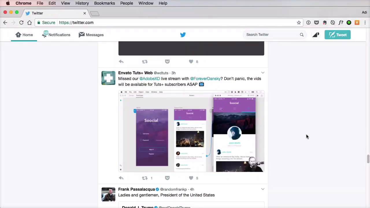
Charles Eames once said that the details are not the details. They make the design. Now, I started with this quote, because it's relevant to the topic of this lesson, which is micro-interactions. Pretty much all definitions I found on the web on micro-interaction sound something like this, a small product moment that accomplishes a single task. For example, toggling the mute switch on your phone, or turning on the light, turning off the light, liking a post on Facebook, swiping down on your mobile phone to refresh the content. Now, all of these are micro-interactions. A micro-interaction is something you do every day, and you take for granted. You don't really think about it, right? It comes naturally. When it comes to web design, micro-interactions can make or break your product. If used correctly, they can enhance the user experience by providing feedback, by communicating status, or by guiding users into taking certain actions. These are small details, basically, but just like the quote said, the details make the design. Now, the problem is that many designers ignore or simply forget about micro-interactions, but they shouldn't. These are as important as other aspects of the website like, for example, typography. That's because when we're designing, we really should take a human-centered approach, which means we have to speak the same language. And micro-interactions help us do that. I don't want to go into a philosophy here. I just want you to understand that these are very important. Now, in the case of web design, these micro-interactions usually come along with certain animations. Take Twitter, for example. Look at what happens when you like a tweet. Clicking the little heart icon produces a very subtle animation. It feels great, and it looks great. More importantly, it gives you visual feedback, letting you know that your action was successful. Here's one of my favorites from Dribble. The animation is really fast, but not too fast that it loses its effect. Here's another one from Dribble. This time, it's for a Play/Pause action. I really like the way the button morphs into something else, highlighting the change. And here is a more complex one for a password check. This is a prime example of using micro-interactions to offer feedback. KLM does a great job with their ifly50.com website. They use micro-interactions to guide the user to discover more by showing this message here at the bottom. They highlight changes and offer feedback by animating this heart icon. And they do a great job of making the navigation clear, so that you always know where you are and how to get get to where you need. Here's another great example from Sound of Change. When you focus a form field, you get this scale transition that makes the text larger and easier to read. Plus, the added bottom border lets you know that it's an input, and you have to type something in, a great little detail that makes all the difference in this case. Now, most of these transitions and animations can be easily done via CSS. But for more complex ones like the Twitter like button, you can use a library called mo.js, which creates motion graphics for the web. I recently made a tutorial about it, so check out the lesson notes if you wanna see that. Now, let's go ahead and explore our final pattern, which is relatively new but has grown so much lately that it's just impossible to ignore, virtual reality. That's coming up next.


