- Overview
- Transcript
2.1 Basic Usage
Let’s talk about the basic usage of multi-column layout, known in shorthand as “multicol”.
To get started, you need to do one of two things: declare a column count or a column width. You can declare both, but to get things moving you need to declare at least one of these two. Here we go!
Related Links
1.Introduction1 lesson, 01:15
1.1Welcome to the Course01:15
2.CSS Multi-Column Layout5 lessons, 31:31
2.1Basic Usage13:19
2.2Spanning Columns04:51
2.3Using Content Breaks05:40
2.4Useful Examples of Multi-Column Layouts05:29
2.5Multi-Column Browser Support02:12
2.1 Basic Usage
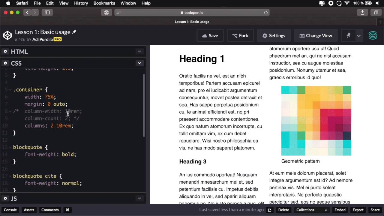
Let's talk about the basic usage of multi column layout or shorthand, multi col. To get started, you need to do one of two things, either declare a column width or a number of columns or a column count. You can do both, but to get things moving, you need to do at least one of these, so here we go. I have a very simple demo prepared here in CodePen, it's basically a page I have a container as a parent for everything. And then inside a couple of headings, paragraphs I have a couple of images and also a block quote. And the result is something like this, it's a very, very simple page. Now in terms of CSS, it's just the usual stuff that you would find a line height on the body, set some width and centered the container. And then applied some light styling to the block quote. So let's say I want to split this content into columns. And as I was saying to get started, you need to either declare a column count or a column width, so here's how you do that. You go to the parent element, in our case it's the container, and you would say, column-count, let's say 3. Now, automatically, the browser split all of my content in three columns, but while doing that it preserved the flow, okay. So we're basically going top to bottom, and then it continues on the second column, top to bottom again. In the third column it continues top to bottom just where it left off on the second column. The browser automatically calculates the width of these columns and creates them for me, how cool is that? You can also specify, instead of column count, you can say column width, let's say 10 rems. So this will tell the browser, I want as many 10 rem columns as you can fit in the space and it does all the calculation automatically. If I say, well, I want each column to be 20 rems, then the browser calculate that well for 20 rems, I can only fit one column in the available space that I have here. But notice if I resize my window, it has more available space so now it can fit two 20 rem columns, and that's exactly what it's doing. Resize this even further, and if I could go beyond this, it will actually create another column. So to demonstrate that, let's say I want each column width to be 5 rem, okay. So now the browser creates one, two, three, four, five, six columns because, it can fit six, 5 rem columns in the space that I gave it. Now you'll see that we have a lot of overlap, a lot of overflow here from the elements, we'll talk about that in just a little bit. But I just wanted to show you the very starting blocks of working with CSS multi column layout. And that is to declare either a column with or a column count. Now, as I was saying, you can specify both of these, and you can do that either by saying column with and give it the number that you want and then column count and let's say 2. Now when you specify both properties, then column count will actually specify the maximum number of columns. So if I comment this, you'll see that if I want 10 rem columns, the brothel can fit three of them, but if I say column count 2, it's only gonna fit two, so here we have a maximum number of columns. You can combine these two properties by using the columns property. And you would use it 10 rems and 2, and it's gonna do exactly the same thing, or you can do 2 and 10 rems, and it's exactly the same thing. So the way this works is, if this value has the unit, then it's gonna be used for the column width. If it doesn't have a unit, for example 2, it's gonna be used for column count, it doesn't matter in which order you use these. Now as I mentioned in the beginning, the flow of my page stays exactly the same, so what do I mean by flow? Well, if I delete this column property you'll see the normal flow of the page from top to bottom, and all the items are laid out in my page, just as they are laid out in the HTML code. Columns doesn't change that, or the multi column layout doesn't change that the flow is kept, so we also go top to bottom. And when we don't have space, we go to the next column, and the content just flows naturally like this. Now, the very cool thing about multi color is the fact that it's responsive by default, okay? So for example, I were to resize this, Notice that on smaller sizes where we can no longer fit two columns, it just turns to one column. So we don't actually need to specify a different number of columns for each breakpoint. We just specify the width that we want, odd number of columns and the browser does all the calculations for us which is just fantastic. Now earlier I mentioned something about these images and how they kind of break the layout by overflowing into the adjacent columns. And a very simple way to demonstrate that is to actually specify let's say I want 5 columns in here, right? And you'll see that this image is really misbehaving. So, one quick way to fix that is to target that image, and just set the max-width to 100%. So now, the image is gonna be constrained to the column so you no longer have these issues. In some cases, there is not a lot you can do because here, for example, the text block code is kind of overflowing in the next column, and that's because I have long words and by default, these do not break. So you really have to be careful when defining your number of columns and making sure that you have enough column width to accommodate your content. So in my case, probably a column count of 4 would be a bit better, because it will accommodate all the content properly. Something else you have to be careful about is when you have a fixed height on your parent elements, so let me show you a quick example. Let's say I want 3 columns here, and the container I'm gonna give it a height of let's say 60 view port height. Okay, so what's gonna happen is that the content will now be overflown in the inline direction, so horizontally. And this is not something that is good for readability, for user experience. Basically your users will have to scroll horizontally to see the rest of the text. Now, there isn't really a way you can get over this right now, but what you can do is prevent it by using some vertical media queries. So vertical media queries are just like regular media queries. If you think about it, when you define a media query, you say media, screen, and whatever minimum or maximum width equals to a specific value, right? Well, you can also check for the height, right, so, if you have, excuse me, a minimum height of let's say I don't know, 20 or 300 pixels, right? Then, you can use calls otherwise, you don't do that so, in our case, a very simple solution would be this. Media and, min-height, let's say it equals to 400 pixels, okay? Then we target the container and then we say columns 3 and let's go ahead and delete these two, right. So now we have a minimum height of 400, and this relays to the view port, be careful. So we are using columns, but if I were to resize this, See, when I get to a view port height of less than 400 pixels, we'll just have normal flow. We're not splitting the content into columns anymore. So that's one way to get around the whole overflowing issue. Now let's quickly talk about styling, because the thing with multiple is that you cannot target individual columns in CSS or JavaScript, you just cannot do that. So for example, you cannot target this middle column and set a different height or a different color or a different pattern to it, it doesn't work like that. All the column boxes are the exact same size, what you can do for styling is one, you can add a rule or a dividing line between columns by using the column rule property. So you will go to the container, and you'd say column-rule, and this behaves just like a border, okay, it has the same possible value. So I can say 1 pixel solid red, and that's gonna add a 1 pixel solid, red, dividing line between the columns. I can do that because this is a property that's supported by the border property or a value excuse me a value supported by the border property. You can also change the gap between columns by using the column gap property. By default this is 1 m, but he can say column-gap, let's say 5ms, and that's gonna create a 5m gap between the columns. And notice the cool thing is the rule, the dividing line stays exactly in the middle between the two columns when you change the column gap. Of course, you can go call them gap 0, and that's gonna leave you with zero space between the columns. There are cases where you might want to do this for styling purposes, of course. And that's the basic usage, that's how you get started with CSS more be column layout. Just to recap, you simply define one of the two properties either column counter column width on an element, and that element will basically transform into a multi-column container. Therefore dividing the content into columns specified of course by either the column or the width that you set. So, now let's talk about spelling elements across columns, and this is something you can do, and I'm gonna tell you all about it in the next lesson.


