

- Overview
- Transcript
2.2 Spanning Columns
When using the multi-column layout, you can choose to span certain elements across columns. This is very useful for large elements that need to be displayed at a bigger size, like images.
Let’s see how we can do this.
Related Links
2.2 Spanning Columns
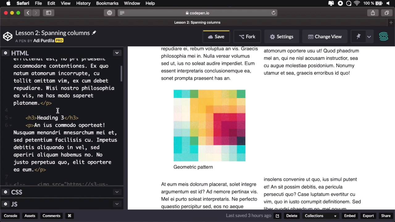
When using the multi-column layout, you can choose to span certain elements across the entire length of the columns. And this is very useful for elements that maybe need to be a larger size, like for example images. So let's see how we can do this. I have the very same example that I show you in the previous lesson, the same HTML, the same CSS. So let's go ahead and create some columns here. Let's say I wanna create two columns, okay? So that's gonna split my content nicely into columns. And let's say that I want this block quote to span my two columns, that's actually very simple to do. What you do is target the element and you say, column, span and they give it the value of all, okay? So now, the columns will be slightly rearranged. And now my block quote spans both columns. If I had three columns, it's gonna span all three columns, right? Just like you can see here. Let's keep this at two. Now currently, it cannot specify a fixed number of columns that you want to span. It's either all or none, which is the default behavior really. Maybe in the future versions of the specification, we'll be able to just, for example span two columns or just three columns. But for now, it's either all or nothing. And you can do this as I was saying with any element that you want. So if I want to span this image, I can do that, no problem. The images inside the figure. So I'm going to say it's a figure, column, span all, right? That's going to be rearranged. The figure is now full size. The image is a tiny image that I have right here. So it doesn't go the full size. But if I go back to my HTML, I have another image here, That I wanna show you. And this is a pretty large image, and if I wanna put that inside a figure, okay? And then inside the CSS, I'm gonna say, figure img max-width 100%. I'm gonna solve that overflow problem as well. Let's see, I have a little error here. I missed to my column. Where is that? There we go. Now it's fixed. Okay, so now the figure spans all three columns, both columns, excuse me. And the image is now 100% max-width of my figure. So this is the kind of layout that you would maybe find in magazines or newspapers. Just columns of content, elements, spanning, multiple columns. This is really something that you couldn't do before in CSS. But now it's here, it's very well-supported in browsers. We'll talk about that in this whole lesson. And it's just super super easy to use. And that's how you can span various elements across columns. So just to quickly recap, find the element that you wanna span across columns and add the property on column span with the value of all. The other value is none which comes in by default. And currently, you cannot span just a fixed number of columns. You either span all of them or none of them. Now, in the next lesson, we're gonna talk about how to deal with content breaks. Because when you're doing a multi-column layout, you're basically fragmenting the content. That's the term. That's the correct term. And when you're fragmenting content, you might end up with certain elements that are suppose to be in the same column but are not, they're fragmented as well. So we're gonna talk about how to prevent that in the next lesson.


