
 Lessons: 5Length: 41 minutes
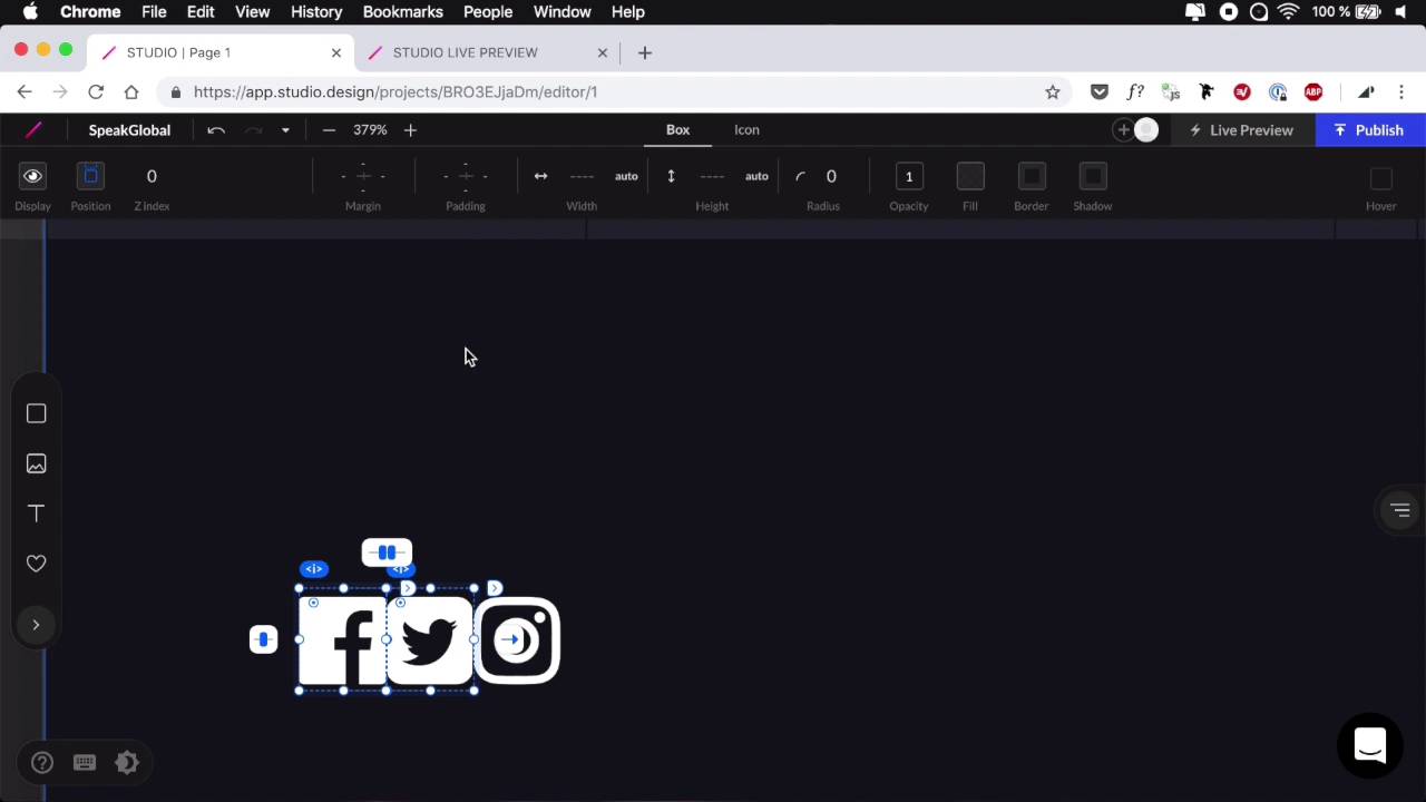
- Overview
- Transcript
2.4 Building and Publishing a Simple Web Page
Now that we are more familiar with the Studio UI and its tools, let’s go ahead and use Studio to build a very simple web page.
2.4 Building and Publishing a Simple Web Page
All right, so now that we're more familiar with Studio and Interface and the tools, let's go ahead and create a simple web page for a fictional piece of software. And in fact it's gonna be a simple coming soon page with just a little bit of information, a form for capturing some email addresses. And that's about it. So we're back here in the Studio dashboard. I'm gonna go ahead and create a new project. As you can see here, we can start over with a black canvas or we can choose from one of the predefined templates. But in our case, we're gonna start with a blank canvas. We're gonna name this project, SpeakGlobal. So first thing's first, I'm gonna upload a logo. It's just a dummy logo that I had laying around. It looks like this. And let's have a background color for our page. I'm gonna go to Fill. I can access some colors by clicking this icon, and there are some predefined colors right here. So let's go with maybe this indigo blue, and now I can tailor this to my needs. So gonna go something like this maybe. Okay, now let's bring in our logo. So simply a matter of drag and drop. Let's position this to the left, and here we have the option to use a box or an image. The box will essentially have the image as a background image. The image, if I set it to img here, it's simply gonna be an image tag. And then I can go ahead and resize it to maybe 120 pixels. Next I'm gonna select my page here and I'm gonna add a padding on all four corners for about 60 pixels. Next, let's add some text. We're gonna create a subheading. And for fonts, we're gonna use PT Sans, again from Google, and I'm gonna use the bold version. It's gonna be 13 pixels. Color, let's set it to white for now so we can see what we're doing. We're gonna align this to the left and I'm gonna set a letter spacing of 1 pixel. And then for the text itself, I'm gonna say the ultimate email marketing platform for, and then I'm gonna have a bigger title. So text again, also my left color white. For font, let's use this one, Lato, and let's make something like this. 48 pixels should do just fine. For line height, I'm gonna select 1.2 right from the get go and from this 1.5, In here I'm gonna type Creators & Entrepreneurs. All right, let's add a little bit of a margin here. I'm gonna add a margin button to all the elements, okay? And here, I'm actually gonna decrease the opacity to a white, let's say 40%. That should do it. And I'm gonna click this little button to add this as a document color so I can reuse it later on. Next I'm gonna group these up, and I'm gonna make sure that everything is aligned properly to the left. And then on the actual page I'm gonna make sure that everything is aligned to the left. And vertically I'm gonna position these like so. So we have logo on the top. This is gonna be in the middle because I'm gonna add a footer. Text, something that says copyright 2019, SpeakGlobal, all rights are reserved. All right, so this will be PT Sans, 16 pixels. Color is going to be the same white, 50%. All right, and also let's make sure this is aligned to the left. Okay, so now if we resize this page, and if I zoom out a little bit, you'll see how our layout is taking shape. We have a logo on top and this is in the middle no matter the size, and this is sitting right at the bottom. Let's generate a live preview link just so we can keep an eye on it on on a larger browser window. And you'll see that as we start making changes, you'll see them reflected here in real time. Next, let's add another bit of text here, so a paragraph right there. PT Sans 16, align left. Color's gonna be white. And we're going to say something like, we're launching very soon. Enter your email address below to be the first one to know. All right, now this and this we're gonna treat as a separate group, and I wanna make sure I add a proper margin bottom. Let's say about 60 pixels should do just fine, okay? And then under this I'm gonna add a form. So I'm gonna add an inline form. Just like that, oops, that didn't work. Let's try it again. There we go. And for this form, I'm gonna get rid of the initial padding. I'm gonna get rid of this label. For this button, we're gonna use a different color, something like, Something like this maybe or maybe something like this like a brick red. I'm gonna change the text here to Notify Me, there we go, and let's select this bit, and let's add a border radius of about 6 pixels. All right, now let's select the text. Let's add a margin bottom to this. 15 pixels should do just fine. And select these two, group them together. Make sure everything is aligned properly. And this piece of text I wanna resize to match my form. And then I'm also gonna set a line height of 1.5. All right, so let's take a look at the preview. That actually looks pretty good. So what else can we do here? Well, we can add a hover state on the bottom, on the button, and that's really easy to do. So I'm gonna select this background and I'm gonna check Hover. And then I'm gonna changes its fill to, I don't know, something a little bit darker ,like this. And now you'll see that we have a nice hover effect. Finally what I'm gonna do is add some social media icons right here. So for that, we're gonna go to Icons Font Awesome, and I'm gonna search for let's say Facebook. Let's grab this one. For now I'm just gonna position them all right here. I'm gonna set the size, 24 is good, and let's grab another one. Let's say, Twitter, I'm gonna put it there. Also color white and, finally, let's choose, what, Instagram? Yeah, that looks pretty good. And I'm gonna place it there, again, color white. So now I'm gonna take these three, and let me zoom in here a little bit. And I'm gonna select Twitter and Facebook. And I'm gonna go to Box and I'm gonna add a margin right of, let's say, 30 pixels, oops. Apparently, I did not have that one selected, 30, just like that. All right, so let's zoom back out and I wanna position these icons on the right side of my page. But they need to be centered with this copyright text. So I'm gonna grab the copyright text, I'm gonna grab this group, and I'm gonna make another group. So now I'm gonna select that group. I'm gonna make it larger. And then I'm gonna change the flow of the group. So instead of top to bottom, I'm gonna set it to, whoops, that was the wrong icon. [LAUGH] There we go. I'm gonna set it to Wrap, and just switch the position here. Like that. And switch the distance. And now everything is centered properly. All right, let's have a look, and there are my icons. Of course, you can make these into links. Let me quickly show you how to do that on one of the icons. So just double-click until you get to the icon. See this little arrow? Click it, it's gonna take you to either a page or a URL, hit URL. And just hits the, I don't know, www.facebook.com. And as soon as you do that you have the option to open that link in a new tab, okay? So now that's gonna take me to www.facebook.com. And I forgot to add the http in front of it. Well, that's a quick fix. I think it's https. There we go! So now it's gonna take me to the correct address. Now let's have a look at how this behaves on smaller screen sizes. So let's check here on the iPad, that looks pretty good. And then I'm gonna manually resize this, see if we have any sort of problems. Okay, so when I'm here, I actually want these to be centered like this. So when I'm up here, they're nice and positioned one to the left, one to the right. But when I come to a lower size, yeah, they're gonna stack one on top of the other. And I think that the last thing I want to do here is add a little bit of margin or padding to these items. So let's go ahead and select them. Let's add just a tiny bit of padding. I'm gonna actually use the box because it's much faster. So I'm gonna add 15 top, 15 bottom, and I'm gonna do the same for these. So 15 and 15. Okay, so now, I have a nice responsive page. Let's take a closer look here. Of course, you can tweak it around a little bit. For example, the padding only occurs here, but you might want it to occur here as well. So in Studio the changes that you make are tied into the various breakpoints. So for example, I can set a position to an element here but then I can do this. I'm at a different breakpoint, and set a different position for that element there. And they're gonna be reflected in the final project as well. So there we go, just a very, very simple coming soon page with a complete form. That's the beauty of it. So right now, if we go to the project dashboard, and we go to Forms, right, you'll see this notification here, for Email Address. So we can go ahead and edit that, and I can register an email address, okay? So now if I'm gonna use a dummy email address here, and I can say notify me, it's now telling me that I received a new mail from my project SpeakGlobal with that email address. And I also have access to it in the backend. So if I go to Forms, again, I can see the results. So here is the email that I've just submitted. And with these results I can download a CSV or an Excel file. So how cool is that? So it took us maybe 15, 20 minutes to get this page up and running. It's responsive. And all we have to do now go and publish it right here, and it's going to be live on a subdomain, of course, but you can upgrade and host this on your own domain. So that was just a quick look at how we can build a very simple page with Studio. I think this is a great, great tool. It has its limitations. For example, it only works in Chrome for now, but they will probably make it work in other browsers as well. And as I was saying in some of the previous lessons, you cannot use JavaScript or do complicated CSS or JavaScript stuff with it. You really have no control over the CSS or the HTML that it generates. So if you're the kind of person who likes to write their own HTML and CSS for doing projects, and I'm one of them, you might not find a good use for this. But for quickly building a page, for creating a prototype, for even mocking up something, this is a really cool tool. And even for designing, even for design work, if you're building a WordPress theme, let's say, right, and you have the choice between designing it in Sketch XD, the usual stuff, and then writing your own code, you could choose to design it in Studio. It doesn't matter if you don't have access to the code behind it. What matters is you have a tool that's gonna help you build, design that product really fast. And because Studio is built the way it is, when you're designing, you actually have to think in terms of how to code this thing later. To give you an example, when you're creating that top bar, right, in a normal design software, you would make a box. You could place the logo, maybe put it in the middle or something. But here, you can actually apply padding, you can actually apply margin. And this is much easier for you when you come back and write the code yourself. You can just reference these values off of the Studio project. You can click on that header, you can see it has a 30 pixel margin all around, it has a 60 pixel margin bottom. Cool, I'll do that. So it's really, really fast. And that's pretty much it for this short course. I thank you very much watching, and I hope you found it useful and it gave you all the information you to get started with Studio. I'm until next time, take care


