

- Overview
- Transcript
2.2 Using Blend Modes
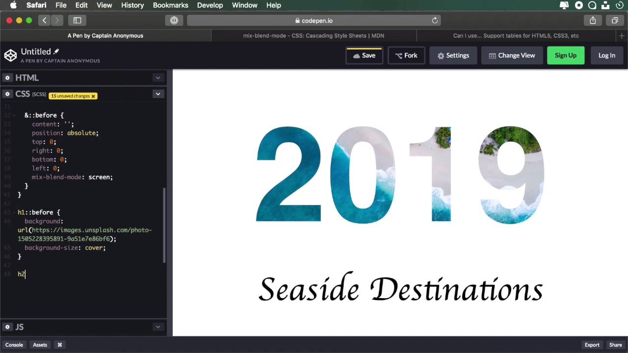
The second technique we’ll use to create text masking relies on blend modes. This approach uses the multiply and screen modes that allow us to use white or black text over an image, and choose which parts of that image to display inside the text.
Let’s begin!
Related Links
1.Introduction
1.1Welcome00:50
2.Text Masking Techniques
2.1Using `background-clip`05:07
2.2Using Blend Modes05:22
2.3Using Blend Modes for Cutouts05:38
2.4Using SVG Text07:06
2.5Using SVG Masks06:47
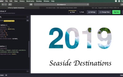
2.2 Using Blend Modes
The second technique we'll cover for creating a text mask uses blend modes. More specifically, the multiply and screen modes that allow us to use white or black text over an image to choose which parts of that image we wanna display through the text. So let's begin. So I have an example setup here I have an hgroup with an h1 and h2. And then I went ahead and applied some general styling, just some font-family, alignment options, and font size information for the h1 and the h2. Now, let's do this. We'll say, h1 and h2 we'll cover the common properties, first. So we set up color to black, and a background to white, then we'll do this. Mix-blend-mode: multiply. Now, this by itself don't do anything because there is no background to the parent element. And to make sure that we don't interfere with any other elements in our page, we're gonna use some pseudo-elements on these actual headings. So we're going to do this. Before, I just reset the content, set position: absolute. Let's set a position: relative here. And then we'll make top, right, bottom, and left 0. And then we'll set mix-blend-mode: oops, to screen. So then, let's target the h1::before and I'm gonna set a background to it and let's also do background-size: cover; and there you go. We have this image that I got from Unsplash it looks something like this. And by making it background-size: cover; all right, we're displaying as much from the image as possible. So now we get this nice text masking for this background. You can actually see the background behind when I do my selection. That's pretty cool. Now, it also works with gradiance. So, on this h2, let's go ahead and add a gradient. So h2::before. We're gonna say background. Let's do a linear-gradient. Let's do (to right,) and let's put a couple of color values in here. So we have a nice multicolor gradient, and all of these colors are taken directly from this image. I just sampled them from there. So that's all there is to it. The key is setting these blend modes correctly. So as you can see on the h1 and the h2, so on the actual text elements, I set the blend mode to multiply. Now, the multiply blend mode will keep dark colors dark and light colors will let through what's behind. Now on the pseudo-element I set the blend mode to screen so the screen is the reverse of multiply. Dark colors allow you to see what's behind and the light colors block what's behind. So by combining these two, we're able to achieve this very nice effect. Now, in terms of browser support, things get a little bit sketchy here. These are not supported in a lot of browsers as you can see, IE and Edge, don't support mix-blend-mode. And Firefox and Chrome, Only the latest version supported Safari. Not so much. Opera supports it. And yeah, that's pretty much it. So not a lot of support, but it's still there, the modern browsers most of them do support it. So, if you wanna play around with blend modes, then you really have to be careful about these things. If it's something experimental, then you can get away with it, no problem. But if it's something that you wanna rely on 100%, go for the previous approach with the background core property. Now, in this lesson, we created this effect where we're basically displaying a background inside a text. But what if you want to create different type of cutouts in the background, excuse me, in the shape of that text. Well, in the next lesson, we'll again, use blend modes to create slightly, something a little bit different. So I'll see you in the next lesson.


