

- Overview
- Transcript
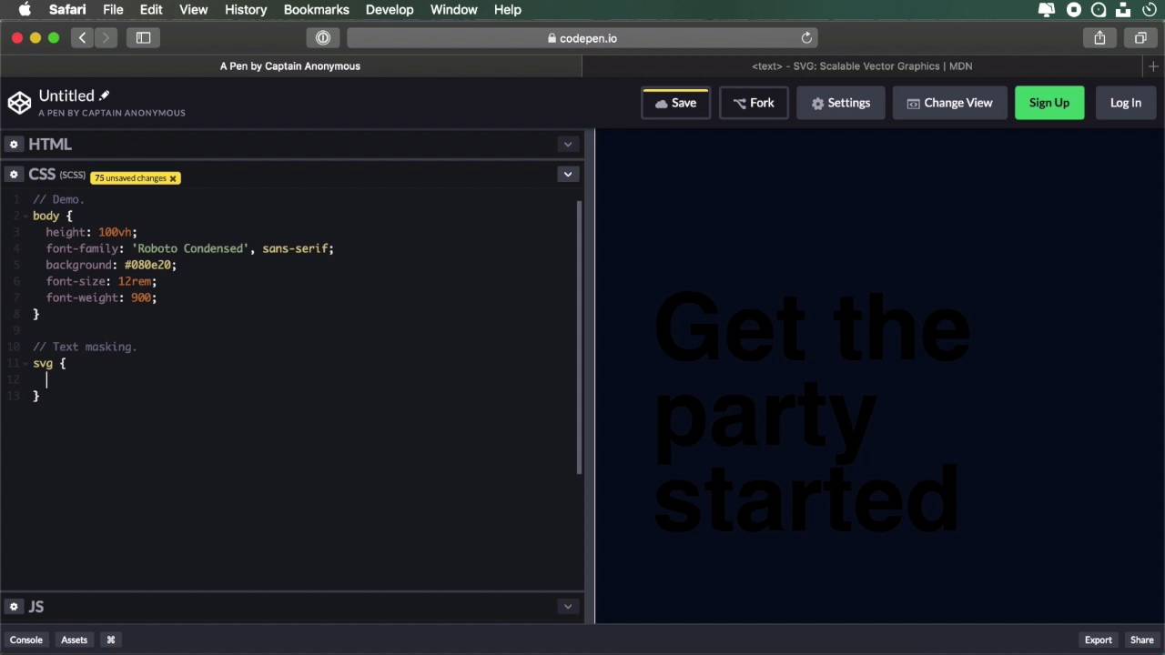
2.4 Using SVG Text
The fourth method we’ll use to create knockout text uses SVG text. This is a more forgiving method in terms of browser compatibility because SVG is widely supported. Having said that, this is a more difficult technique to implement. Let’s see an example.
Related Links
1.Introduction
1.1Welcome00:50
2.Text Masking Techniques
2.1Using `background-clip`05:07
2.2Using Blend Modes05:22
2.3Using Blend Modes for Cutouts05:38
2.4Using SVG Text07:06
2.5Using SVG Masks06:47
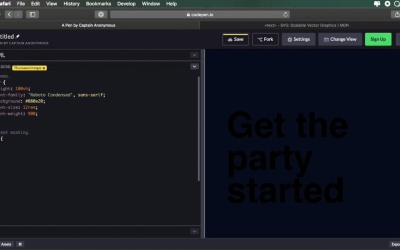
2.4 Using SVG Text
The fourth method we'll use to create knock-out text uses SVG text. Now, this is more forgiving in terms of browser compatibility, because SVG is widely supported. But this is also a technique that's a little bit harder to implement, so let's see an example. If we take a look at the SVG text, we can see that it defines a graphic element consisting of text. And we can apply gradients, patterns, clipping paths, masks, and so on to text, just like any other SVG graphic element. And taking a look at the syntax, it's actually quite simple. We define an SVG, and then we define the text inside it. So let's begin here, we're gonna define a viewbox, oops, obviously not here, but here. And we'll say 0 0, let's give it some dimensions of 1000 by 1000. So then we'll say text, and I'm gonna say text-anchor, this basically defines the starting point of our text. I'm gonna say start, and it's gonna start, I'm gonna make this bigger. It's gonna start at the following coordinates, x, let's say 10%, y, let's say 35%. And the text itself, we'll say this, get the, now let's go ahead and duplicate this. We're gonna say, party, started, so get the party started. Now I'm gonna change the y properties here, I'm gonna say 50% and 65%. Now we're gonna apply a little bit of a shift on the y-axis, so dy, let's do .35em, 35 here. And this has nothing to do with text masking whatsoever, I just want to make the text look a little bit better. So let's go to the CSS now, and define some properties for this. So let's do a height on the body, font family, let's do Roboto Condensed with a sans-serif fall back. Let's add a background color, and let's set a font-size of 12rem and a font weight of 900. So now, for the actual text masking, let's say we want to display a gradient inside this text, right, well, how do we do that? We start by defining that gradient inside the SVG. So here, we're gonna say linear-gradient, whoops, it's actually like this, so LinearGradient. Let's give it an ID of gradient, this can be whatever you want, of course. Let's also set some coordinates here, x2 is 100%, y2 is 100%. Okay, so that's the starting and ending point for our color stops. So then we'll define a color stop, and let's do another one, all right? So now, what do I have to do? We gonna go right here, inside the SVG, and let's do this. Position: absolute, I just wanna stretch it on the entire canvas. We're gonna say, width: 100%, height: 100%. So then we'll target the SVG text, and we'll do text-transform: uppercase. And then simply, we'll say fill: url(), and will pass in the id of our gradient, which in our case, is called gradient. And let's work a little bit more on this gradient, let's do an offset here, and let's do an offset here, Just like that, all right, so now we have an SVG with a gradient inside. So it's not as easy as just writing a piece of text in HTML, and using a background color. With SVG, there's a little bit more work involved. As you can see, you have to define the gradients here, you have to define the text, you have to position the text properly. So as I was saying, it's a bit more work. Now, you can also put images in the background. So to do that, we're gonna define a pattern, let's do an id of pattern. Let's define some pattern units here, just to make sure our image is displayed properly. So let's also make it as wide and as tall as our SVG, okay? And inside the pattern, well, it can be anything, I'm gonna choose to display an image. So the image, again, is gonna be as wide and as tall as my SVG. And then we'll say xlink:href, and I'm just gonna grab an image from Unsplash. And then we'll will go to our CSS, and instead of our gradient, we'll say fill, pattern. And there we go, we now have an image as a background for our SVG text. It's not that hard, but it's a little bit harder than using the traditional methods, like background clip or blend modes. You do have to code the SVG, and you have to use, or create text like this, which might not always work for the best. But if you're just looking to create a showpiece, and you're not using this very often, then creating an SVG like this is really simple. So just as a quick recap, we're creating the text here, we're defining our fills, basically either gradients or patterns. And then in CSS, we use the fill property to apply those. And by the way, this also works here, so I can use the fill property here, and it's gonna work just as well. But with CSS, we can target all the text elements at once, so that's a little bit easier. Now, in the final lesson of this course, we'll explore the fifth technique, which uses SVG masks, so see you in the next lesson.


