- Overview
- Transcript
2.5 Shadow Effects
To wrap up your site’s design, in this lesson you’ll learn how to add some CSS3 shadow effects. You’ll add subtle shadow effects to your heading text, and also to the main content area of the layout.
1.Introduction1 lesson, 00:58
1.1Start Here: Learn CSS Colors and Backgrounds00:58
2.Learn CSS Colors and Backgrounds5 lessons, 34:24
2.1Background Colors12:13
2.2Text and Link Colors06:40
2.3Background Images05:48
2.4Border Colors03:17
2.5Shadow Effects06:26
3.Conclusion1 lesson, 02:54
3.1Wrapping Up02:54
2.5 Shadow Effects
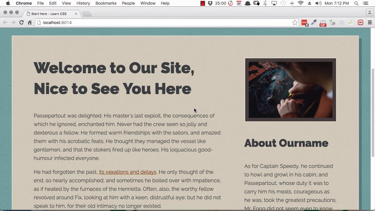
Hi, and welcome to the final lesson of Start Here, Learn CSS Colors and Backgrounds. In this lesson we're going to use some CSS3 shadow effects to add a little bit of extra dimension and a little bit of extra polish to our coloring process. There have been a few different versions of CSS. We started with CSS1. We went through CSS2. Right now, we're in the middle of CSS3, which is almost fully supported across all popular browsers. We're starting to see what's gonna be coming next in CSS4. CSS3 put in some extra cool things that you can do that previously you needed to work with flat images for. One of those things is drop-down shadows. There's two types of shadows that we're going to be working with in this video. The first is a box-shadow and the second is a text-shadow. A text-shadow can be put on any text, as the name suggests. A box shadow is designed for using on square elements like divs. We're going to start by putting a box-shadow on our wrapper element. We'll add in the property box-shadow. There are a few values that you need to put into your box-shadow property. The first two let you define the offset of the shadow that you're creating. The first value is the x-offset, which is on the horizontal axis. The second value is the y-offset, which is on the vertical axis. You'll see what we mean by offset once the shadow's in place in a little bit. So for both of these values we're gonna enter 0.625rem. Here you also have the option to add a value for blur and spread. Blur is how softened you want your shadow to be and spread controls the overall size of your shadow. We're not gonna be using those properties for our purposes, but I'll include a link below where you can read a little bit more about them. Because we're not going to be using those properties, we can skip to the last property, and that is the color of the shadow. Now here, we're gonna be using an RGBA value. You remember from our first video in this course, we talked about how RGBA color values allow you to create see-through colors. That's perfect for our shadow because we'll be able to have a shadow coming off our wrapper with the background image showing through it. So we'll add rgba with a set of brackets, and we'll just add a semi-colon to close off our line. And now for the color, we're going to add 58 for the red value, 89 for the green value, 87 for the blue value, and 0.5 for the alpha value. Now save that and we'll expand our windows so you can see the shadow. And there we go. Now we have a shadow running down the right side of our wrapper. If you look closely, you'll see that the image is showing through that shadow. Then we also have the same shadow running along the bottom. The way the shadow is generated is a box the same size as the element we've applied it to, in this case our wrapper element, is generated. Then it's offset by the amount that we specify in the first two values of our shadow. So that's what we mean when we refer to offset. The shadow is created and then it's just moved, or offset. Then it's given the color that we specified in the last value of our shadow. So that just gives us a little bit of something extra to help add dimension and style to the sign. Now we're gonna do the same thing to our headings here. This time we're gonna use the text shadow property. For this one, we're going to create a new class. We're going to call it heading_shadow. Now before we move on, we're just going to add this class to our two headings. In the html for h1 here, we're gonna add a class= heading_shadow. And then we'll do the same thing in the heading for our sidebar. Back in our CSS, we'll add the property text-shadow. What we're going to do with this effect is we're actually gonna create two shadows and have them stacked one on top of the other. That's one of the cool things that you can do with CSS shadows. You can actually have as many shadows as you want. All you need to do is create a list of values just like we did here with our box shadow. Then add a comma, and then after that you can add another list of values just the same. What you'll end up with is a number of shadows stacked one on top of the other. You can create a lot of really cool visual effects with this. What we're gonna do is to create a subtle, dark-colored shadow underneath that text. But on top of that, we're gonna have another shadow that's about the same color as the background. That's gonna make it look like there's a gap in between the letters and the shadow that's underneath them. Let's go ahead and set that up. First, we'll put in our darkly colored shadow. We're gonna set the x-offset for this shadow to 0.125rem. We're also gonna set the y-offset to the same amount. We're gonna set the color with the hex code ABA076. We'll save that. So there, now you can see we've had our shadow come up on our heading text. It's a version of the color of our background, but it's a little darker to try and make it look like a natural shadow. Now we're gonna stack a shadow on top of them. When you're creating multiple shadows, whichever you put first in your list is gonna come up on top. We want to add a shadow that's gonna come up on top of the one that we've already added. So we're gonna put this in front of the shadow that we've already created. We'll just add a comma before this and a space, and then before the comma, we're gonna add in our new shadow. This one is gonna have a smaller offset, so for both the x- and y-offsets, we'll put 0.0625 rem. For the color, we use the hex code D0CBB8, and now we'll save that. Now when you look at the shadow, you can see that that's changed the effects. We've put a smallest shadow on top of the one we'd already created, and that shadow is about the same color as the background. And because we put that shadow first, it partially obscures the shadow that's behind it. The same shadow effect is also applied to the sidebar heading. All right, so that's it. You've now completed the coloring of your website. You've added in background colors and background images. You've set the text coloring and the link coloring for your site, and you've made sure that it's all accessible. You've set up all your border colors. And you've created some nice shadow effects to go along with it all. That wraps up the final lesson for this course. I hope you'll join me in the last video, where we recap what we've done in this course. As well as everything that you've learned through the entire Start Here series. And then I'll give you some tips on where you can go next as you continue learning web design. So I'll see you in the final video.


