

- Overview
- Transcript
2.2 Text and Link Colors
With your color scheme beginning to take form, you can now set your text colors to fit and adequately contrast with your background colors. In this video, you’ll learn how to set the colors of your regular text and headings, as well as links in their various states of interaction.
Related Links
1.Introduction
1.1Start Here: Learn CSS Colors and Backgrounds00:58
2.Learn CSS Colors and Backgrounds
2.1Background Colors12:13
2.2Text and Link Colors06:40
2.3Background Images05:48
2.4Border Colors03:17
2.5Shadow Effects06:26
3.Conclusion
3.1Wrapping Up02:54
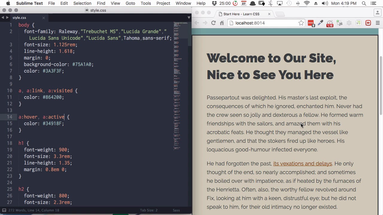
2.2 Text and Link Colors
Hi, welcome back to Start Here, learn CSS colors and backgrounds. In this lesson, you're gonna learn how to apply colors to your text and to your links. So what we've got to work with here is we have an h1 heading. We have some regular text in paragraphs here. We also have an h3 heading down here. Now, what you could do if you wanted, is set a color to specifically target the h1 element and h3 element. However, in our design, we're gonna have the headings and the text all the same color. So we're not gonna need to set separate colors for our headings, just wanted to make sure that you're aware that you can do that if you want to. But in the case of our site, what we're gonna do is just set a site-wide text color, and we're gonna do that by targeting the body element. So, any unlinked text that is inside our body element, including paragraph text and headings, will be affected. Now the property to use when you are creating text color, is just color. So we'll add that in. And then we're gonna set the default text color for our whole site with the hex code 3A3F3F. All right, so now the color is applied to our main h1 heading, to our regular text, and to our h3 heading. But you'll notice that it hasn't affected our links and that's because we need to add in some link specific code. So you remember from our previous lessons on HTML that the element that controls the link is the a element. So that's the element that we're gonna target. So we'll add in an a selector to our CSS, and now we'll set the color for that to the hex code 864200. All right, and there we go. That's changed our link color to a nice soft and bright brown, and that brings it into keeping with all the rest of our colors. But we're also gonna add in a couple of little extras to our link color. So right now nothing happens when you hover over the link. You do get the regular little hand sign that you're used to seeing when you hover over links, but nothing else happens. So what we're gonna do is make the link change color when we hover over it, and the way that we do that is by adding a new style still using our a selector, but this time we're gonna add colon hover. And this is gonna let us set a color that will only appear when a person is hovering over this link. So we're adding that color property again, and this time we use the hex code 34918F. And now when we hover over, we can see the color change in our link and there are a couple of other states that we can also target in a similar way to what we just did with the hover state. We can also target the active state, for a link that a person has already been to, and the link state, which is another way of targeting the default link color. And we're going to use a comma separated list to make our first color applied to the link states and visited states. So we're gonna include a:link for the link state, and a:visited to color the visited state. And then we're gonna apply our hover color also to the active state. Now you can color these different states however you like. Here we're just applying the colors that we're already using, just to keep things a little bit simpler, but feel free to experiment with those. So now we have our headings, our regular text and our link colors, including hover colors. However, our footer text down on the bottom here is still just taking the same color as the rest of our site, which doesn't really fit. So outside of our wrapper area you'll recall that we have two elements. We have our footer element here and we have our header element up here. So we're gonna create some styling that's going to control the color in both of those elements. So with that header, comma, footer we'll add a color property and then we're gonna set the hex code as 165A58. All right, so that's changed our color here to a green that matches the background that we have it over. Now there's one important thing that you have to be aware of when you're setting the colors in your text for your sites. And that is what we call accessibility. Accessibility is thinking about people who may have vision impairment or other sorts of reading difficulty, that make it difficult for them to access your website. And one aspect of accessibility is ensuring that you have good color contrast. So for example, if you have a light background, you have to make sure that your text color is dark enough, that it contrasts with the background sufficiently to be readable. So when you setting all of your color codes, what you should do is run a little accessibility ordering plugin. This works with Chrome web developer tools and I'll include a link to where you can get that plugin and notes below this video. So let's see how this audit works. I'm gonna open up Chrome web developer tools and I'm gonna choose the Audits tab on the very far right hand side here, and then I'm gonna press the Run button. And you see here that we have a warning. And if we expand that out, it's telling use of the color that we've applied to a header and footer, just have a look at that color again. That it doesn't have enough of a contrast ratio. So that's letting us know that right now this color is not accessible enough. So what we can do is inspect that color, and we'll just have a look at the window here. And then you just wanna click into the tab named Accessibility Properties. So we have our paragraph highlighted here, and then down here, you'll see it suggesting some different colors that we can use. And it's telling us that in order for a text here to have enough of a contrast ratio, that we should instead use the hex code 003837. So let's copy that code and add it into our CSS. Now we'll refresh. We'll open up our audits again. Click back up into this audit section here on the left. Click Run one more time. And now you can see that we're passing all of the tests, we don't have any warnings. Everything is green lit, so that tells us that the color that we've inserted has made this text properly accessible. So now we have got our background colors in, we've got our heading colors, our text color and our link colors. And everything has a contrast ratio that allows it to be fully accessible. And right now we just have flat background colors. But in the next lesson, we're gonna add a little texture. We're gonna do that by adding background images. We're gonna add a background image in our main body area, and we're also gonna add a background image to our wrapper. And you'll learn how to do that in the next lesson. I'll see you there.


