Lessons: 20Length: 1.9 hours

Next lesson playing in 5 seconds

Cancel
  • Overview
  • Transcript

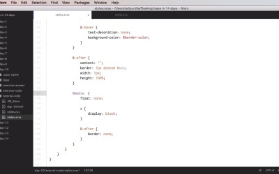
4.3 Day 3: @media Directive

Welcome to day number ten, where you'll learn about the media directive. Now this is just like the CSS version, but it has one big bonus. You can nest it. So, let's begin. Let's start with a very simple example here. So we have the sass code that we've used previously. That's also coupled to this HTML file. And this HTML file has a navigation that you can see here. And it looks something like this. Now, let's say that I want this navigation to behave and look differently on a screen that has a smaller width, say 768 which is kind of a standard tablet size in portrait. Well, what we can do here is go to our navigation, and we're going to go right here. And it'll say this. Media, we'll say screen and max widths, 768 pixels. Then we can nest the necessary styles. For example, I can do float none. And then I can target the anchor tags and do display block. And maybe remove the separators. And that should do it. So let's see how this is compiled. So remember we are inside the nav ul li and we've nested the media on this level. So in CSS, if we scroll down. We're gonna see at the root level. We're gonna see media screen so our break point here, our CSS rules. Now ul li and then all the necessary styles for that. So even though we've nested this in SAS in CSS it compiles at the root level of the document. So, that's exactly what we need. Now the media can also contain variables, functions, and operators, in the place of feature names and values. So for example, instead of this bit, I can put in a variable. And let's say that I have a variable called tablet break point. However, I do need to use interpolation here. So I'm going to say tablet-breakpoint, and I'm gonna go up here I'm gonna define that variable to that value exactly and I need to quote this, like that. And you'll get exactly the same result in CSS. No you can also nest media, inside another media. In this case the queries will be combined using the & operator. For example, in here I can do something like media orientation portrait. I can do some styles. Border, bottom, for example. I want pixel. Just as a demo style there. So now, we can see that we have screen and max width, and orientation portrait. So that's really, really cool. And yeah, that's basically it for media. And how you can use them to organize your CSS file better. Because, if you think of it, normally, you would do media queries in a separate section of your CSS file, right? But when you're using Sass. You can actually do the media queries where they make more sense. So if for this screen size I want to change how the navigation looks like, well, I'm gonna place the media query right here. Now, for your exercise, you have a CSS file and your assignment is to write the corresponding SCSS file while respecting a few rules. First of all, you have to use variables where ever you see fit. You need to use at least two maps. You need to nest media rules at least once. And you must use the multiplication operator at least twice. Good luck. All right, that's it for the @media directive and as you can see it's much easier to use it compared to the plain CSS version. Now in day 11, you're going to learn about the @extend directive. And that's coming up next.

Back to the top