


- Overview
- Transcript
2.1 Basic Menu Styles
For the first project, I’ll demonstrate how to use the CSS Flexbox model to simplify the task of evenly spacing out menu items. In this lesson, you will review the HTML structure and basic styling of the menu.
Relevant Links
1.Introduction
1.1Introduction00:39
2.Project 1: Flexbox Menu
2.1Basic Menu Styles03:56
2.2Styling the Flexbox Menu08:03
3.Project 2: Complex Layouts
3.1Flexbox for Page Layout06:44
3.2Nested Flexible Boxes05:32
4.Project 3: Banner With Centered Content
4.1Vertically and Horizontally Centered07:25
5.Project 4: Ordered Content
5.1Changing the Order05:23
6.Project 5: Image Grid
6.1Basic Styles05:00
6.2Using Flexbox to Finish the Layout05:03
7.Project 6: Uneven Image Grids
7.1Basic Image Styles05:05
7.2Styling the Grid07:34
8.Bonus Project 1: Flexbox Modal
8.1Building the Flexbox Modal04:46
8.2Flexbox Modal Functionality07:12
9.Bonus Project 2: Flexbox Content Slider
9.1Building the Slider12:49
10.Conclusion
10.1Final Thoughts00:38
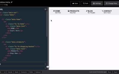
2.1 Basic Menu Styles
Hello, and welcome back. For our first project, I wanna take a look at creating a horizontal navigation menu using Flexbox. Now we have our starting navigation menu, as you can see here. And you can find the URL for this particular CodePen that contains this menu in your course notes for this lesson. And it looks like our menu's already built out and for the most part it has been, but it's not using Flexbox right now and I wanna show you some of the limitations of what we've done so far. So once you've got that open, we can see that initially it looks pretty good. We've got the basic style set up for it, but as we resize it you'll notice that there's not a whole lot of flexibility here. We've got the same amount of spacing between all of our items no matter how wide or how narrow the window is, but once we get down to a certain point they just start collapsing and jumping down to the next line. Now we can put some media queries in place and things like that in order to make it better. But we're going to discover soon how using Flexbox can make this even easier. And one of the things that Flexbox is going to allow us to do very, very easily is to automatically adjust the spacing between each of these menu items as we resize our browser. So we're gonna see that space expand and grow as we change the size of the browser window. But before we get to that, let's take a look at the way it's currently set up. So if we look at our HTML, we have a nav element with a class of main-nav. This contains the entire navigation menu. Inside that we have an unordered list with a class of menu. And then inside that unordered list, we have each of our list items, which are each of our menu items. And each of those list items has an icon and then a div with a class of menu text that has two blocks of text in it, an h4 and a paragraph. So it's a very straightforward setup and for the most part, it works rather well. We would just need to throw in a few media queries to make it work at different browser sizes, but I don't like that it's not very flexible. We can't adjust the spacing between these items very easily. Now we could try to use percentages and try to get it to work that way, but even that's gonna be really difficult to get it to work right. So again, we'll soon take a look at how we can make that easier with Flexbox. For now, let's jump into our CSS and see how we've set this up. So we have our main-nav, which again is the entire navigation menu, all contained within that nav element with a class of main-nav, and inside that we have the menu class which is applied to the unordered list itself. So we've given that unordered list a background color. We've turned off the bullet points by setting list-style to none, and got rid of the default padding left on those list items. And then we just gave it a height of 60 pixels, so from top to bottom this menu is 60 pixels tall. Then for the list items inside that unordered list, we've given them some padding, floated them to the left, and given them some margin as well. Now this float left and margin, this is how we're currently laying out our menu items right now. That's gonna go away once we jump into Flexbox. We won't need to float anything anymore. We don't have to rely on floats, we're gonna allow Flexbox to take care of that alignment for us. And the margin as well is going to be taken care of by Flexbox because Flexbox is going to automatically adjust the spacing between these items once we know which properties to use to do that. And then we have some more CSS down here related to the icons that are out here to the left of the text. The text itself, as well as some basic styles applied to the different font tags or the different text element tags. So those are the basics of how the menu is currently set up, and in the next lesson, we're gonna learn how we can use Flexbox to make this more flexible and easier to use. So thank you for watching and I'll see you then.


