

- Overview
- Transcript
5.1 Changing the Order
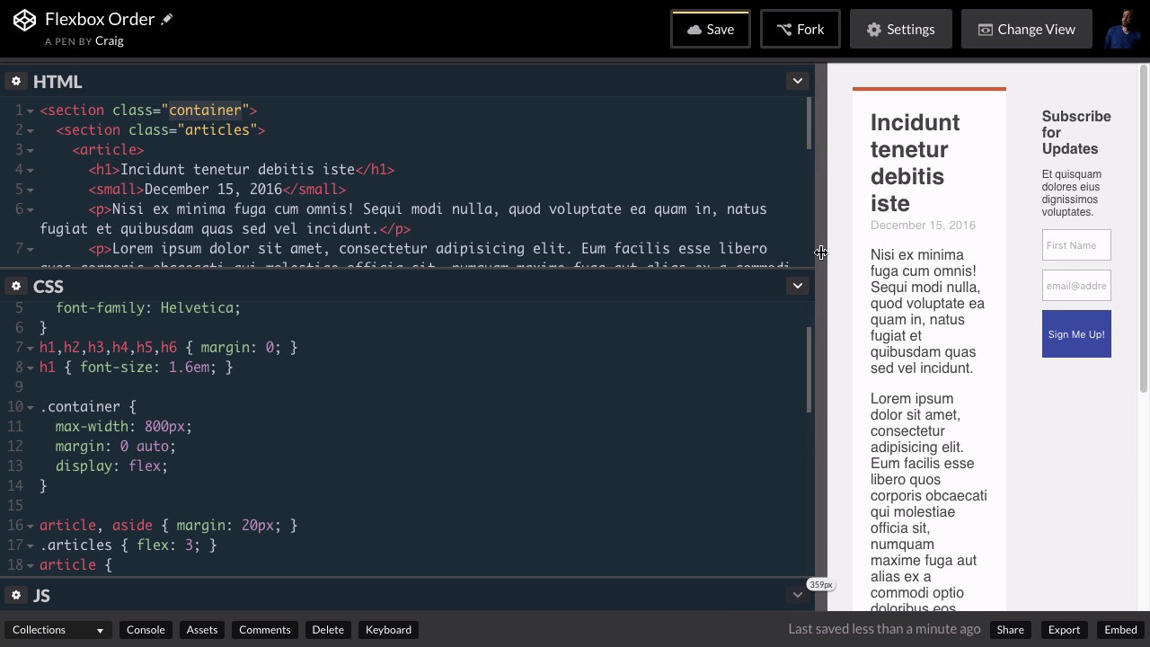
You may have heard that Flexbox allows you to change the order of your HTML elements, but why would you want to do that? If you want your content to display in a different order, why not just change the order of your HTML elements? In this project, I will show you a practical example of when you would use Flexbox to solve the problem.
Relevant Links
1.Introduction
1.1Introduction00:39
2.Project 1: Flexbox Menu
2.1Basic Menu Styles03:56
2.2Styling the Flexbox Menu08:03
3.Project 2: Complex Layouts
3.1Flexbox for Page Layout06:44
3.2Nested Flexible Boxes05:32
4.Project 3: Banner With Centered Content
4.1Vertically and Horizontally Centered07:25
5.Project 4: Ordered Content
5.1Changing the Order05:23
6.Project 5: Image Grid
6.1Basic Styles05:00
6.2Using Flexbox to Finish the Layout05:03
7.Project 6: Uneven Image Grids
7.1Basic Image Styles05:05
7.2Styling the Grid07:34
8.Bonus Project 1: Flexbox Modal
8.1Building the Flexbox Modal04:46
8.2Flexbox Modal Functionality07:12
9.Bonus Project 2: Flexbox Content Slider
9.1Building the Slider12:49
10.Conclusion
10.1Final Thoughts00:38
5.1 Changing the Order
Often when we're using a new technology or learning a new technology for the first time, we sometimes find it difficult to come up with practical uses for certain aspects of that technology. With Flexbox for example, I didn't initially understand why you would want to change the order of your HTML elements as you can do using the order property in Flexbox. So if for example, you have six divs in a row in your HTML you can go into your CSS and change the order of those six divs. And initially I couldn't really come up with a good practical example of why you would want to do that. But recently while working on a website for a client, I came across a perfect example of why you would want to do something like that. And so in this lesson, we're gonna talk about a practical example of changing the order of your HTML elements at a certain break point. So let's say that we have a website and we're gonna have two columns here. Right now it's all in one column, but we're gonna separate this into two columns. So our first block, here, is gonna be the left column, and then our block down here at the bottom, which is our subscription form, is gonna be a smaller sidebar on the right. And then once we get down to a certain browser size I want it to break down into a single column. But I want this Subscribe for Updates section, which was on the right, it was the second item on the screen, I want it to move to the top so that the users will always see that subscription form first. And so that's what we're gonna do in this lesson. So I've already set up the HTML that we need, it's a pretty straightforward layout here. We have a section element with a class of container and that's gonna contain both of our columns. Our left column is contained in another section with a class of articles. And then if we scroll down we have our second, what's gonna be our second flex item which is this aside element and that's gonna be our sidebar. So let's jump into CSS and let's set the initial column layout up. And again we're gonna to use this container class for our flex container. So we're going to look for that contain a rule and we see it right here in our CSS. And we've given it a max width of 800, a margin of 0 auto. And I'm also going to set its display to flex. Now by default, we can see that that sets up our two columns for us and that's exactly how we want it by default. But obviously, with a setup like this if we start resizing our browser window there's gonna come a point where there's just not enough room for everything. So what I wanna do is I'm gonna create a media query that's gonna break that down into a single column. So let's say we wanna create this media query once our screen or browser width gets down to about 500 pixels. Let's go down to the very bottom of our CSS. I'm gonna skip a couple of lines and I'm gonna create our media query by saying @media screen and, and then inside parentheses we're going to set up a max width. So when our browser is at a max width of 500 pixels, we're going to run all of the CSS in between these curly brackets here. So what I wanna do is I wanna point to our container, which again is our flex container object, and by default it's set to row, or the flex direction is set to row. And we wanna change that so that when we get down to under 500 pixels, we're gonna switch that over to a column. So we're just gonna change the flex direction property here. So flex-direction and we're gonna set that equal to column. So let's test that. We'll start resizing our browser and hopefully once we get down to a certain width, we see that it breaks down into a single column. A problem is our client wants this subscription form up at the very top. We want our users to always be able to see that. So what we wanna do is we wanna swap the order of these two columns once we get down to a single column. And that's gonna be as easy as simply switching the order. So we can set the order property equal to one for our form and we can set the order property to two for our first column, and that will swap them around. Or, we can just take care of it all with one property, by setting the order for our subscription form to negative one. So inside this media query, but after our container class, we're gonna skip a couple of lines. And I'm gonna point to the container class again, but I'm gonna point to the aside element inside that container class. And I'm going to set the order of that element to -1. And you'll see that it moves it up above what was initially our first column. And if we expand back out you'll see that the first column is still on the left until we get down to that smaller size where it jumps down underneath that subscription form. So that's just one example of why you might want to change the order of HTML elements on your page. I'm sure you could think of plenty of other reasons why you might wanna do something like that but that's just one example. So thank you for watching and I'll see you in the next lesson.


