


- Overview
- Transcript
6.2 Using Flexbox to Finish the Layout
With your HTML in place, it’s time to press the “Easy Button” to lay out the grid. By using Flexbox here, you can avoid much of the headache which usually goes along with this kind of layout.
Relevant Links
1.Introduction
1.1Introduction00:39
2.Project 1: Flexbox Menu
2.1Basic Menu Styles03:56
2.2Styling the Flexbox Menu08:03
3.Project 2: Complex Layouts
3.1Flexbox for Page Layout06:44
3.2Nested Flexible Boxes05:32
4.Project 3: Banner With Centered Content
4.1Vertically and Horizontally Centered07:25
5.Project 4: Ordered Content
5.1Changing the Order05:23
6.Project 5: Image Grid
6.1Basic Styles05:00
6.2Using Flexbox to Finish the Layout05:03
7.Project 6: Uneven Image Grids
7.1Basic Image Styles05:05
7.2Styling the Grid07:34
8.Bonus Project 1: Flexbox Modal
8.1Building the Flexbox Modal04:46
8.2Flexbox Modal Functionality07:12
9.Bonus Project 2: Flexbox Content Slider
9.1Building the Slider12:49
10.Conclusion
10.1Final Thoughts00:38
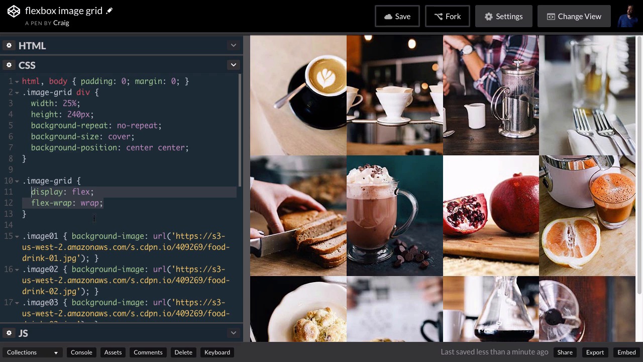
6.2 Using Flexbox to Finish the Layout
In our last lesson, we set up the basic styles for our image grid up to the point where we're gonna start applying some flexbox rules to it. So each of these is using a background image. And we've set up the width and height for each of these images, as well as some basic background properties that are going to apply to all of them. And now we're just going to flexbox the whole layout. So, if we go back to HTML. It's very easy to tell which element needs to be a flexbox container. It's gonna be this image grid class, which contains all of our images and then each of our images will be set up as a flexbox item or a flex item. So you can find the URL for this starting pen in the course notes for this lesson, and it contains everything that we've done up till now. So let's get started laying this out. We're gonna find that this is very, very easy to do. We're gonna jump into our CSS, and then underneath our image-grid div rule, we're gonna create another rule for just the image-grid by itself so .image-grid. And the first thing we're gonna do is simply set the display to a value of flex. And by default, you'll see that's going to squeeze all of these divs into one row even though we've set the width of the individual items to 25%. You see it still throwing all of these together in a single row. It's still putting all of these together and obviously each one of these takes up much less than 25% now. Well, there's a property called flex-wrap, which allows us to wrap these items down to the next line. So if we set that to a value of wrap, you'll see that everything jumps into place. So we now have four elements on each row. If that wrap is not turned on, then it will only respect that 25% width, if there are few enough items to display. So if there were only three items to display for example, it would display each of those at 25% of the the entire width. But since there were too many to fit on one line, it just squeezed them all in despite the fact that we had set that width to 25%. But when we set that wrap property, that flex-wrap property to a value of wrap. Then it looks back at our preferred width and it applies that to everything. So just by adding two properties here to our image-grid element, we were able to make this entire image-grid work for us. That would have been a lot more work if we didn't have the flexbox model. Now we do have a little bit of an issue once we get down to smaller browser sizes. Those are gonna get awfully small really quickly and it's gonna be very difficult to even tell what's in each of those images. That looks maybe a little artsy but you can't really tell what's there. So what I wanna do is I want to add a media query to handle that at smaller browser sizes. So, let's go back into our CSS. Let's go down to the very bottom and skip a couple of lines and add a media query. So we're gonna do, media screen, and I'm gonna set a max width here of 400 pixels. So once our browser gets down to a maximum width of 400 pixels or less, then whatever is inside these curly brackets will take effect. So I want to point to our image-grid. And by default, it set up as a row. We're gonna change that. We're gonna set it up as a column. So we're gonna change our flex direction and set it up as a column, instead. And then we're also gonna turn off the wrapping, so we're gonna set flex-wrap equal to a value of no-wrap. So let's resize our browser now and see what happens once we get down to four 400 pixels. You'll see that it does break down into a single column that is no longer wrapping. If it were wrapping with columns, then you would just see the next one appear over here to the right. And then it would start moving down, just like this first column. So we've got the initial setup fixed. However, we're still at 25% of the full width. So all we need to do now is to change these images divs to a width of 100% and we should be good to go. So after the image-grid rule here, but still inside our media query, we'll create another rule for image-grid div. And all we're gonna do for this is we're gonna set the width to 100%. And we can see immediately that, that takes effect over here in the right. So anytime we're over 400 pixels wide, we see our image-grid. And once we get under that threshold, it jumps down to a single column of images, and it still looks really nice. So that's how you can create a very simple image grid using the flexbox CSS layout. Let's save our work and we'll move on with the next project. Thank you for watching.


