


- Overview
- Transcript
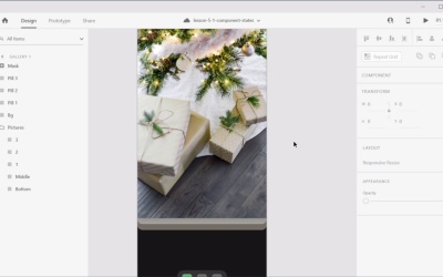
5.1 Advanced Components With States
Welcome back to the course. In this lesson, I’ll show you how to work with component states.
States allow you to create multiple versions of a component and switch between those versions really easily. This can be very useful for creating buttons or form elements, for example. So let’s see how component states work.
Related Links
1.Introduction
1.1Welcome to the Course01:51
1.1
Welcome to the Course
01:51
2.Auto-Animate in Adobe XD
2.1Auto-Animating Position, Size, and Rotation10:26
2.1
Auto-Animating Position, Size, and Rotation
10:26
2.2Combining Masks and Auto-Animate19:08
2.2
Combining Masks and Auto-Animate
19:08
2.3Using Multiple Interactions on One Element07:49
2.3
Using Multiple Interactions on One Element
07:49
2.4Micro-Interactions in Adobe XD15:58
2.4
Micro-Interactions in Adobe XD
15:58
3.3D Transforms
3.1Next-Level 3D Transforms13:58
3.1
Next-Level 3D Transforms
13:58
4.Adobe XD Layout Tools
4.1Advanced Layouts With Stacks07:03
4.1
Advanced Layouts With Stacks
07:03
5.Components
5.1Advanced Components With States08:35
5.1
Advanced Components With States
08:35
6.Adobe XD Plugins
6.15 Top Plugins for Advanced Users11:27
6.1
5 Top Plugins for Advanced Users
11:27


